
Chapter 9 Bootstrapping and Confidence Intervals
In Chapter 8, we studied sampling. We started with a “tactile” exercise where we wanted to know the proportion of balls in the sampling bowl in Figure 8.1 that are red. While we could have performed an exhaustive count, this would have been a tedious process. So instead we used a shovel to extract a sample of 50 balls and used the resulting proportion that were red as an estimate of the proportion of the bowl’s balls that are red. Furthermore, we made sure to mix the bowl’s contents before every use of the shovel. Because of the randomness induced by the mixing, different uses of the shovel yielded different proportions red and hence different estimates of the proportion of the bowl’s balls that are red.
We then mimicked this “tactile” exercise with an equivalent “virtual” exercise performed on the computer. Using our computers’ random number generator, we could very quickly mimic the above sampling procedure a large number of times. In Section 8.2.4, we quickly repeated the above sampling procedure 1000 times using three different “virtual” shovels with 25, 50, and 100 slots. We compared the variation of these three sets of 1000 estimates of the proportion of the bowl’s balls that are red in the three histograms in Figure 8.15.
What we did there was construct sampling distributions. The motivation for taking 1000 repeated samples and visualizing the resulting estimates was to study how these estimates varied from one sample to another; in other words we wanted to study the effect of sampling variation. We quantified the variation of these estimates using their standard deviation which has a special name: the standard error. In particular, we saw that as the sample size increased from 25 to 50 to 100, the standard error decreased and thus the sampling distributions narrowed. In other words, larger sample sizes lead to more precise estimates.
We also described the above sampling exercises using the terminology and mathematical notation related to sampling we introduced in Section 8.3.1. Our study population was the large bowl with \(N\) = 2400 balls, while the population parameter, the unknown quantity of interest, here was the population proportion \(p\) of the bowl’s balls that are red. Since performing a census would be very expensive in terms of time and energy, we instead extracted a sample of size \(n\) = 50. The point estimate, also known as a sample statistic, used to estimate \(p\) was the sample proportion \(\widehat{p}\) of these 50 sampled balls that were red. Furthermore, since the sample was obtained at random, it can be considered as unbiased and representative of the population. Thus any results based on the sample could be generalized to the population. In other words, the sample proportion \(\widehat{p}\) of the shovel’s \(n\) = 50 balls that were red was a “good guess” of the true population proportion \(p\) of the bowl’s \(N\) = 2400 balls that are red. In other words, we used the sample to infer about the population.
However as described in Section 8.2, both the tactile and virtual sampling exercises are not what one would do in real life; they were merely simulations used to study the effects of sampling variation. In a real life situation, we would not take 1000 samples of size \(n\), but rather take a single representative sample of as large a size as possible. Additionally, we knew what the true value of the population parameter here was: the true population proportion of the bowl’s balls that are red. In a real life situation we will not know what this value is. Because if we did, then why would we take a sample to estimate it?
An example of a realistic sampling situation would be a poll, like the one described in the Obama poll article you saw in Section 8.4. Pollsters did not know the true proportion of all young Americans who supported President Obama and thus took a single sample of size \(n\) = 2089 young Americans to estimate the true unknown value.
So how does one study the effects of sampling variation when you only have a single sample to work with? There is no sample-to-sample variation is estimates when you only have one sample. One common method is known as bootstrapping resampling, which will be the focus of the earlier sections of this chapter.
Furthermore, what if we would like not only a single estimate of the unknown population parameter, we would like a range of highly plausible values? Going back to the Obama poll article, it stated that the pollsters’ estimate of the proportion of all young Americans who supported President Obama was 41%, but in addition it stated that the poll’s “margin of error was plus or minus 2.1 percentage points.” In other words this “plausible range” was [41% - 2.1%, 41% + 2.1%] = [37.9%, 43.1%]. This range of plausible values is known as a confidence interval and will be the focus of the later sections of this chapter.
Needed packages
Let’s load all the packages needed for this chapter (this assumes you’ve already installed them). Recall from our discussion in Section 5.4.1 that loading the tidyverse package by running library(tidyverse) loads the following commonly used data science packages all at once:
ggplot2for data visualizationdplyrfor data wranglingtidyrfor converting data to “tidy” formatreadrfor importing spreadsheet data into R- As well as the more advanced
purrr,tibble,stringr, andforcatspackages
If needed, read Section 2.3 for information on how to install and load R packages.
library(tidyverse)
library(moderndive)
library(infer)
9.1 Pennies activity
As we did in Chapter 8, we’ll begin with a hands-on tactile activity.
9.1.1 What is the average year on US pennies in 2019?
Try to imagine all pennies being used in the United States in 2019. That’s a lot of pennies! Now say we’re are interested in the average year of minting of all these pennies. One way to compute this value would be to gather up all pennies being used in the US, record the year, and compute the average. This would be near impossible! So instead, let’s collect a sample of 50 pennies collected from a local bank in downtown Northampton, Massachusetts, the USA seen in Figure 9.1.

FIGURE 9.1: Collecting a sample of 50 US pennies from a local bank.
An image of these 50 pennies can be seen in Figure 9.2.
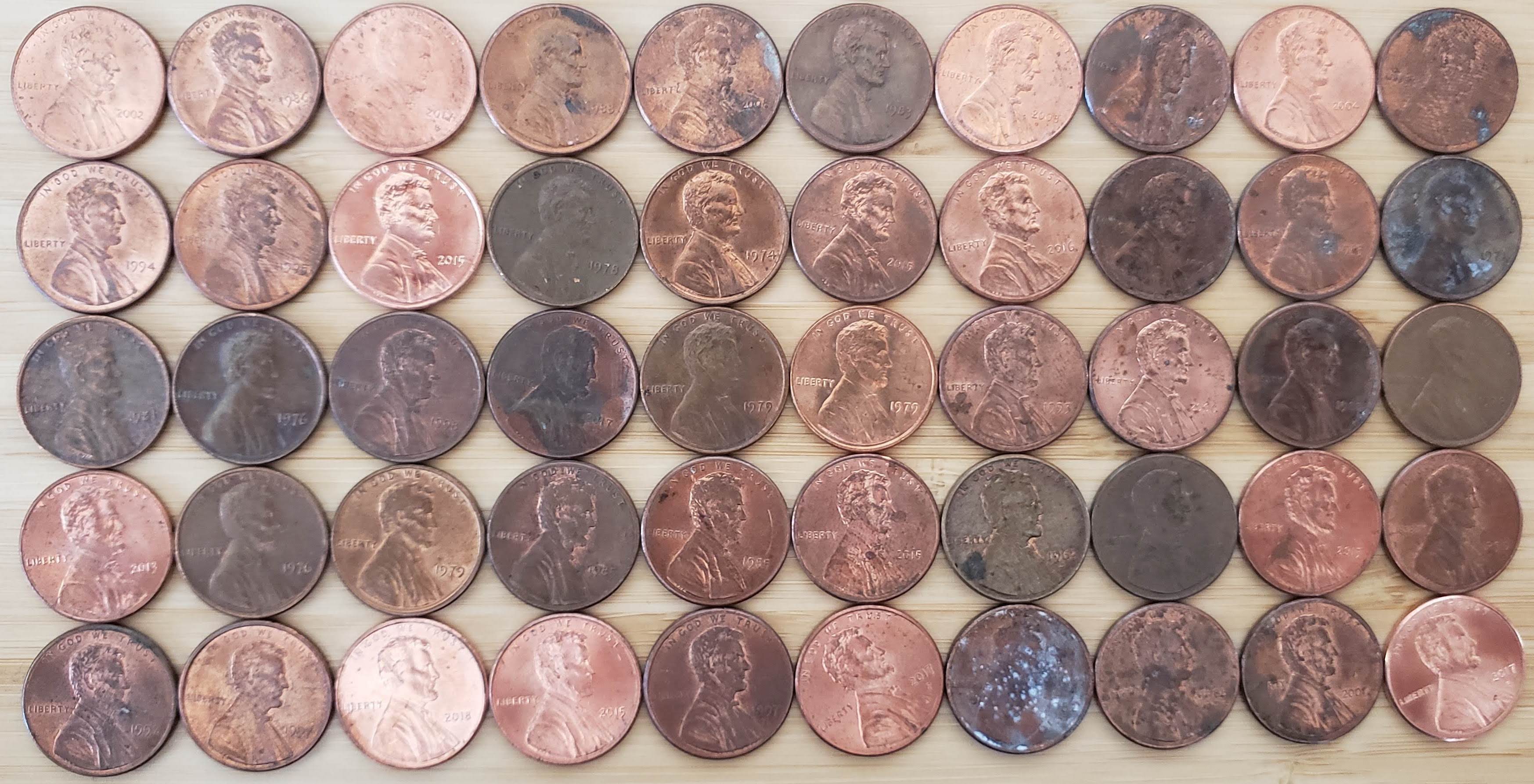
FIGURE 9.2: 50 US pennies.
For each of the 50 pennies let’s assign an “ID” label and mark the year of minting, starting in the top left and ending in the bottom right progressing row by row, as seen in Figure 9.3.
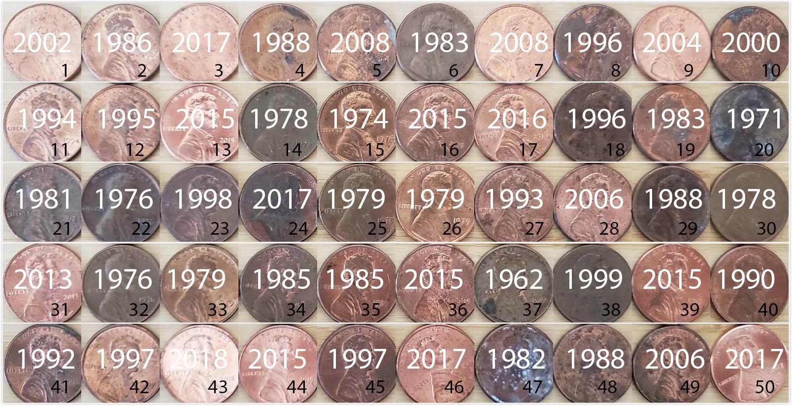
FIGURE 9.3: 50 US pennies labelled.
The moderndive package contains this data on our 50 sampled pennies. Let’s explore this sample data first:
pennies_sample# A tibble: 50 x 2
ID year
<int> <dbl>
1 1 2002
2 2 1986
3 3 2017
4 4 1988
5 5 2008
6 6 1983
7 7 2008
8 8 1996
9 9 2004
10 10 2000
# … with 40 more rowsThe pennies_sample data frame has 50 rows corresponding to each penny with two variables. The first variable ID corresponds to the ID labels in Figure 9.3 whereas the second variable year corresponds to the year of minting saved as an integer.
Based on these 50 sampled pennies, what can we say about all US pennies in 2019? Let’s study some properties of our sample by performing an exploratory data analysis. Let’s first visualize the distribution of the year of these 50 pennies using our data visualization tools from Chapter 3. Since year is a numerical variable, we use a histogram in Figure 9.4.
ggplot(pennies_sample, aes(x = year)) +
  geom_histogram(binwidth = 10, color = "white")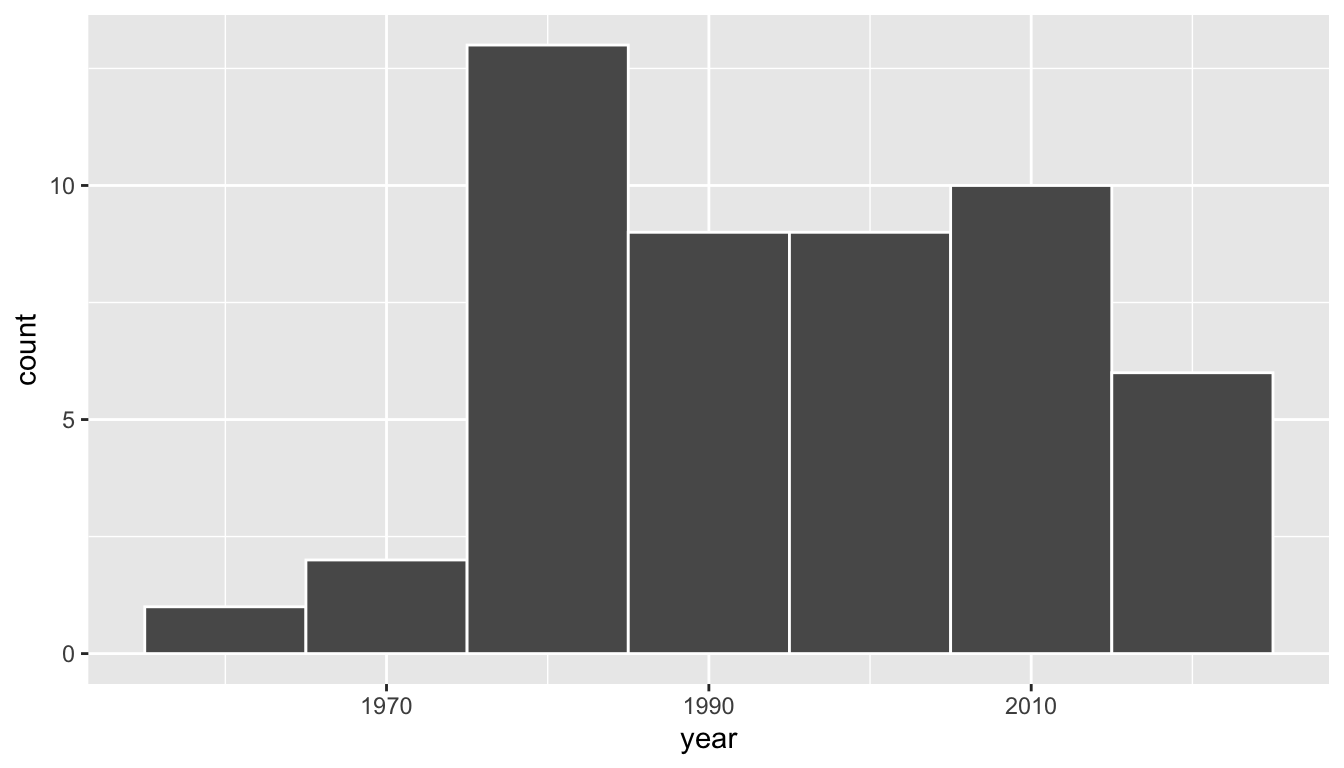
FIGURE 9.4: Distribution of year on 50 US pennies.
We observe a slightly left-skewed distribution since most values fall in between the 1980s through 2010s with only a few older than 1970. What is the average year for the 50 sampled pennies? Eyeballing the histogram it appears to be around 1990. Let’s now compute this value exactly using our data wrangling tools from Chapter 4.
pennies_sample %>%
  summarize(mean_year = mean(year))
# A tibble: 1 x 1
mean_year
<dbl>
1 1995.44Thus assuming pennies_sample is a representative sample from the population of all US pennies, a “good guess” of the average year of minting of all US pennies would be 1995.44, the average year of minting of our 50 sampled pennies. This should all start sounding similar to what we did previously in Chapter 8!
In Chapter 8 our study population was the bowl of \(N\) = 2400 balls. Our population parameter of interest was the population proportion of these balls that were red, denoted mathematically by \(p\). In order to estimate \(p\), we extracted a sample of 50 balls using the shovel and computed the relevant point estimate: the sample proportion of these 50 balls that were red, denoted mathematically by \(\widehat{p}\).
Here our study population is \(N\) = whatever the number of pennies are being used in the US, a value which we don’t know and probably never will. The population parameter of interest is now the population mean year of all these pennies, a value denoted mathematically by the Greek letter \(\mu\) pronounced “mu”. In order to estimate \(\mu\), we went to the bank and obtained a sample of 50 pennies and computed the relevant point estimate: the sample mean year of these 50 pennies, denoted mathematically by \(\overline{x}\) pronounced “x-bar”. An alternative and more intuitive notation for the sample mean is \(\widehat{\mu}\). However this is unfortunately not as commonly used, so in this text, we’ll always denote the sample mean as \(\overline{x}\).
We summarize the correspondence between the sampling bowl exercise in Chapter 8 and our pennies exercise in Table 9.1, which are the first two rows of the previously seen Table 8.8 of the various sampling scenarios we’ll cover in this text.
| Scenario | Population parameter | Notation | Point estimate | Notation. |
|---|---|---|---|---|
| 1 | Population proportion | \(p\) | Sample proportion | \(\widehat{p}\) |
| 2 | Population mean | \(\mu\) | Sample mean | \(\overline{x}\) or \(\widehat{\mu}\) |
Going back to our 50 sampled pennies in Figure 9.3, the point estimate of interest is the sample mean \(\overline{x}\) of 1995.44. This quantity is an estimate of the population mean year of all US pennies \(\mu\).
Recall that we also saw in Chapter 8 that such estimates are prone to sampling variation. For example, in this particular sample in Figure 9.3, we observed three pennies with the year of 1999. If we obtained other samples of size 50 would we always observe exactly three pennies with the year of 1999? More than likely not. We might observe none, or one, or two, or maybe even all 50! The same can be said for the other 26 unique years that are represented in our sample of 50 pennies.
To study this sampling variation as we did in Chapter 8, we need more than one sample. In our case with pennies, how would we obtain another sample? We would go to the bank and get another roll of 50 pennies! However, in real-life sampling one doesn’t obtain many samples as we did in Chapter 8; those were merely simulations. So what how can we study sample-to-sample variation when we have only a single sample as in our case?
Just as different uses of the shovel in the bowl led to the different sample proportions red, different samples of 50 pennies will lead to different sample mean years. However, how can we study the effect of sampling variation using only our single sample seen in Figure 9.3? We will do so using a technique known as “bootstrap resampling with replacement”, which we now illustrate.
9.1.2 Resampling once
Step 1: Let’s print out identically-sized slips of paper representing the 50 pennies in Figure 9.3.

FIGURE 9.5: 50 slips of paper representing 50 US pennies.
Step 2: Put the 50 small pieces of paper into a hat or tuque.
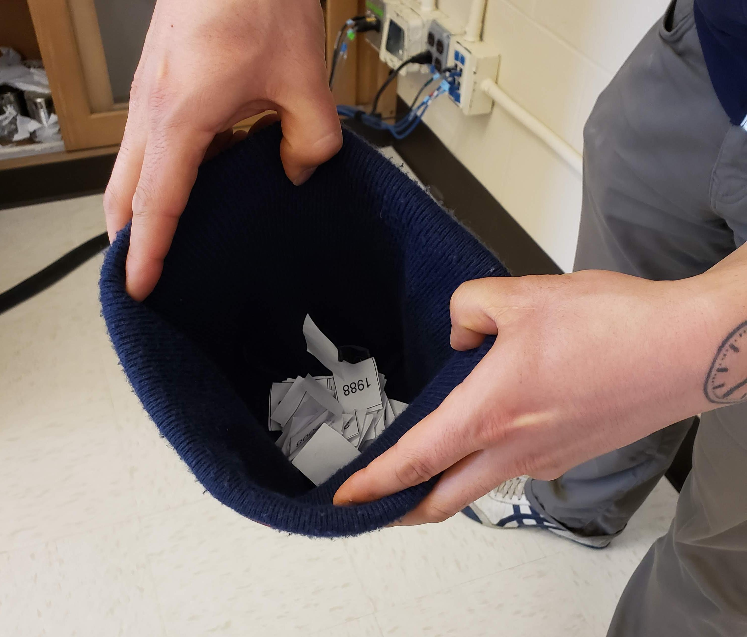
FIGURE 9.6: Putting 50 slips of paper in a hat.
Step 3: Mix the hat’s contents and draw one slip of paper at random. Record the year somewhere.
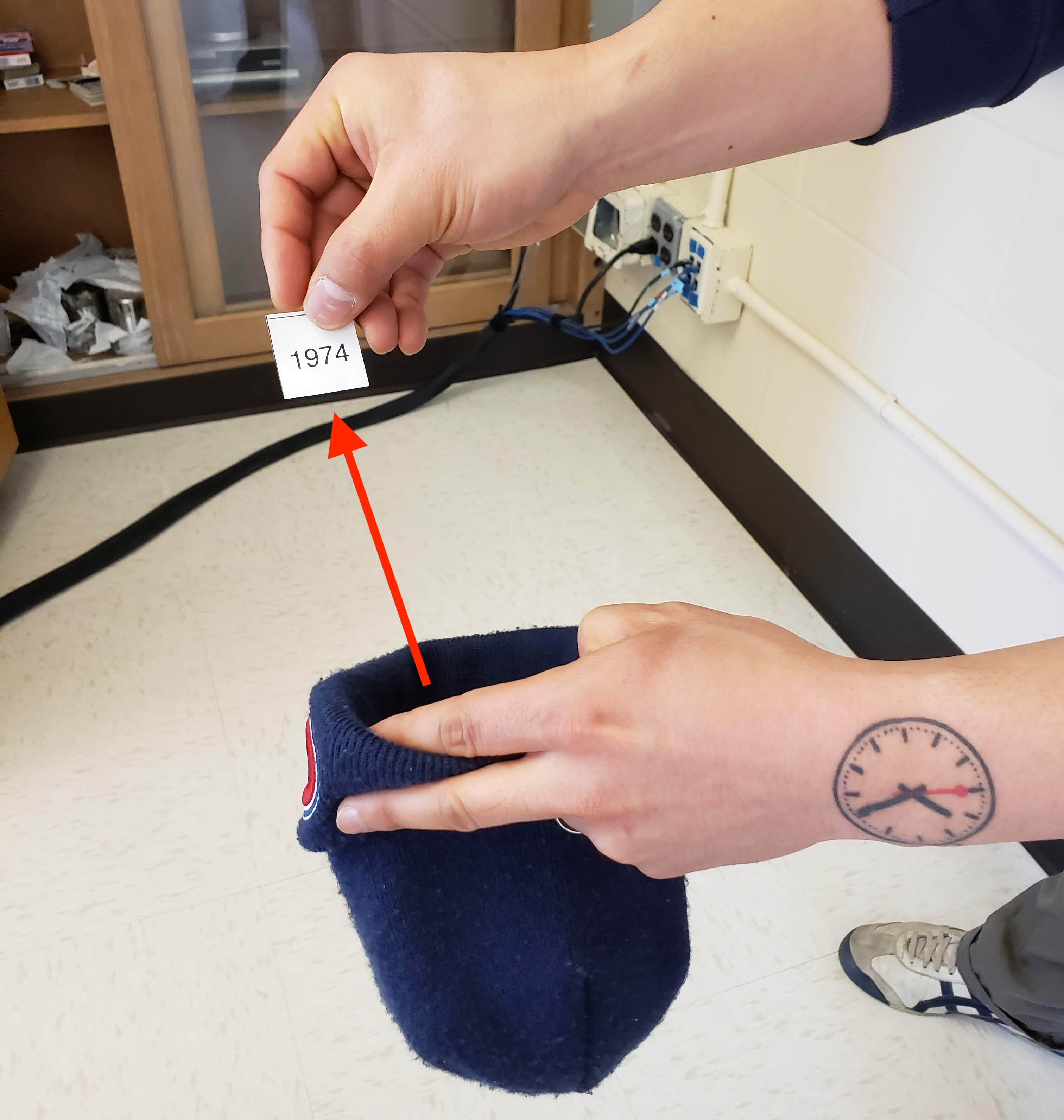
FIGURE 9.7: Drawing one slip of paper.
Step 4: Put the slip of paper back in the hat! In other words, replace it!
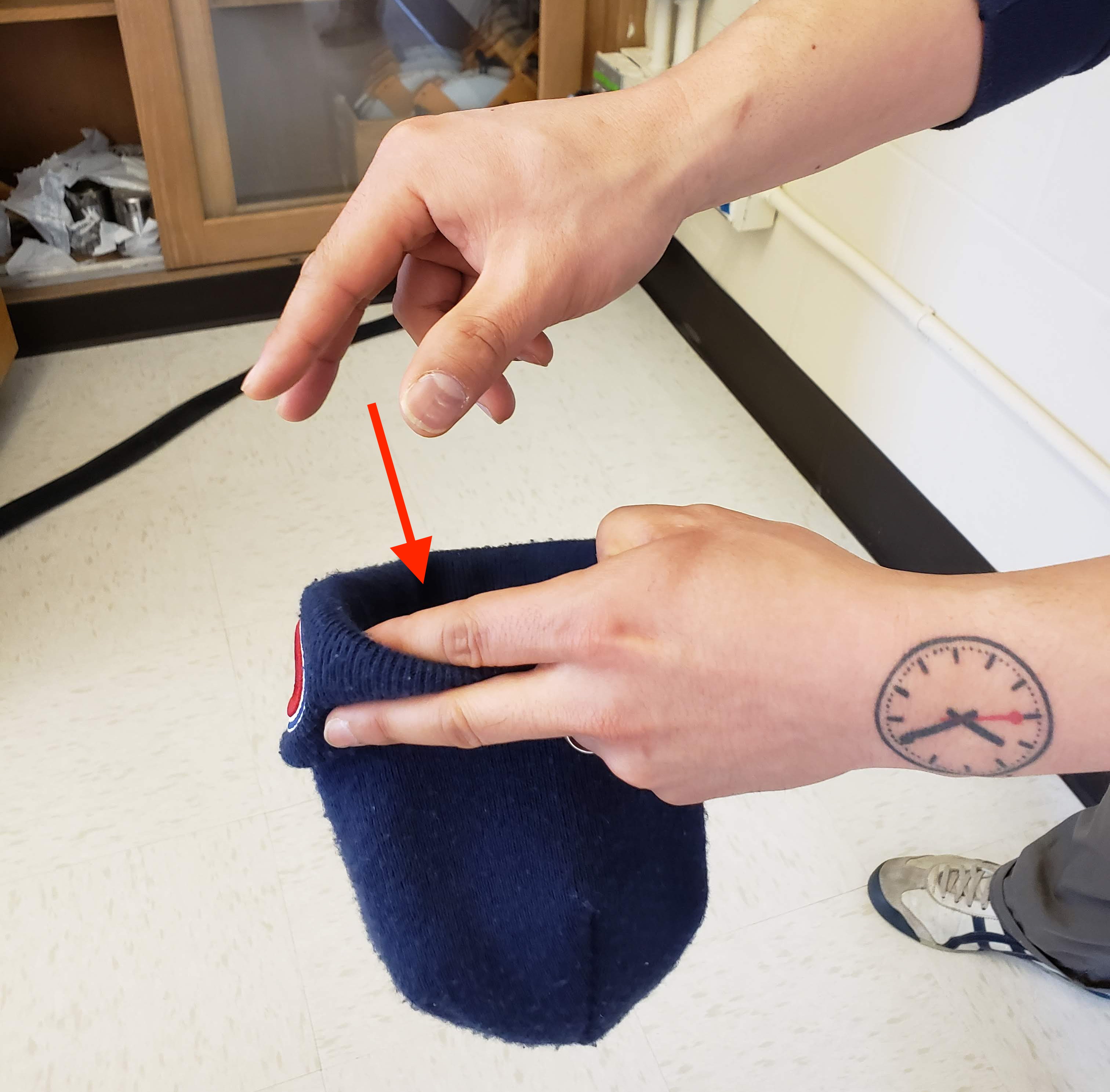
FIGURE 9.8: Replacing slip of paper.
Step 5: Repeat Steps 3 and 4 49 more times, resulting in 50 recorded years.
What we just performed was a resampling of the original sample of 50 pennies. We are not sampling 50 pennies from the population of all US pennies as we did in our trip to the bank. Instead, we are mimicking this act by “re”-sampling 50 pennies from our originally sampled 50 pennies. However, why did we replace our resampled slip of paper back into the hat in Step 4? Because if we left the slip of paper out of the hat each time we performed Step 4, we would obtain the same 50 pennies, in the end, each time! In other words, replacing the slips of paper induces variation.
Being more precise with our terminology, we just performed a resampling with replacement of the original sample of 50 pennies. Had we left the slip of paper out of the hat each time we performed Step 4, this would be “resampling without replacement”.
Let’s study our 50 resampled pennies via an exploratory data analysis. First, let’s load the data into R by manually creating a data frame pennies_resample of our 50 resampled values. We’ll do this using the tibble() command from the dplyr package. Note that the 50 values you obtained will almost certainly not be the same as ours.
pennies_resample <- tibble(
  year = c(1976, 1962, 1976, 1983, 2017, 2015, 2015, 1962, 2016, 1976,
           2006, 1997, 1988, 2015, 2015, 1988, 2016, 1978, 1979, 1997,
           1974, 2013, 1978, 2015, 2008, 1982, 1986, 1979, 1981, 2004,
           2000, 1995, 1999, 2006, 1979, 2015, 1979, 1998, 1981, 2015,
           2000, 1999, 1988, 2017, 1992, 1997, 1990, 1988, 2006, 2000)
)
The 50 values of year in pennies_resample represent the resample of size 50 from the original sample of 50 pennies from the bank. We display the 50 resampled pennies in Figure 9.9.
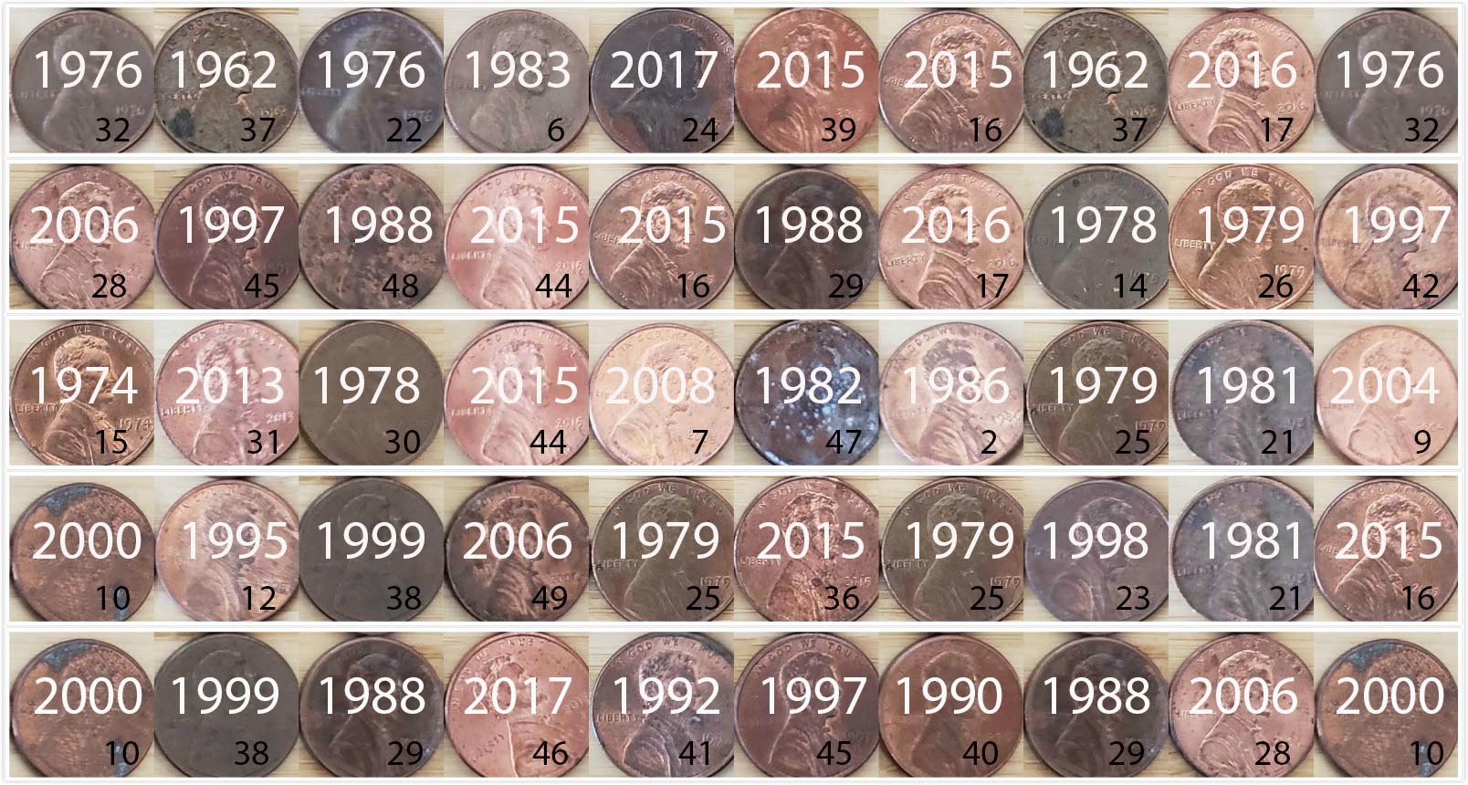
FIGURE 9.9: 50 resampled US pennies labelled.
Let’s compare the distribution of the numerical variable year of our 50 resampled pennies with the distribution of the numerical variable year of our original sample of 50 pennies from the bank in Figure 9.10.
ggplot(pennies_resample, aes(x = year)) +
  geom_histogram(binwidth = 10, color = "white") +
  labs(title = "Resample of 50 pennies")
ggplot(pennies_sample, aes(x = year)) +
  geom_histogram(binwidth = 10, color = "white") +
  labs(title = "Original sample of 50 pennies")
<ScaleContinuousPosition>
Range:
Limits: 0 -- 15<ScaleContinuousPosition>
Range:
Limits: 0 -- 15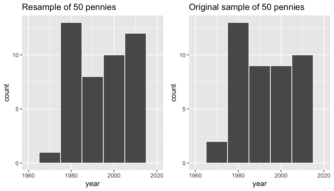
FIGURE 9.10: Comparing year in the resample pennies_resample with the original sample pennies_sample.
Observe that while the general shape of the distribution of year is roughly similar, they are not identical. This is due to the variation induced by replacing the slips of paper each time we pull one out and recorded the year.
Recall from the previous section that the sample mean of the original sample of 50 pennies from the bank was 1995.44. What about for the year variable in pennies_resample? Any guesses? Let’s have dplyr help us out as before:
pennies_resample %>%
  summarize(mean_year = mean(year))
# A tibble: 1 x 1
mean_year
<dbl>
1 1994.82We obtained a different mean year of 1994.82. Again, this variation is induced by the “with replacement” from the “resampling with replacement” terminology we defined earlier.
What if we repeated several times this resampling exercise many times? Would we obtain the same sample mean year value each time? In other words, would our guess at the mean year of all pennies in the US in 2019 be exactly 1994.82 every time? Just as we did in Chapter 8, let’s perform this resampling activity with the help of 35 of our friends.
9.1.3 Resampling 35 times
Each of our 35 friends will repeat the same 5 steps above:
- Start with 50 identically-sized slips of paper representing the 50 pennies.
- Put the 50 small pieces of paper into a hat or tuque.
- Mix the hat’s contents and draw one slip of paper at random. Record the year somewhere.
- Replace the slip of paper back in the hat!
- Repeat Steps 3 and 4 49 more times, resulting in 50 recorded years.
Since we had 35 of our friends perform this task, we ended up with 35 \(\times\) 50 = 1750 values. We recorded these values in a shared spreadsheet with 50 rows (plus a header row) and 35 columns; we display a snapshot of the first 10 rows and 5 columns in Figure 9.11
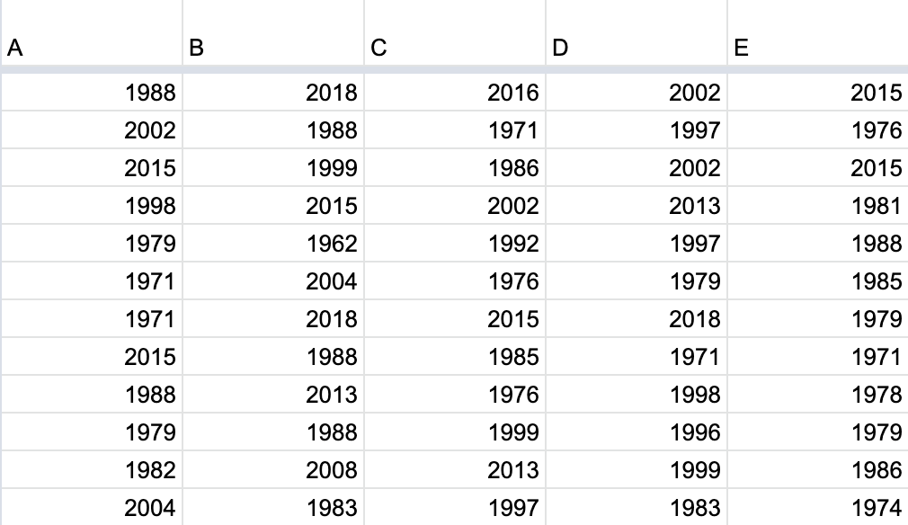
FIGURE 9.11: Snapshot of shared spreadsheet of resampled pennies.
For your convenience, we’ve taken these 35 \(\times\) 50 = 1750 values and saved them in virtual_resamples, a “tidy” data frame included in the moderndive package:
pennies_resamples# A tibble: 1,750 x 3
replicate name year
<int> <chr> <dbl>
1 1 A 1988
2 1 A 2002
3 1 A 2015
4 1 A 1998
5 1 A 1979
6 1 A 1971
7 1 A 1971
8 1 A 2015
9 1 A 1988
10 1 A 1979
# … with 1,740 more rowsWhat did each of our 35 friends obtain as the mean year? dplyr to the rescue once more! After grouping the rows by name, we summarize each group of rows with their mean year:
resampled_means <- pennies_resamples %>%
  group_by(name) %>%
  summarize(mean_year = mean(year))
resampled_means
# A tibble: 35 x 2
name mean_year
<chr> <dbl>
1 A 1992.5
2 AA 1995.86
3 B 1996.42
4 BB 1992.4
5 C 1996.32
6 CC 1995.88
7 D 1996.9
8 DD 1997.46
9 E 1991.22
10 EE 1998.44
# … with 25 more rowsObserve that resampled_means has 35 rows corresponding to the 35 resample means based the 35 resamples performed by our friends. Furthermore, observe the variation in the 35 values in the variable mean_year. This variation exists because by “resampling with replacement”, our 35 friends obtained different resamples of 50 pennies, and thus obtained different resample mean year.
Since the variable mean_year is numerical, let’s visualize its distribution using a histogram in Figure 9.12. Note that adding the argument boundary = 1990 to geom_histogram() sets the binning structure of the histogram so that one of the boundaries between bins is at the year 1990 exactly.
ggplot(resampled_means, aes(x = mean_year)) +
  geom_histogram(binwidth = 1, color = "white", boundary = 1990) +
  labs(x = "Resampled mean year")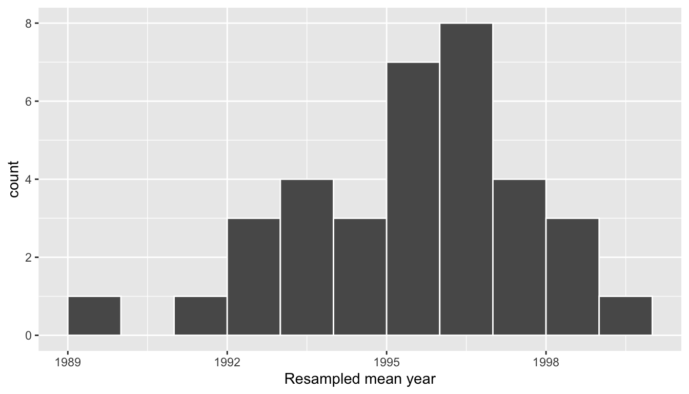
FIGURE 9.12: Distribution of 35 sample means from 35 resamples.
Observe the following about the histogram in Figure 9.12:
- The distribution looks roughly normal.
- We rarely observe sample mean years less than in 1992.
- On the other side of the distribution, we rarely observe sample mean years greater than in 2000.
- The most frequently occurring values occur between roughly 1992 and 1998.
- The distribution of these 35 sample means based on 35 resamples is roughly centered at 1995, which is the sample mean of 1995.44 of the original sample of 50 pennies from the bank.
9.1.4 What did we just do?
What we just demonstrated in this activity is the statistical procedure known as bootstrap resampling with replacement . We used resampling to mimic the sampling variation we observe from sample-to-sample as we did in Chapter 8 on sampling, but this time using a single sample from the population.
In fact, the histogram of sample means from 35 resamples in Figure 9.12 is called the bootstrap distribution of the sample mean and it is an approximation of the sampling distribution of the same mean, a concept we introduced in Chapter 8. In Section 9.7 we’ll show you that the bootstrap distribution is an approximation to the sampling distribution. Using this bootstrap distribution, we can study the effect of sampling variation on our estimates, in particular study the typical “error” of our estimates, known as the standard error .
In Section 9.2 we’ll mimic our tactile resampling activity virtually on the computer. We can use a computer to do the resampling many more times than our 35 friends could possibly do. This will allow us to better understand the bootstrap distribution. In Section 9.3 we’ll explicitly articulate our goals for this chapter: understanding resampling variation, defining the statistical concept of a confidence interval by building on our pennies example, and discussing the interpretation of confidence intervals.
Following this framework on confidence intervals, we’ll discuss the dplyr and infer package code needed to complete the process of bootstrapping, which is another name for this resampling approach that is most commonly found in developing confidence intervals. We’ve used one of the functions in the infer package already with rep_sample_n(), but there’s a lot more to this package than just that. We’ll introduce the tidy statistical inference framework that was the motivation for the infer package pipeline that will be the driving package throughout the rest of this book.
As we did in Chapter 8, we’ll tie all these ideas together with a real-life case study in Section 9.6 involving data from an experiment about yawning from the US television show Mythbusters. The chapter concludes with a comparison of the sampling distribution and a bootstrap distribution using the balls data from Chapter 8 on sampling.
9.2 Computer simulation of resampling
Let’s now mimic our tactile resampling activity virtually by using our computer.
9.2.1 Virtually resampling once
First, let’s perform the virtual analog of resampling once. Recall that the pennies_sample data frame included in the moderndive package contains the years of our original sample of 50 pennies from the bank. Furthermore, recall in Chapter 8 on sampling that we used the rep_sample_n() function as a virtual shovel to sample balls from our virtual bowl of 2400 balls.
virtual_shovel <- bowl %>%
  rep_sample_n(size = 50)
Let’s combine these two elements to virtually mimic our resampling with replacement exercise involving the slips of paper representing our 50 pennies in Figure 9.3:
virtual_resample <- pennies_sample %>%
  rep_sample_n(size = 50, replace = TRUE)
Observe how we explicitly set the replace argument to TRUE in order to tell rep_sample_n() that we would like to sample pennies with replacement. Had we not set replace = TRUE, the function would’ve assumed the default value of FALSE. Additionally, since we didn’t specify the number of replicates via the reps argument, the function assumes the default of one replicate reps = 1. Note also that the size argument is set to match the original sample size of 50 pennies. So what does virtual_resample look like?
View(virtual_resample)We’ll display only the first 10 out of 50 rows of virtual_resample’s contents in Table 8.2.
| replicate | ID | year |
|---|---|---|
| 1 | 37 | 1962 |
| 1 | 1 | 2002 |
| 1 | 45 | 1997 |
| 1 | 28 | 2006 |
| 1 | 50 | 2017 |
| 1 | 10 | 2000 |
| 1 | 16 | 2015 |
| 1 | 47 | 1982 |
| 1 | 23 | 1998 |
| 1 | 44 | 2015 |
The replicate variable only takes on the value of 1 corresponding to us only having reps = 1, the ID variable indexes which of the 50 pennies from pennies_sample was resampled, and year denotes the year of minting.
Let’s compute the mean year in our virtual resample of size 50 using data wrangling functions included in the dplyr package:
virtual_resample %>%
  summarize(resample_mean = mean(year))
# A tibble: 1 x 2
replicate resample_mean
<int> <dbl>
1 1 1996As when we did our tactile resampling, the resulting mean year is different than that mean year of our 50 originally sampled pennies of 1995.44.
9.2.2 Virtually resampling 35 times
Let’s now have 35 virtual friends perform our virtual resampling exercise. Using these results, we’ll be able to study the variability in the sample means from 35 resamples of size 50. Let’s first add a reps = 35 argument to rep_sample_n() to indicate we would like 35 replicates, or in other words, repeat the resampling with the replacement of 50 pennies 35 times.
virtual_resamples <- pennies_sample %>%
  rep_sample_n(size = 50, replace = TRUE, reps = 35)
virtual_resamples
# A tibble: 1,750 x 3
# Groups: replicate [35]
replicate ID year
<int> <int> <dbl>
1 1 21 1981
2 1 34 1985
3 1 4 1988
4 1 11 1994
5 1 26 1979
6 1 8 1996
7 1 19 1983
8 1 21 1981
9 1 49 2006
10 1 2 1986
# … with 1,740 more rowsThe resulting virtual_resamples data frame has 35 \(\times\) 50 = 1750 rows corresponding to 35 resamples of 50 pennies. What did each of our 35 virtual friends obtain as the mean year? We’ll use the same dplyr verbs as we did in the previous section, but computing the mean for each of our virtual friends separately by adding a group_by(replicate):
virtual_resampled_means <- virtual_resamples %>%
  group_by(replicate) %>%
  summarize(mean_year = mean(year))
virtual_resampled_means
# A tibble: 35 x 2
replicate mean_year
<int> <dbl>
1 1 1995.58
2 2 1999.74
3 3 1993.7
4 4 1997.1
5 5 1999.42
6 6 1995.12
7 7 1994.94
8 8 1997.78
9 9 1991.26
10 10 1996.88
# … with 25 more rowsObserve that virtual_resampled_means has 35 rows corresponding to the 35 resampled means and that the values of mean_year vary. Let’s visualize the distribution of the numerical variable mean_year using a histogram in Figure 9.13.
ggplot(virtual_resampled_means, aes(x = mean_year)) +
  geom_histogram(binwidth = 1, color = "white", boundary = 1990) +
  labs(x = "Resampled mean year")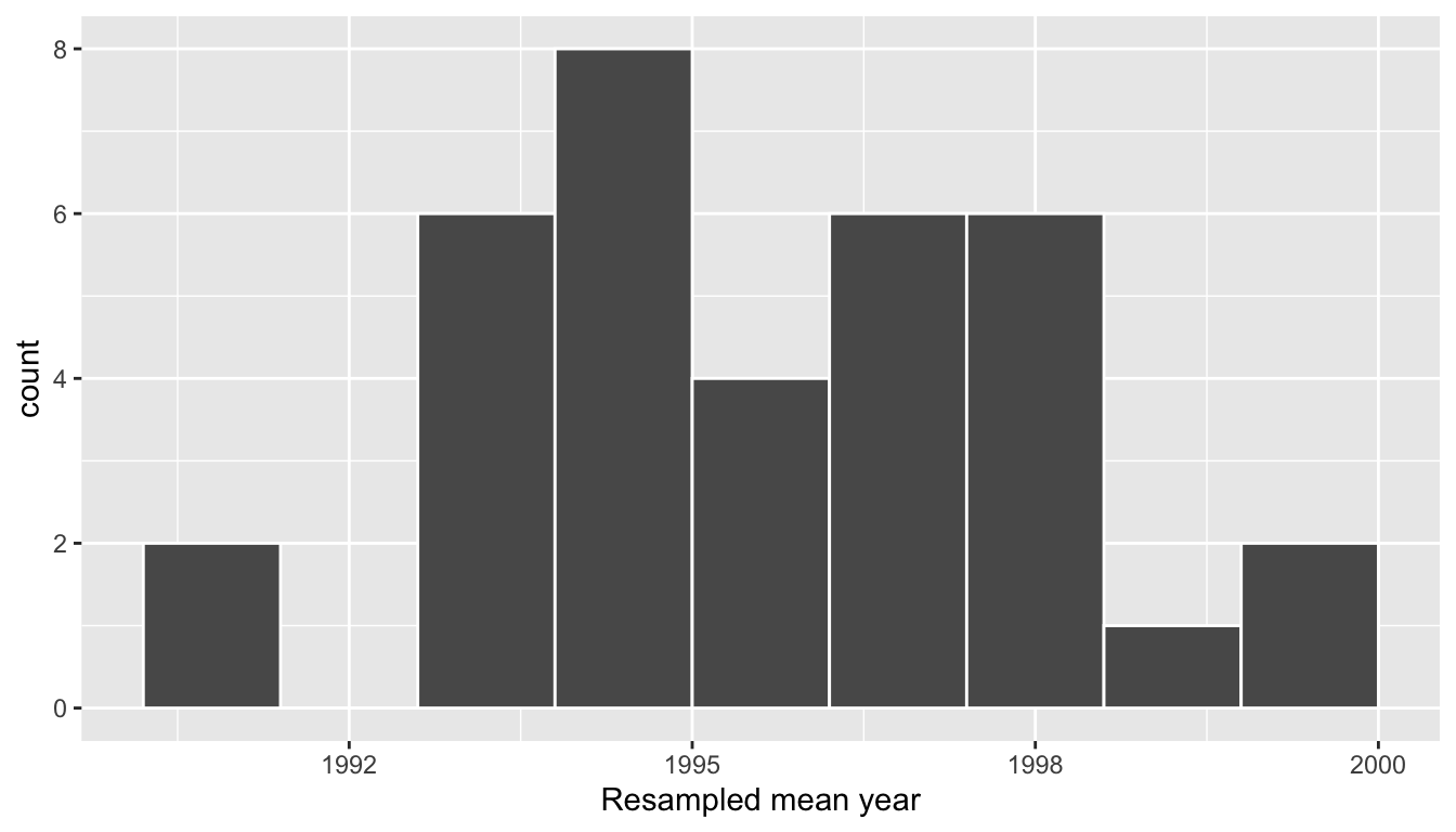
FIGURE 9.13: Distribution of 35 sample means from 35 resamples.
To convince ourselves that our virtual resampling indeed mimics the resampling done by our 35 friends, let’s compare the bootstrap distribution we just virtually constructed with the bootstrap distribution our 35 friends constructed via tactile resampling in the previous section.
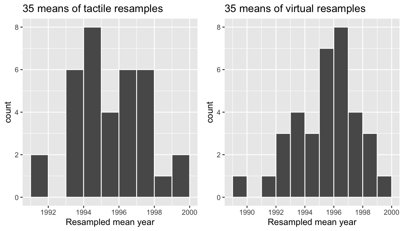
FIGURE 9.14: Comparing distributions of means from resamples.
Recall that in the “resampling with replacement” scenario we are illustrating here both the above histograms have a special name: the bootstrap distribution of the sample mean. Furthermore, they are an approximation to the sampling distribution of the sample mean, a concept you saw in Chapter 8 on sampling. These distributions allow us to study the effect of sampling variation on our estimates of the true population mean, in this case the true mean year for all US pennies. However, unlike in Chapter 8 where we simulated the act of taking multiple samples, something one would never do in practice, bootstrap distributions are constructed from a single sample, in this case the 50 original pennies from the bank.
Learning check
9.2.3 Virtually resampling 1000 times
Remember that one of the goals of resampling with replacement is to construct the bootstrap distribution, which is an approximation of the sampling distribution of the point estimate of interest, here the sample mean year. However, the bootstrap distribution of in Figure 9.13 is based only on 35 resamples and hence looks a little coarse. Let’s increase the number of resamples to 1000 to better observe the shape and the variability from one resample to the next.
# Repeat resampling 1000 times
virtual_resamples <- pennies_sample %>%
  rep_sample_n(size = 50, replace = TRUE, reps = 1000)

# Compute 1000 sample means
virtual_resampled_means <- virtual_resamples %>%
  group_by(replicate) %>%
  summarize(mean_year = mean(year))
However, in the interest of brevity, going forward let’s combine the above two operations into a single chain of %>% pipe operators:
virtual_resampled_means <- pennies_sample %>%
  rep_sample_n(size = 50, replace = TRUE, reps = 1000) %>%
  group_by(replicate) %>%
  summarize(mean_year = mean(year))
virtual_resampled_means
# A tibble: 1,000 x 2
replicate mean_year
<int> <dbl>
1 1 1992.6
2 2 1994.78
3 3 1994.74
4 4 1997.88
5 5 1990
6 6 1999.48
7 7 1990.26
8 8 1993.2
9 9 1994.88
10 10 1996.3
# … with 990 more rowsLet’s visualize the bootstrap distribution of these 1000 sample means from 1000 virtual resamples looks like in Figure 9.15:
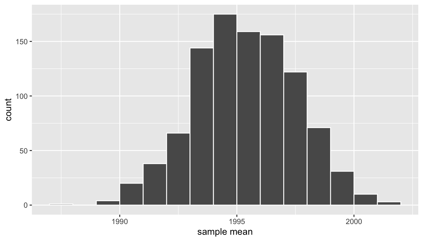
FIGURE 9.15: Bootstrap resampling distribution based on 1000 resamples.
Note here the bell shape starting to become more apparent. We now have a general sense for the range of values that the sample mean may take on in these resamples from this histogram of the bootstrap distribution. Do you have a guess as to where this histogram is centered? With it being close to symmetric, either the mean or the median would serve as a good estimate for the center here. Let’s compute the mean:
virtual_resampled_means %>%
  summarize(mean_of_means = mean(mean_year))
# A tibble: 1 x 1
mean_of_means
<dbl>
1 1995.36The mean of the 1000 means from 1000 resamples is 1995.365. Note that this is quite close to the mean of our original sample of 50 pennies from the bank: 1995.44. This is the case since each of the 1000 resamples are based on the original sample of 50 pennies.
Learning check
(LC9.2) What is the difference between a bootstrap distribution and a sampling distribution?
9.3 Understanding confidence intervals
Let’s start this section with an analogy involving fishing. Say you are trying to catch a fish. On the one hand, you could use a spear, while on the other you could use a net. Using the net will probably yield better results! Bringing things back to the pennies: you are trying to estimate the true population mean year \(\mu\) of all US pennies. Think of the value of \(\mu\) as the fish.
On the one hand, we could use the appropriate point estimate/sample statistic to estimate \(\mu\), which we saw in Table 9.1 is the sample mean \(\overline{x}\). Based on our sample of 50 pennies from the bank, the sample mean was 1995.44. Think of this value as fishing with a spear.
On the other hand, let’s use our results from the previous section to construct a range of highly probable values for \(\mu\). Looking at the bootstrap distribution in Figure 9.15, between which two years would you say that “most” sample means lie? While this question is somewhat subjective, saying that most sample means lie in the interval 1992 to 2000 would not be unreasonable. Think of this interval as fishing with a net.
What we’ve just illustrated is the concept of a confidence interval, which we’ll abbreviate with “CI” throughout this book. So as opposed to a point estimate/sample statistic that estimates the value of an unknown population parameter with a single value, a confidence interval gives a range of plausible values. Going back to our analogy, point estimates/sample statistics can be thought of as spears, whereas confidence intervals can be thought of as nets.

FIGURE 9.16: Analogy of difference between point estimates and confidence intervals.
Our proposed interval of highly probably values for \(\mu\) of 1992 to 2000 was constructed by eye and is thus somewhat subjective. We now introduce two methods for constructing such intervals in a more principled fashion: the percentile method and the standard error method.
Both methods for confidence interval construction share some commonalities. First, they are both constructed from the bootstrap distribution, an example of which you created using 1000 bootstrap resamples with replacement in Subsection 9.2.3 and saved in the virtual_resampled_means data frame.
Second, they both require you to specify the confidence level. All other things being equal, higher confidence levels correspond to wider confidence intervals and lower confidence levels corresponding to narrower confidence intervals. Commonly used confidence levels include 90%, 95%, and 99%; we’ll be mostly using 95% and hence constructing “95% confidence intervals for \(\mu\)”.
9.3.1 Percentile method
Recall that the actual population mean year \(\mu\) for all pennies in circulation in the US is unknown to us. The only way to know this value exactly would be to conduct a census of all pennies, a near impossible task. Instead, by constructing a confidence interval we’ll obtain a range of plausible values for this unknown \(\mu\).
One method to construct this range is to use the middle 95% of the 1000 sample means we computed using bootstrap resampling with replacement. We can do this by computing the 2.5th and 97.5th percentiles, which are 1991.059 and 1999.283 respectively. For now, let’s focus on the concepts behind a percentile method constructed confidence interval; we’ll show you the code to compute these values in the next section.
We can mark these percentiles on the bootstrap distribution with red vertical lines in Figure 9.17. You can see that 95% of the values in the mean_year variable in virtual_resampled_means fall between the two endpoints, with 2.5% to the left of the left-most red line and 2.5% to the right of the right-most red line.
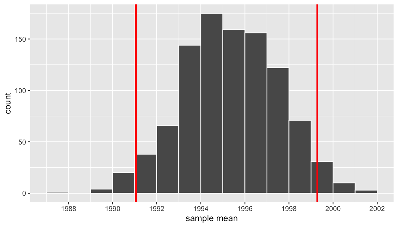
FIGURE 9.17: Percentile method 95 percent confidence interval.
9.3.2 Standard error method
Recall in Subsection 8.5.3, we saw that if a numerical variable follows a normal distribution, or in other words, the histogram of this variable is bell-shaped, then roughly 95% of values fall between \(\pm\) 1.96 standard deviations of the mean. Given that our bootstrap distribution based on 1000 resamples with replacement in Figure 9.15 is normally shaped, let’s use the above fact about normal distributions to construct a confidence interval in a different way.
First, the bootstrap distribution has a mean equal to \(\overline{x}\): the sample mean of our original 50 pennies of 1995.44. In other words, the bootstrap distribution is centered at 1995.44. Second, let’s compute the standard deviation of the bootstrap distribution
virtual_resampled_means %>%
  summarize(SE = sd(mean_year))
# A tibble: 1 x 1
SE
<dbl>
1 2.15466What is this value? Recall that the bootstrap distribution is an approximation to the sampling distribution and that the standard deviation of the sampling distribution has a special name: the standard error. So in other words, 2.15 is an approximation of the standard error of \(\overline{x}\).
Thus using our 95% rule of thumb about normal distributions from Subsection 8.5.3, we can use the following formula to determine the lower and upper endpoints of the 95% confidence interval for \(\mu\):
\[ \begin{aligned} \overline{x} \pm 1.96 \cdot SE &= (\overline{x} - 1.96 \cdot SE, \overline{x} + 1.96 \cdot SE)\\ &= (1995.44 - 1.96 \cdot 2.15, 1995.44 + 1.96 \cdot 2.15)\\ &= (1991.15, 1999.73) \end{aligned} \]
Let’s add the SE method confidence interval (in blue) to our previously constructed percentile method confidence (in red) in Figure 9.18.
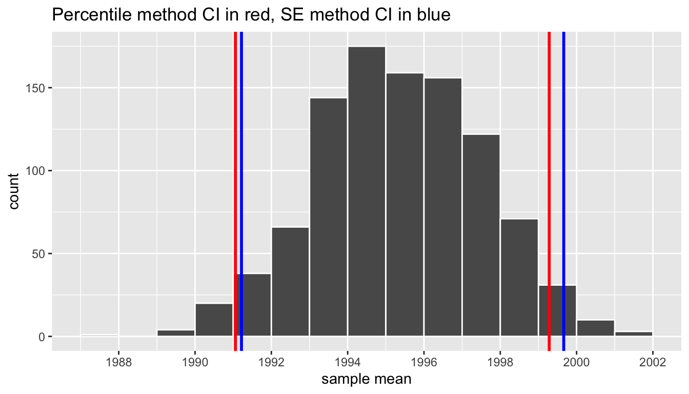
FIGURE 9.18: Comparing 95 percent confidence interval methods.
We see that both methods produce nearly identical confidence intervals with the percentile method yielding \((1991.06, 1999.28)\) while the standard error method being \((1991.22, 1999.66)\). However, recall that we can only use the standard error rule when the bootstrap distribution is roughly normally-shaped.
Now that we’ve introduced the concept of confidence intervals and laid out the intuition behind two methods for constructing them, let’s explore the code that allows us to construct them.
Learning check
(LC9.4) What condition about the bootstrap distribution must be met for us to be able to construct confidence intervals using the standard error method?
(LC9.5) Say we wanted to construct a 68% confidence interval instead of a 95% confidence interval for \(\mu\)?
9.4 Constructing confidence intervals
Recall that the process of resampling with a replacement we performed by hand in Section 9.1 and virtually in Section 9.2 is known as bootstrapping. The term bootstrapping originates in the expression of “pulling oneself up by their bootstraps”: to “succeed only by one’s own efforts or abilities.” From a statistical perspective, it alludes to succeeding in being able to study the effects of sampling variation on estimates from the “effort” of a single sample. Or more precisely, constructing an approximation to the sampling distribution using only one sample.
To perform this resampling with replacement virtually in Section 9.2, we used the rep_sample_n() function, making sure that the size of the resamples matched the original sample size. In this section, we’ll build off these ideas to construct confidence intervals using a new package: the infer package for “tidy” and transparent statistical inference.
9.4.1 Original workflow
Recall that in Section 9.2, we virtually performed bootstrap resampling with replacement to build the bootstrap distribution, which in turn is an approximation to the sampling distribution we saw in Chapter 8 but using only a single sample. Let’s revisit the flow using the %>% pipe operator:
First, we used the rep_sample_n() function to sample size = 50 pennies with replacement from the original sample of 50 pennies in pennies_sample by setting replace = TRUE. Furthermore, we repeated this resampling 1000 times by setting reps = 1000:
pennies_sample %>%
  rep_sample_n(size = 50, replace = TRUE, reps = 1000)
Second, since for each of our 1000 resamples of size 50, we want to compute a separate sample mean, we used the dplyr verb group_by() to group observations/rows together by the replicate variable…
pennies_sample %>%
  rep_sample_n(size = 50, replace = TRUE, reps = 1000) %>%
  group_by(replicate)
… followed by using summarize() to compute the sample mean() year from each replicate group:
pennies_sample %>%
  rep_sample_n(size = 50, replace = TRUE, reps = 1000) %>%
  group_by(replicate) %>%
  summarize(mean_year = mean(year))
For this simple case, we can get by with using the rep_sample_n() function and a couple of dplyr verbs to construct the bootstrap distribution. However, using only dplyr verbs only provides us with a limited set of tools. For more complicated situations, we need a little more firepower. Let’s repeat the above using the infer package.
9.4.2 infer package workflow
Just as group_by() %>% summarize() produces a useful workflow in dplyr, we can also use specify() %>% calculate() to compute summary measures on our original sample data. It’s often helpful both in confidence interval calculations, but also in hypothesis testing to identify what the corresponding statistic is in the original data. For our example on penny age, we computed above a value of x_bar using the summarize() verb in dplyr:
pennies_sample %>%
  summarize(stat = mean(year))
This can also be done by skipping the generate() step in the pipeline feeding specify() directly into calculate():
pennies_sample %>%
  specify(response = year) %>%
  calculate(stat = "mean")
This shortcut will be particularly useful when the calculation of the observed statistic is tricky to do using dplyr alone. This is particularly the case when working with more than one explanatory variable as will be seen in Chapter 10.
The infer package makes efficient use of the %>% pipe operator we saw in Chapter 4 to spell out the sequence of steps necessary to perform statistical inference in a “tidy” and transparent fashion. Much in the same way that the functions in the dplyr have intuitive verb-based names, the infer package’s functions are also verbs that spell out the computational process of constructing confidence intervals, as well as hypothesis tests as we’ll see in Chapter 10.
Let’s illustrate the sequence of verbs to construct a confidence interval for \(\mu\), the population mean year of minting of all pennies in the US.
1. specify variables
FIGURE 9.19: Diagram of specify() variables.
The specify() function is used to choose which variables in a data frame will be the focus of the statistical inference. We do this by specifying the response argument. For example, in our pennies_sample data frame of the 50 pennies sampled from the bank, the variable of interest is year:
pennies_sample %>%
  specify(response = year)
Response: year (numeric)
# A tibble: 50 x 1
year
<dbl>
1 2002
2 1986
3 2017
4 1988
5 2008
6 1983
7 2008
8 1996
9 2004
10 2000
# … with 40 more rowsNotice how the data itself doesn’t change, but the Response: year (numeric) meta-data does. This is similar to how the group_by() verb from dplyr doesn’t change the data, but only adds “grouping” meta-data as we saw in Section 4.4.
We can also specify which variables will be the focus of the statistical inference using a formula = y ~ x argument, where y is the response variable, x is the explanatory variable, with both separated by a “tilde” ~. Recall that you used this same formula notation within the lm() function in Chapters 6 and 7 when fitting regression models. The following use of specify() with the formula argument yields the same result as above:
pennies_sample %>%
  specify(formula = year ~ NULL)
Since in the case of pennies we only have a response variable and no explanatory variable of interest, we set the x on the right-hand side of the ~ to NULL.
While in the case of the pennies either specification works just fine, we’ll see examples later on where we have no choice but to use the formula specification, in particular in the upcoming Section 9.6 on comparing two proportions and Chapter 10 on hypothesis testing.
2. generate replicates
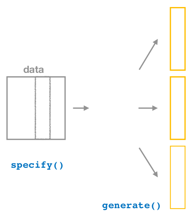
FIGURE 9.20: Diagram of generate() replicates.
After we specify() the variables of interest, we pipe the results into the generate() function to generate resampling replicates, or in other words, repeat the resampling process a large number of times. The generate() function’s first argument is reps, which is used to give how many different repetitions one would like to perform. The second argument type determines the type of resampling we’d like to perform.
In our case, since we want to resample the 50 pennies in pennies_sample with replacement 1000 times, we set reps = 1000 and type = "bootstrap" indicating that we want to perform bootstrap resampling.
pennies_sample %>%
  specify(response = year) %>%
  generate(reps = 1000, type = "bootstrap")
Response: year (numeric)
# A tibble: 50,000 x 2
# Groups: replicate [1,000]
replicate year
<int> <dbl>
1 1 1996
2 1 1988
3 1 1979
4 1 1978
5 1 1983
6 1 1981
7 1 1993
8 1 1996
9 1 1992
10 1 1978
# … with 49,990 more rowsNote the the resulting data frame has 50,000 rows. This is because we performed resampling of 50 pennies with replacement 1000 times and thus 50,000 = 1000 \(\times\) 50. Accordingly, the variable replicate, indicating which resample each row belongs to, has the value 1 50 times, the value 2 50 times, all the way through to the value 1000 50 times.
The default value of the type argument is "bootstrap", so if the last line above were written as generate(reps = 1000), we’d obtain the same results.
Comparing with original workflow: Note that the steps up of the infer workflow so far produce the same results as the original workflow using the rep_sample_n() function we saw earlier. In other words, the following two code chunks produce similar results:
# infer workflow:               # Original workflow:
pennies_sample %>%              pennies_sample %>%
  specify(response = year) %>%    rep_sample_n(size = 50, replace = TRUE,
  generate(reps = 1000)                        reps = 1000)
3. calculate summary statistics
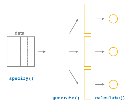
FIGURE 9.21: Diagram of calculate() summary statistics.
After we generate() many replicates of bootstrap resampling with replacement, we next want to condense each of 1000 resamples of size 50 to a single statistic value. As seen in the diagram, the calculate() function does this.
In our case as we did earlier, we want to calculate the mean year for each bootstrap resample of size 50. To do so, we set the stat argument to "mean". You can also set the stat argument to a variety of other common summary statistics, like "median", "sum", "sd" (standard deviation), and "prop" (proportion); we’ll see examples of their use throughout the remaining chapters. Let’s save the result in a data frame called bootstrap_distribution:
bootstrap_distribution <- pennies_sample %>%
  specify(response = year) %>%
  generate(reps = 1000) %>%
  calculate(stat = "mean")
bootstrap_distribution
# A tibble: 1,000 x 2
replicate stat
<int> <dbl>
1 1 1993.48
2 2 1993.8
3 3 1996.88
4 4 1995.34
5 5 1996.98
6 6 1995.72
7 7 1995.36
8 8 1992.6
9 9 1994.24
10 10 1993.16
# … with 990 more rowsWe see that the resulting data frame has 1000 rows and 2 columns corresponding to the 1000 replicates and the mean year for each bootstrap resample saved in the variable stat.
Comparing with original workflow: You may have recognized at this point that the calculate() step in the infer workflow produces the same output as the group_by() %>% summarize() steps in the original workflow:
# infer workflow:                 # Original workflow:
pennies_sample %>%                pennies_sample %>%
  specify(response = year) %>%      rep_sample_n(size = 50, replace = TRUE,
  generate(reps = 1000) %>%                      reps = 1000) %>%
  calculate(stat = "mean")          group_by(replicate) %>%
                                    summarize(mean_year = mean(year))
4. visualize the results
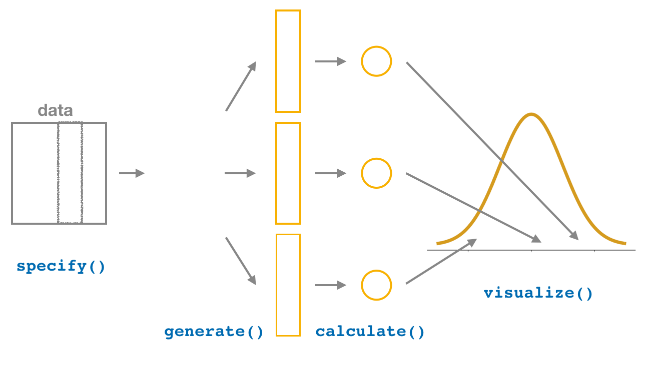
FIGURE 9.22: Diagram of visualize() results.
The visualize() verb provides a quick way to visualize the bootstrap distribution as a histogram of the numerical stat variable’s values.
visualize(bootstrap_distribution)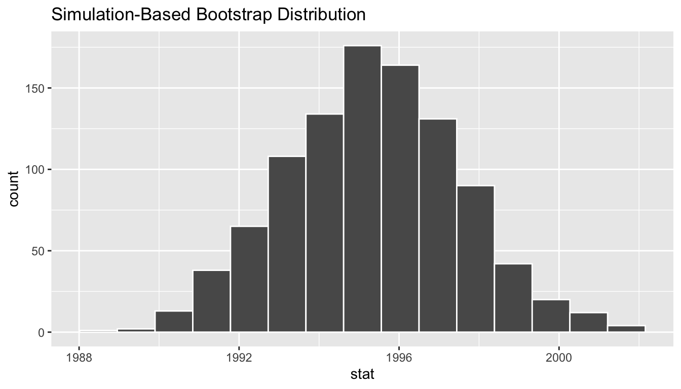
FIGURE 9.23: Bootstrap distribution.
Comparing with original workflow: In fact, visualize() is a wrapper function for the ggplot() function that uses a geom_histogram() layer. Recall that we illustrated the concept of a wrapper function in Figure 6.5 in Section 6.1.2.
# infer workflow:                    # Original workflow:
visualize(bootstrap_distribution)    ggplot(bootstrap_distribution,
                                            aes(x = stat)) +
                                       geom_histogram()
The visualize() function can take many other arguments which we’ll see momentarily to customize the plot further. It also works with helper functions to do the shading of the histogram values corresponding to the confidence interval values.
Let’s recap the steps of the infer workflow for creating a visualization of the bootstrap distribution.
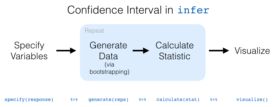
FIGURE 9.24: infer package workflow for confidence intervals.
Recall how we introduced two different methods for constructing 95% confidence intervals for an unknown population parameter in Section 9. Let’s now check out the infer package code to explicitly construct these. There are also some additional neat functions to visualize the resulting confidence intervals built-in!
9.4.3 Percentile method with infer
Recall the percentile method for constructing 95% confidence intervals we introduced in Section 9.3.1. This method sets the lower endpoint at the 2.5th percentile of the bootstrap distribution and similarly sets the upper-endpoint at the 97.5th percentile. The resulting interval captures the middle 95% of the values of the sample mean in the bootstrap distribution.
We can compute the 95% confidence interval by piping the bootstrap_distribution data frame we created above into the get_confidence_interval() function from the infer package, with the confidence level set to 0.95 and the confidence interval type to be percentile. Let’s save the results in percentile_ci.
percentile_ci <- bootstrap_distribution %>%
  get_confidence_interval(level = 0.95, type = "percentile")
percentile_ci
# A tibble: 1 x 2
`2.5%` `97.5%`
<dbl> <dbl>
1 1991.16 1999.58If we would like to visualize the interval (1991.16, 1999.58), we can pipe the bootstrap_distribution data frame into the visualize() function and add a shade_confidence_interval() layer to our plot with the endpoints argument to be percentile_ci:
visualize(bootstrap_distribution) +
  shade_confidence_interval(endpoints = c(1991.28, 1999.76))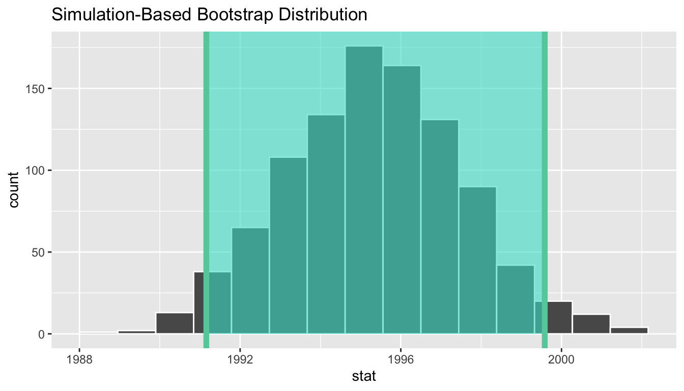
FIGURE 9.25: Percentile method 95 percent confidence interval.
Observe that 95% of the sample means stored in the stat variable in bootstrap_distribution falls between the two endpoints marked with the darker lines, with 2.5% of the sample means to the left of the shaded area and 2.5% of the sample means to the right. You also have the option to change the colors of the shading using the color and fill arguments. There’s also the alias shade_ci() for folks that don’t want to type out all of confidence_interval and prefer ci instead.
visualize(bootstrap_distribution) +
  shade_ci(endpoints = percentile_ci, color = "hotpink", fill = "khaki")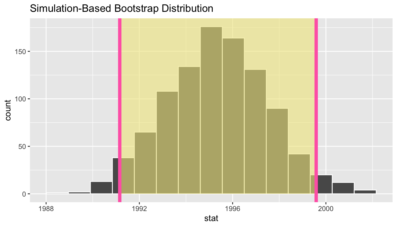
FIGURE 9.26: Alternate display of percentile method 95 percent confidence interval.
9.4.4 Standard error method with infer
Recall the standard error method for constructing 95% confidence intervals we introduced in Section 9.3.2. For any distribution that is normally shaped, roughly 95% of values lie within two standard deviations of the mean. In the case of the bootstrap distribution, the standard deviation has a special name: the standard error. So using our rule of thumb about normally shaped distributions, a 95% confidence interval is \(\overline{x} \pm 1.96 \cdot SE\) = \((\overline{x} - 1.96 \cdot SE, \overline{x} + 1.96 \cdot SE)\).
We can compute the 95% confidence interval by piping the bootstrap_distribution data frame we created above into the get_confidence_interval() function. First, we set the type argument set to be "se". Second, we must specify the point_estimate argument in order to set the center of the confidence interval: we set this to be sample mean of the original sample of 50 pennies of 1995.44.
standard_error_ci <- bootstrap_distribution %>%
  get_confidence_interval(type = "se", point_estimate = 1995.44)
standard_error_ci
# A tibble: 1 x 2
lower upper
<dbl> <dbl>
1 1991.16 1999.72If we would like to visualize the interval (1991.16, 1999.72), we can pipe the bootstrap_distribution data frame into the visualize() function and add a shade_confidence_interval() layer to our plot with the endpoints argument to be standard_error_ci:
visualize(bootstrap_distribution) +
  shade_confidence_interval(endpoints = standard_error_ci)
FIGURE 9.27: Standard error method 95 percent confidence interval.
As noted in Section 9.3, both methods produce similar confidence intervals:
- Percentile method: (1991.16, 1999.58)
- Standard error method: (1991.16, 1999.72)
9.5 Interpreting confidence intervals
Now that we’ve shown you how to construct confidence intervals using a sample drawn from the population, let’s now focus on how to interpret them. In order to interpret a confidence interval thoroughly however, we need to know the true value of the population parameter in question.
In the case of our pennies example, we don’t know the value of the population parameter of interest: the population mean year of minting \(\mu\) of all pennies in the US. Furthermore, we probably never will know this value given the near impossibility of performing a census.
In the case of our sampling bowl from Chapter 8 however, we can compute the value of the population parameter of interest: the population proportion \(p\) of the \(N\) = 2400 balls that are red. Recall the bowl data frame in the moderndive package contains our population of interest. We can calculate the proportion of red balls in this population to get the value of \(p\):
bowl %>%
  summarize(p_red = mean(color == "red"))
# A tibble: 1 x 1
p_red
<dbl>
1 0.375At this point you might be asking yourself: If we already know that \(p\) = 0.375 = 37.5% of the bowl’s balls are red, then why are we sampling to estimate this value, to begin with? Your skepticism is merited! Recall from Section 8.2, that this was virtual “simulation” used to study sampling. In any real-world setting, however, we would not know the value of the population proportion \(p\) and hence we have no choice but use sampling to estimate it.
Bringing the discussion back to confidence intervals constructed based on samples from the bowl, we have to ask ourselves: Does the interval include \(p\) = 0.375 = 37.5% or not? Alternatively, going back to our “fishing with a spear” versus “fishing with a net” analogy from Section 9.3, we have to ask ourselves: Did our net capture the fish or not?
9.5.1 Did the net capture the fish?
Recall from in Table 8.1 that we had 33 groups of friends repeat this sampling simulation, each taking samples of size 50 from the bowl and compute the sample proportion of red \(\widehat{p}\), resulting in 33 such estimates of \(p\). Let’s focus on Ilyas and Yohan’s sample in Table 8.1 where they observed 21 red balls out of the 50 in their shovel, in other words, their sample proportion \(\widehat{p}\) = 21/50 = 0.42 = 42%. This data is stored in the bowl_sample_1 data frame in the moderndive package:
bowl_sample_1# A tibble: 50 x 1
color
<chr>
1 white
2 white
3 red
4 red
5 white
6 white
7 red
8 white
9 white
10 white
# … with 40 more rowsLet’s follow the infer package workflow from Section 9.4.2 to create a percentile method 95% confidence interval for \(p\) using sample data in bowl_sample_1.
1. specify variables
First, we specify() the response variable of interest color:
bowl_sample_1 %>%
  specify(response = color)
Error: A level of the response variable `color` needs to be specified for the `success`
argument in `specify()`.Whoops! We need to define which event is of interest! red or white balls? Since we are interested in proportions red, let’s set success to be "red":
bowl_sample_1 %>%
  specify(response = color, success = "red")
Response: color (factor)
# A tibble: 50 x 1
color
<fct>
1 white
2 white
3 red
4 red
5 white
6 white
7 red
8 white
9 white
10 white
# … with 40 more rows2. generate replicates
Second, we generate() 1000 replicates via bootstrap with replacement of our original sample of 50 balls in bowl_sample_1 by setting reps = 1000 and type = "bootstrap".
bowl_sample_1 %>%
  specify(response = color, success = "red") %>%
  generate(reps = 1000, type = "bootstrap")
Note the resulting data frame has 50,000 rows. This is because we performed resampling of 50 balls with replacement 1000 times and thus 50,000 = 1000 \(\times\) 50. Accordingly, the variable replicate, indicating which resample each row belongs to, has the value 1 50 times, the value 2 50 times, all the way through to the value 1000 50 times. Recall generating 1000 replicates means we are repeating the resampling 1000 times so that we can study the sampling variation from resampling to resample!
3. calculate summary statistics
Third, we summarize each of 1000 resamples of size 50 with their proportion of “successes”, in other words, the proportion of the balls that are "red". Let’s save the result in a data frame called sample_1_bootstrap:
sample_1_bootstrap <- bowl_sample_1 %>%
  specify(response = color, success = "red") %>%
  generate(reps = 1000, type = "bootstrap") %>%
  calculate(stat = "prop")
sample_1_bootstrap
# A tibble: 1,000 x 2
replicate stat
<int> <dbl>
1 1 0.36
2 2 0.42
3 3 0.52
4 4 0.38
5 5 0.38
6 6 0.38
7 7 0.46
8 8 0.3
9 9 0.5
10 10 0.46
# … with 990 more rows4. visualize the results
Fourth and lastly, let’s compute the resulting 95% confidence interval.
percentile_ci_1 <- sample_1_bootstrap %>%
  get_confidence_interval(level = 0.95, type = "percentile")
percentile_ci_1
# A tibble: 1 x 2
`2.5%` `97.5%`
<dbl> <dbl>
1 0.28 0.540500Furthermore, let’s visualize the bootstrap distribution where we’ve adjusted the number of bins to better see the resulting shape. Furthermore, we add a vertical red line at \(\widehat{p}\) = 21/50 = 0.42 = 42% using geom_vline() by setting the xintercept argument.
sample_1_bootstrap %>%
  visualize(bins = 15) +
  shade_confidence_interval(endpoints = c(0.28, 0.56)) +
  geom_vline(xintercept = 0.375, col = "red")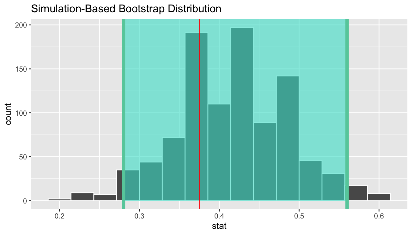
FIGURE 9.28: Bootstrap distribution.
Did Ilyas and Yohan’s net capture the fish? In other words, did the 95% confidence interval for \(p\) based on the 50 balls they sampled contain the true value of \(p\), the population proportion of the bowl’s balls that are red? Yes! 0.375 is between the endpoints of our confidence interval (0.28, 0.54).
However, will every 95% confidence interval for \(p\) capture this value? In other words, if we had a different sample of size 50 and constructed a confidence interval using the same method, would we be guaranteed that it contained the population proportion \(p\) as well? Let’s study the effect of sampling variation by randomly sampling another 50 balls from our virtual bowl using our virtual shovel:
bowl_sample_2 <- bowl %>%
  rep_sample_n(size = 50)
bowl_sample_2
# A tibble: 50 x 3
# Groups: replicate [1]
replicate ball_ID color
<int> <int> <chr>
1 1 1665 red
2 1 1312 red
3 1 2105 red
4 1 810 white
5 1 189 white
6 1 1429 white
7 1 2294 red
8 1 1233 white
9 1 1951 white
10 1 2061 white
# … with 40 more rowsLet’s perform the same steps of the infer pipeline we did on bowl_sample_1 to generate another 95% confidence interval for \(p\) based on the new sample of 50 balls in bowl_sample_2. First we create the bootstrap distribution of the sample proportion \(\widehat{p}\) and save the results in sample_2_bootstrap:
sample_2_bootstrap <- bowl_sample_2 %>%
  specify(response = color, success = "red") %>%
  generate(reps = 1000, type = "bootstrap") %>%
  calculate(stat = "prop")
sample_2_bootstrap
# A tibble: 1,000 x 2
replicate stat
<int> <dbl>
1 1 0.36
2 2 0.38
3 3 0.42
4 4 0.26
5 5 0.5
6 6 0.32
7 7 0.4
8 8 0.32
9 9 0.5
10 10 0.44
# … with 990 more rowsWe once again compute the percentile-based confidence interval.
percentile_ci_2 <- sample_2_bootstrap %>%
  get_confidence_interval(level = 0.95, type = "percentile")
percentile_ci_2
# A tibble: 1 x 2
`2.5%` `97.5%`
<dbl> <dbl>
1 0.22 0.5Does this new net capture the fish? In other words, did the 95% confidence interval for \(p\) based on the 50 newly sampled balls contain the true value of \(p\), the population proportion of the bowl’s balls that are red? Yes! 0.375 is between the endpoints of our confidence interval (0.22, 0.5).
Let’s now repeat this process 100 more times, leaving us with 100 different 95% confidence intervals \(p\) derived from 100 different samples of size 50 balls from the population bowl. Let’s visualize the results in Figure 9.29 where:
- We mark the true population proportion red \(p\) = 0.375 = 0.375% with a vertical red line.
- We mark each of the 100 95% confidence intervals for \(p\) with horizontal lines. These are the “nets.”
- The horizontal the line if colored orange of the confidence interval “captures” the true value of \(p\) in red and the line is blue otherwise.
- We also mark each line with a dot indicated the value of the point estimate: the sample proportion \(\widehat{p}\). These are the “spears.”
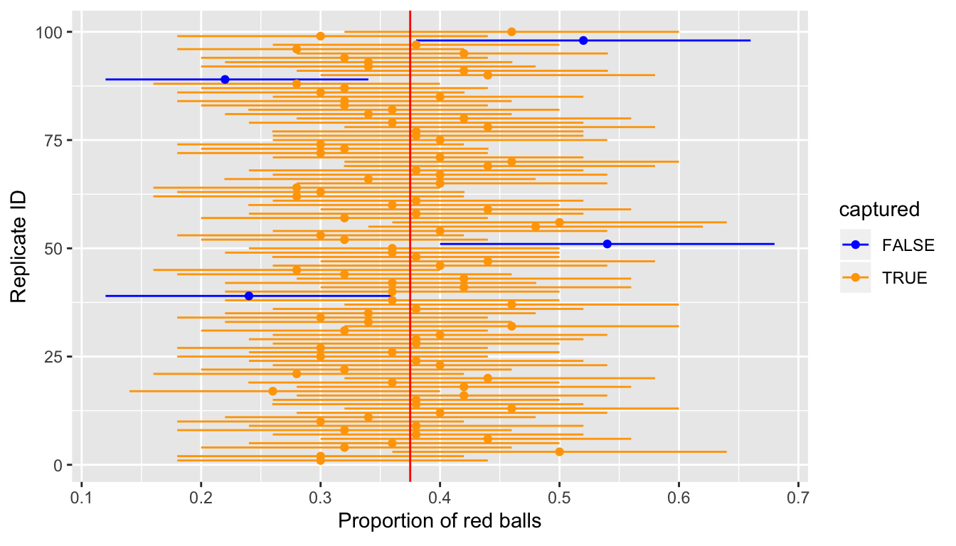
FIGURE 9.29: 100 SE-based 95 percent confidence intervals for \(p\).
Of the 100 confidence intervals based on 100 samples of size \(n\) = 50, 96 of them captured the population mean \(p\) = 0.375, whereas 4 of them didn’t. In other words, 96 of our nets caught the fish whereas 4 of our nets didn’t.
This is where the 95% confidence level we defined in Section 9.3 comes into play: for every 100 confidence intervals based on 100 different random examples, we expect that 95 of them will capture \(p\) and 5 won’t. Note that “expect” is a probabilistic statement that averages over the sampling variation. In other words, for every 100 confidence intervals, we will observe about 5 confidence intervals that fail to capture \(p\). In Figure 9.29 for example, 4 of the confidence intervals failed to capture \(p\).
To further accentuate this point, let’s perform a similar procedure using 85% standard-error based confidence intervals instead. Let’s visualize the results in Figure 9.30. Observe how the widths of the 80% confidence intervals are narrower than the 95% confidence intervals; we’ll explore other determinants of the widths of confidence intervals in the next section.
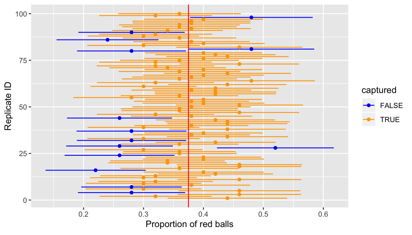
FIGURE 9.30: 100 SE-based 85 percent confidence intervals for \(p\)
Of the 100 confidence intervals based on 100 samples of size \(n = 50\), 86 of them captured the population proportion \(p = 0.375\), whereas 14 of them did not. Note that since we lowered the confidence level from 95% to 80%, we now have a much larger number of confidence intervals that failed to “catch the fish.”
9.5.2 Precise & shorthand interpretation
Let’s return our attention to our 95% confidence intervals. The precise and mathematically correct interpretation of a 95% confidence interval is a little long-winded:
Precise interpretation: If we repeated our sampling procedure a large number of times, we expect about 95% of the resulting confidence intervals to capture the value of the population parameter.
This is what we observed in Figure 9.29: that our confidence interval construction procedure is 95% “reliable”. In other words, we can expect our confidence intervals to include the true population parameter 95% of the time.
A common but incorrect interpretation is: “There is a 95% probability that the confidence interval contains \(p\).” Because looking at Figure 9.29, each of the confidence intervals either does or doesn’t contain \(p\), in other words, the probability is either 1 or 0.
So if the 95% confidence level only relates to the reliability of the confidence interval construction procedure, what insight can be derived from one particular confidence interval? For example, going back to the pennies example, we found that the percentile method 95% confidence interval for \(\mu\) was (1991.16, 1999.58) whereas the standard error method 95% confidence interval was (1991.16, 1999.72).
Loosely speaking, we can think of these intervals as our “best guess” of a plausible range of values for the mean year of minting of all US pennies. Furthermore, for the rest of this text, we’ll use the following shorthand to summarize the precise interpretation.
Short-hand interpretation: We are 95% “confident” that a 95% confidence interval captures the value of the population parameter.
We use quotation marks around “confident” to emphasize that while 95% relates to the reliability of our confidence interval construction procedure, ultimately the resulting interval is our best guess of a range of values that contain the population parameter.
So returning to our pennies example and focusing on the percentile-method, we are 95% “confident” that the true mean year of pennies in circulation in 2019 is somewhere between 1991.16 and 1999.58.
9.5.3 Width of confidence intervals
Now that we know how to interpret confidence intervals, let’s go over some factors that determine their width.
Impact of confidence level
One factor that determines the confidence interval width is the pre-specified confidence level. For example in Figures 9.29 and 9.30, we compared the widths of 95% and 80% confidence intervals. Recall that the 95% confidence intervals were wider. The quantification of the confidence level should match what you expect of the word “confident.” In order to be more confident in our best guess of a range of values, we need to widen the range of values.
To elaborate on this, imagine we want to guess the forecasted high temperature in Seoul, South Korea on August 15th. Given Seoul’s temperate climate with 4 distinct seasons, we could say somewhat confidently that the high temperature would be between 50°F - 95°F (10°C - 35°C). However, if we wanted a temperature range we were absolutely confident about, would we need to widen or narrow this range? We’d need to widen it! We need this wider range since it is possible to have a freak cold spell or heat wave. So a range of temperatures we could be near certain about would be between 32°F - 110°F (0°C - 43°C). On the other hand, if we wanted a range we could tolerate being a little less confident, we could narrow this range to between 70°F - 85°F (21°C - 30°C).
Going back to our sampling bowl, let’s compare confidence intervals for \(p\) based on three different confidence levels: 80%, 95%, and 99%. Specifically, we’ll first take 30 different random samples of \(n\) = 50 balls from the bowl. We’ll then construct 10 percentile-based confidence intervals based on each of the three different confidence levels and compare the widths of these intervals. We visualize the resulting 30 confidence intervals in Figure 9.31 along with a vertical red line marking the true value of \(p\) = 0.375 = 0.375%, the population proportion of the bowl’s balls that are red.
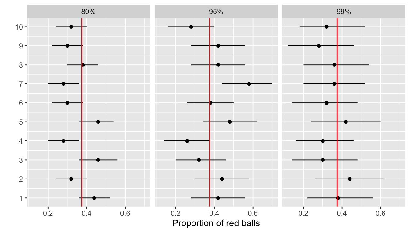
FIGURE 9.31: Ten 80, 95, and 99 percent confidence intervals for \(p\) based on \(n = 50\).
Observe that as the confidence level increase from 80% to 95% to 99%, in general, the confidence intervals get wider. Let’s compare the average widths in Table 9.3.
| Confidence level | Mean width |
|---|---|
| 80% | 0.166 |
| 95% | 0.264 |
| 99% | 0.338 |
So in order to have a higher confidence interval, our “plausible range of values” must be wider. Ideally we would have both high confidence level and narrower confidence intervals; however, we cannot have it both ways. If we want to “be more confident”, we need to allow for wider intervals. Conversely, if we would like a narrow and tight interval, we must sacrifice confidence level.
The moral of the story is: Higher confidence levels tend to produce wider confidence intervals. However, it is important to keep in mind in our example that we kept the sample size fixed at \(n\) = 50. In other words, all 30 random samples from bowl used to construct the 30 confidence intervals had the same sample size. What happens if, instead, we take samples of different sizes? Recall that we did this in Section 8.2.4 where did this using virtual shovels with 25, 50, and 100 slots. We delve into this next.
Impact of sample size
This time, let’s fix the confidence level at 95%, but consider three different sample sizes: \(n\) equals 25, 50, and 100. Specifically, we’ll first take 10 different random samples of size 25, 10 different random samples of size 50, and 10 different random samples of size 100. We’ll then construct 95% percentile-based confidence intervals. We visualize the resulting 30 confidence intervals in Figure 9.32 along with a vertical red line marking the true value of \(p\) = 0.375 = 0.375%, the population proportion of the bowl’s balls that are red.
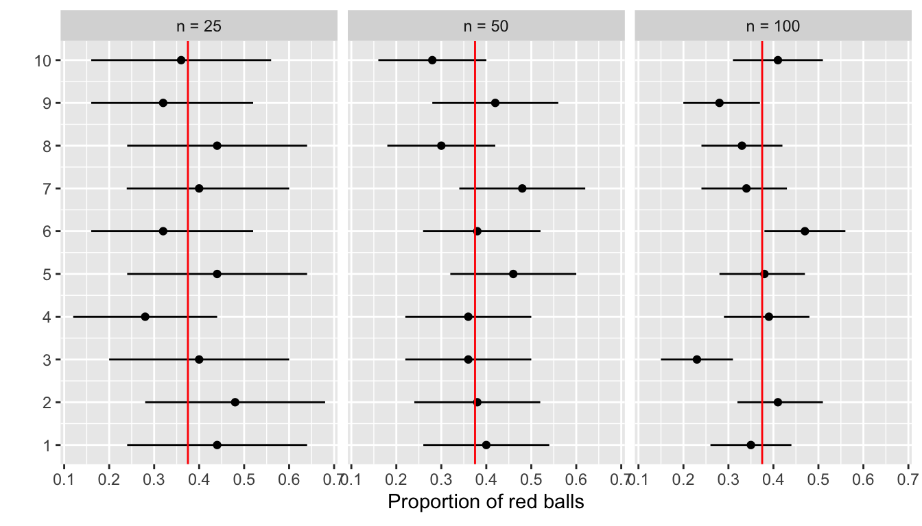
FIGURE 9.32: Ten 95 percent confidence intervals for \(p\) based on n = 25, 50, and 100.
Observe that as our confidence intervals are based on larger and larger sample sizes, in general, the confidence intervals get narrower. Let’s compare the average widths in Table 9.4.
| Sample size | Mean width |
|---|---|
| n = 25 | 0.380 |
| n = 50 | 0.270 |
| n = 100 | 0.183 |
The moral of the story is: Larger sample sizes tend to produce narrow confidence intervals. Recall that this was a key message in Section 8.3.3. As we used the larger and larger shovels to draw our samples, our sample proportions red \(\widehat{p}\) tended to vary less. In other words, our estimates got more and more precise.
We visualized these results in Figure 8.15 where we compared the sampling distributions for \(\widehat{p}\) based on samples of size \(n\) equal 25, 50, 100. Furthermore, we could quantify the spread of these sampling distributions using their standard deviation, which as a special name: the standard error. As the sample size increases, the standard error decreases.
In fact, the standard error is a related factor in confidence interval width, which we explore in Subsection 9.7.2 when we discuss theoretically constructed confidence intervals using mathematical formulas.
9.6 Case study: Is yawning contagious?
Let’s apply our knowledge of confidence intervals to answer the question: “Is yawning contagious?” If you see someone else yawn, are you more likely to yawn? In an episode of the US show Mythbusters, the hosts conducted an experiment to answer this question. The episode is available to view in the United States on the Discovery Network website here and more information about the episode is also available on IMDb.
9.6.1 Mythbusters study data
Fifty adult participants who thought they were being considered for an appearance on the show were interviewed by a show recruiter who either yawned or did not. Participants then sat by themselves in a large van and were asked to wait. While in the van, the Mythbusters watched via hidden camera to see if the participants yawned. The data frame containing the results is available in the mythbusters_yawn data frame included in the moderndive package:
mythbusters_yawn# A tibble: 50 x 3
subj group yawn
<int> <chr> <chr>
1 1 seed yes
2 2 control yes
3 3 seed no
4 4 seed yes
5 5 seed no
6 6 control no
7 7 seed yes
8 8 control no
9 9 control no
10 10 seed no
# … with 40 more rowsThe variables are:
subj: The participant ID with values 1 through 50.group: A binary categorical variable of whether the participant was exposed to yawning, where"seed"indicates the participant was exposed to yawning and"control"indicates the participant was not.yawn: A"yes"vs"no"binary categorical variable indicating whether the participant responded by yawning.
Let’s use some data wrangling to obtain counts of the four possible outcomes:
mythbusters_yawn %>%
  group_by(group, yawn) %>%
  summarize(count = n())
# A tibble: 4 x 3
# Groups: group [2]
group yawn count
<chr> <chr> <int>
1 control no 12
2 control yes 4
3 seed no 24
4 seed yes 10So 12 participants who were not exposed to yawning did not yawn, while 4 participants who were not exposed to yawning did yawn. So out of the 16 people who were not exposed to yawning, 4/16 = 0.25 = 25% did yawn. On the other hand, 24 participants who were exposed to yawning did not yawn, while 10 participants who were exposed to yawning did yawn. So out of the 34 people who were exposed to yawning, 10/34 = 0.294 = 29.4% did yawn.
Putting these two values together, the participants who were exposed to yawning yawned 29.4% - 25% = 4.4% more often than those who were not exposed to yawning.
9.6.2 Sampling scenario
In Chapter 8 our study population was the bowl of \(N\) = 2400 balls. Our population parameter of interest was the population proportion of these balls that were red, denoted mathematically by \(p\). In order to estimate \(p\), we extracted a sample of 50 balls using the shovel and computed the relevant point estimate: the sample proportion of these 50 balls that were red, denoted mathematically by \(\widehat{p}\).
Who is the study population here? All humans? All the people who watch the show Mythbusters? It’s hard to say! This question can only be answered if we know how the show’s hosts recruited participants! We alas don’t have this information. Only for the purposes of this case study, however, we’ll assume that the 50 participants are a representative sample of all Americans, and thus any results of this experiment will generalize to all \(N\) = 327 million Americans (2018 population).
Just like with our sampling bowl, the population parameter of interest will involve proportions, but this time it will be the difference in population proportions \(p_{seed} - p_{control}\), where \(p_{seed}\) is the population proportion of people exposed to yawning who yawn and \(p_{control}\) is the population proportion of people not exposed to yawning who yawn. Correspondingly, the point estimate/sample statistic based on sampled data will be the difference in sample proportions \(\widehat{p}_{seed} - \widehat{p}_{control}\). Let’s extend Table 8.8 of scenarios of sampling for inference to include our latest scenario.
| Scenario | Population parameter | Notation | Point estimate | Notation. |
|---|---|---|---|---|
| 1 | Population proportion | \(p\) | Sample proportion | \(\widehat{p}\) |
| 2 | Population mean | \(\mu\) | Sample mean | \(\overline{x}\) or \(\widehat{\mu}\) |
| 3 | Difference in population proportions | \(p_1 - p_2\) | Difference in sample proportions | \(\widehat{p}_1 - \widehat{p}_2\) |
This is known as a situation of two-sample inference since we have two separate samples, in this case, those who were exposed to yawning and those who were not. So in our case, based on two separate samples of size \(n_{seed}\) = 34 and \(n_{control}\) = 16,
\[ \widehat{p}_{seed} - \widehat{p}_{control} = \frac{24}{34} - \frac{12}{16} = 0.04411765 \approx 4.4\% \]
However, say we had sampled 50 different people, 34 to be exposed to yawning and 16 not, and repeated this experiment. Would we obtain the exact same estimated difference of 4.4%? Probably not, because of sampling variation. How does this sampling variation affect our estimate of 4.4%? In other words, what would be a plausible range of values for this difference that accounts for this sampling variation? We can answer this question with confidence intervals! Furthermore, since we only have one single sample of 50 participants, we can construct the 95% confidence interval for \(p_{seed} - p_{control}\) using bootstrap resampling with replacement.
9.6.3 Constructing the confidence interval
As we did in Section 9.4.2, let’s spell out the steps of the infer workflow to construct the 95% confidence interval for \(p_{seed} - p_{control}\). However, since the difference in proportions is a new scenario for inference, we’ll need to identify some new arguments to include in the infer functions along the way.
1. specify variables
We take our mythbusters_yawn data frame with the data and specify() which variables are of interest using the formula interface where
- Our response variable is
yawn: whether or not a participant yawned. - The explanatory variable is
group: whether or not a participant was exposed to yawning.
mythbusters_yawn %>%
  specify(formula = yawn ~ group)
Error: A level of the response variable `yawn` needs to be
specified for the `success` argument in `specify()`.Alas, we got an error message. infer is telling us that one of the levels of the categorical variable yawn needs to be defined as the success, or the event of interest we are trying to count and compute proportions. Are we interested in those participants who "yes" yawned or are we interested in those participants who "no" didn’t yawn? This isn’t clear. So we set the success argument to "yes" as follows:
mythbusters_yawn %>%
  specify(formula = yawn ~ group, success = "yes")
Response: yawn (factor)
Explanatory: group (factor)
# A tibble: 50 x 2
yawn group
<fct> <fct>
1 yes seed
2 yes control
3 no seed
4 yes seed
5 no seed
6 no control
7 yes seed
8 no control
9 no control
10 no seed
# … with 40 more rows2. generate replicates
Our next step in building a confidence interval is to create a bootstrap distribution of statistics (differences in proportions of successes). We saw how it works with both a single variable in computing bootstrap means in Subsection 9.4 and in computing bootstrap proportions in Section 9.5, but we haven’t yet worked with bootstrapping involving multiple variables though.
In the infer package, bootstrapping with multiple variables means that each row is potentially resampled. Let’s investigate this by looking at the first few rows of mythbusters_yawn:
head(mythbusters_yawn)# A tibble: 6 x 3
subj group yawn
<int> <chr> <chr>
1 1 seed yes
2 2 control yes
3 3 seed no
4 4 seed yes
5 5 seed no
6 6 control no When we bootstrap this data, we are potentially pulling the subject’s readings multiple times. Thus, we could see the entries of "seed" for group and "no" for yawn together in a new row in a bootstrap sample. This is further seen by exploring the sample_n() function in dplyr on this smaller 6-row data frame comprised of head(mythbusters_yawn). The sample_n() function can perform this bootstrapping procedure and is similar to the rep_sample_n() function in infer, except that it is not repeated but rather only performs one sample with or without replacement.
head(mythbusters_yawn) %>%
  sample_n(size = 6, replace = TRUE)
# A tibble: 6 x 3
subj group yawn
<int> <chr> <chr>
1 1 seed yes
2 6 control no
3 1 seed yes
4 5 seed no
5 4 seed yes
6 4 seed yes We can see that in this bootstrap sample generated from the first six rows of mythbusters_yawn, we have some rows repeated. The same is true when we perform the generate() step in infer as done below. Next, we generate 1000 replicates, or in other words, we bootstrap resample the 50 participants with replacement 1000 times. This is what will inject sampling variation into our results.
mythbusters_yawn %>%
  specify(formula = yawn ~ group, success = "yes") %>%
  generate(reps = 1000, type = "bootstrap")
Response: yawn (factor)
Explanatory: group (factor)
# A tibble: 50,000 x 3
# Groups: replicate [1,000]
replicate yawn group
<int> <fct> <fct>
1 1 no seed
2 1 no seed
3 1 yes control
4 1 yes seed
5 1 no control
6 1 yes seed
7 1 no control
8 1 no seed
9 1 no seed
10 1 no seed
# … with 49,990 more rowsNote the resulting data frame has 50,000 rows. This is because we performed resampling of 50 participants with replacement 1000 times and thus 50,000 = 1000 \(\times\) 50. Accordingly, the variable replicate, indicating which resample each row belongs to, has the value 1 50 times, the value 2 50 times, all the way through to the value 1000 50 times.
3. calculate summary statistics
After we generate() many replicates of bootstrap resampling with replacement, we next want to summarize of the bootstrap resamples of size 50 with a single summary statistic, the difference in proportions. I do this by setting the stat argument to "diff in props":
mythbusters_yawn %>%
  specify(formula = yawn ~ group, success = "yes") %>%
  generate(reps = 1000, type = "bootstrap") %>%
  calculate(stat = "diff in props")
Error: Statistic is based on a difference; specify the `order` in which to
subtract the levels of the explanatory variable.We see another error here. We need to specify the order of the subtraction. Is it \(\widehat{p}_{seed} - \widehat{p}_{control}\) or \(\widehat{p}_{control} - \widehat{p}_{seed}\). We specify it to be \(\widehat{p}_{seed} - \widehat{p}_{control}\) by setting order = c("seed", "control"). You can also set order = c("control", "seed"); it makes no difference in the analysis. However, whatever order you choose, it is important to stay consistent throughout your analysis.
Let’s save the output in a data frame bootstrap_distribution_yawning:
bootstrap_distribution_yawning <- mythbusters_yawn %>%
  specify(formula = yawn ~ group, success = "yes") %>%
  generate(reps = 1000, type = "bootstrap") %>%
  calculate(stat = "diff in props", order = c("seed", "control"))
bootstrap_distribution_yawning
# A tibble: 1,000 x 2
replicate stat
<int> <dbl>
1 1 -0.0213904
2 2 0.0459770
3 3 0
4 4 -0.0129870
5 5 0.326765
6 6 0.122807
7 7 0.293718
8 8 0.0761905
9 9 0.0679117
10 10 -0.0231729
# … with 990 more rowsWe see that the resulting data frame has 1000 rows and 2 columns corresponding to the 1000 replicates and the difference in proportions for each bootstrap resample saved in the variable stat.
4. visualize the results
In Figure 9.33 we visualize() the resulting bootstrap resampling distribution.
visualize(bootstrap_distribution_yawning)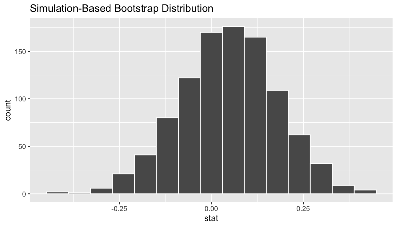
FIGURE 9.33: Bootstrap distribution.
First, let’s compute the 95% confidence interval for \(p_{seed} - p_{control}\) using the percentile method, in other words by identifying the 2.5th and 97.5th percentiles which include the middle 95% of values. Recall that this method does not require the bootstrap distribution to be normally shaped.
bootstrap_distribution_yawning %>%
  get_confidence_interval(type = "percentile", level = 0.95)
# A tibble: 1 x 2
`2.5%` `97.5%`
<dbl> <dbl>
1 -0.218313 0.304763Second, since the bootstrap distribution is roughly bell-shaped, it is reasonable to assume that it is normally shaped, and thus we can construct a confidence interval using the standard error method. Recall to construct a standard error method, we need to specify the center of the interval using the point_estimate argument. We set it to be the observed difference in sample proportions of 4.4% we computed earlier.
However, we can also use the infer workflow to let R compute this value by excluding the generate() 1000 bootstrap replicates step. In other words, do not compute the difference in proportions for 1000 bootstrap samples with replacement, rather focus only on the observed sample data. We can achieve this by commenting out the generate() line, telling R to ignore it:
mythbusters_yawn %>%
  specify(formula = yawn ~ group, success = "yes") %>%
  # generate(reps = 1000, type = "bootstrap") %>%
  calculate(stat = "diff in props", order = c("seed", "control"))
# A tibble: 1 x 1
stat
<dbl>
1 0.0441176We thus plug this value as the point_estimate argument.
bootstrap_distribution_yawning %>%
  get_confidence_interval(type = "se", point_estimate = 0.0441176)
# A tibble: 1 x 2
lower upper
<dbl> <dbl>
1 -0.213435 0.301670Let’s visualize both confidence intervals in Figure 9.34, with the percentile method interval in red and the standard error method interval in blue. Observe that they are both similar.
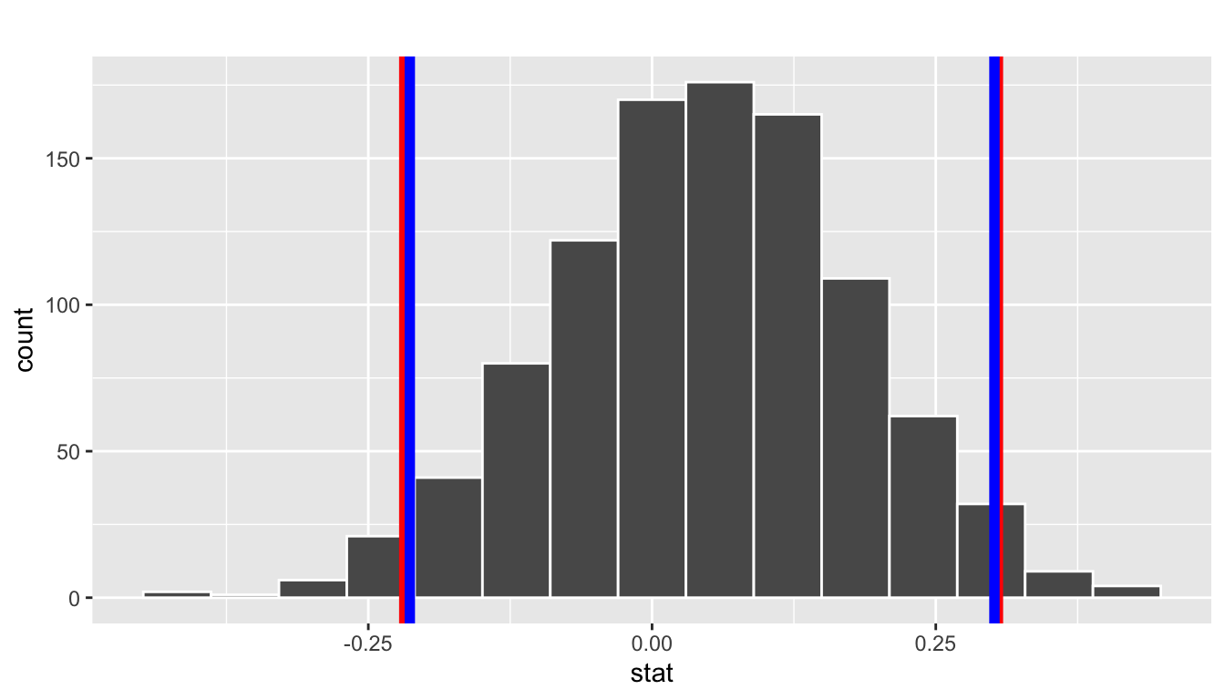
FIGURE 9.34: Two 95 percent confidence intervals: percentile method in red, standard error method in blue.
9.6.4 Interpreting the confidence interval
Given that both confidence intervals are quite similar, let’s focus our interpretation to only the percentile method confidence interval of (-0.22, 0.3). Recall that the correct statistical interpretation of a 95% confidence interval is: if repeated this procedure 100 times, then we’d expect 95 of the confidence intervals to capture the true population difference in proportions \(p_{seed} - p_{control}\). In other words, if we gathered 100 samples of \(n\) = 50 participants from a similar pool of people and constructed 100 confidence intervals, about 95 of them will contain the true value of \(p_{seed} - p_{control}\) while about 5 won’t. Given that this is a little long winded, we use the shorthand: we’re 95% “confident” that the true difference in proportions \(p_{seed} - p_{control}\) is between (-0.22, 0.3).
There is one value of particular interest that this interval contains: zero. If \(p_{seed} - p_{control} = 0\), then there would be no difference in proportion yawning, suggesting that there is no associated effect of being exposed to yawning. Since the 95% confidence interval includes 0, we cannot conclusively say if either proportion is larger. Of our 1000 bootstrap resamples with replacement, sometimes \(\widehat{p}_{seed}\) was higher and thus those exposed to yawning yawned themselves more often, and other times the reverse. Say on the other hand the 95% confidence interval was entirely above zero. This would be suggestive that \(p_{seed} - p_{control} > 0\) and thus those exposed to yawning yawned more often.
Furthermore, if the 50 participants were randomly allocated to the "seed" and "control" groups, then this would be suggestive that being exposed to yawning doesn’t not cause yawning. In other words, yawning is not contagious. However, no information on how participants were assigned to be exposed to yawning or not could be found, so we cannot make such a causal statement.
9.7 Conclusion
9.7.1 Comparing bootstrap and sampling distributions
In Section 8.2.3, we took 1000 virtual samples from the bowl using a virtual shovel, then computed 1000 values of the sample proportion red \(\widehat{p}\), an visualized their distribution in a histogram. Recall that this distribution is called the sampling distribution of \(\widehat{p}\) and furthermore the standard deviation of this sampling distribution has a special name: the standard error.
However, this exercise was not what one would typically do in real-life, rather is was a simulation to study the effects of sampling variation on the value of \(\widehat{p}\). In real-life, one would take only one sample that’s as large as possible. But how can we get a sense of the effect of sample-to-sample variation if we only have one sample? Don’t we need many samples?
The solution to this was to perform bootstrap resampling with replacement from the original sample. We did this in the resampling activity in Section 9.1 where in this case, we were focused on the mean year of minting of pennies rather than the proportion of the bowl’s balls that were red. We used pieces of paper representing the original sample of 50 pennies from the bank and resampled them with replacement from the hat. We had 35 of our friends perform this activity and visualized their resulting sample means \(\overline{x}\).
This distribution was called the bootstrap distribution of \(\overline{x}\) and it is an approximation to the sampling distribution of \(\overline{x}\). Thus the variation of the bootstrap distribution of \(\overline{x}\) could be used as an approximation to the variation of the sampling distribution of \(\overline{x}\).
Let’s now compare the sampling distribution of \(\widehat{p}\) with the bootstrap distribution of \(\widehat{p}\) and see how well they line up. Recall that we computed the sampling distribution of \(\widehat{p}\) in Section 8.2.3 based on 1000 virtual samples of size \(n\) = 50 from the bowl. We’ll compare this to the bootstrap distribution of \(\widehat{p}\) from Section 9.5.1 based on 1000 resamples with replacement from Ilyas and Yohan’s sample of 50 balls saved in bowl_sample_1.
Sampling distribution
Here is the code you previously saw in Section 8.2.3 to construct the sampling distribution of \(\widehat{p}\), with some small changes to incorporate the statistical terminology relating to sampling you learned in Section 8.3.1.
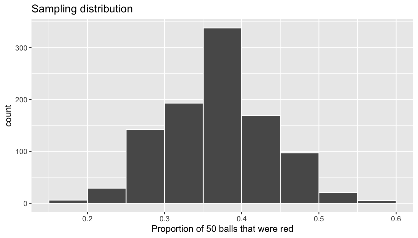
FIGURE 9.35: Previously seen sampling distribution of sample proportion red for \(n = 1000\).
An important thing to keep in mind is the default value for replace is FALSE when using rep_sample_n(). This is because when sampling 50 balls with a shovel, we are extracting 50 balls one-by-one without replacing them. This is in contrast to bootstrap resampling with replacement, where we resample a ball and put it back, and repeat this process 50 times.
We can also examine the variability in this sampling distribution by calculating the standard deviation of the propr_red variable representing 1000 values of the sample proportion \(\widehat{p}\). Remember that the standard deviation of the sampling distribution is the standard error, frequently denoted as se.
sampling_distribution %>%
  summarize(se = sd(prop_red))
# A tibble: 1 x 1
se
<dbl>
1 0.0673987Bootstrap distribution
Here is the code you previously saw in Section 9.5.1 to construct the bootstrap distribution of \(\widehat{p}\) based on Ilyas and Yohan’s original sample of 50 balls saved in bowl_sample_1.
# Compute the bootstrap distribution using infer workflow:
bootstrap_distribution <- bowl_sample_1 %>%
  specify(response = color, success = "red") %>%
  generate(reps = 1000, type = "bootstrap") %>%
  calculate(stat = "prop")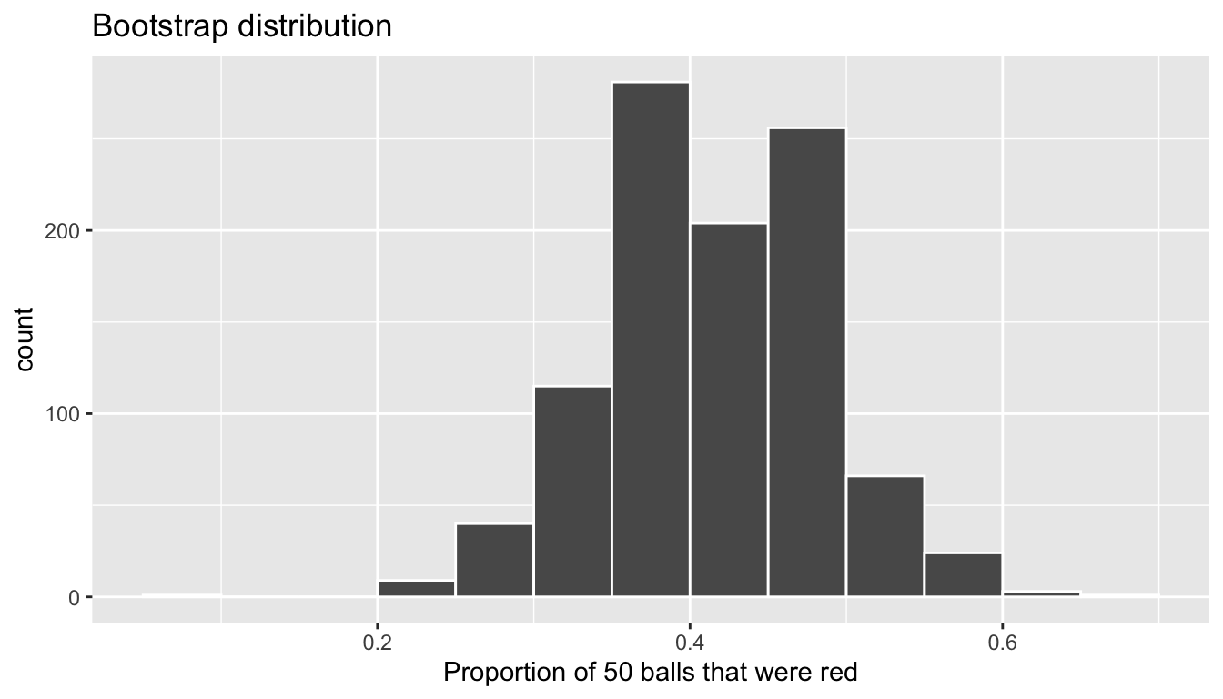
FIGURE 9.36: Bootstrap distribution of sample proportion red for \(n = 1000\).
bootstrap_distribution %>%
  summarize(se = sd(stat))
# A tibble: 1 x 1
se
<dbl>
1 0.0693340Comparison
Now that we have computed both the sampling distribution and the bootstrap distributions, let’s visualize them side-by-side in Figure 9.37. We’ll make both histograms have the same scale on the x and y-axes to make them more comparable and add vertical red lines that denote the proportion of the bowl’s balls that are red \(p\) = 0.375. Furthermore, we’ll add a vertical dashed line at Ilyas and Yohan’s value of the sample proportion \(\widehat{p}\) = 21/50 = 0.42 = 42%.
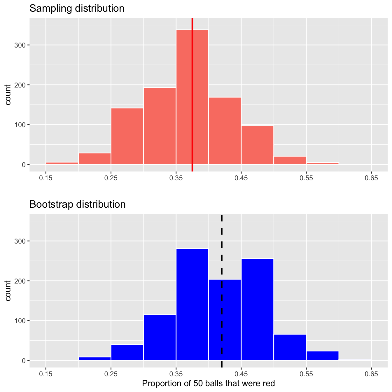
FIGURE 9.37: Comparing the sampling and bootstrap distributions of \(\widehat{p}\)
There is a lot going on in this comparison, so let’s pick them apart slowly. First, notice how the sampling distribution in salmon is centered at \(p\) = 0.375. This is because the sample is done at random in an unbiased fashion, so the estimates \(\widehat{p}\) are centered at the true value of \(p\). This is actually an artifact of the Central Limit Theorem introduced in Chapter 8. The center of the sampling distribution is expected to be the value of the population parameter, in this case \(p\).
However, this is not the case with the bootstrap distribution in blue. The bootstrap distribution is centered at 0.42, which is the proportion red of Ilyas and Yohan’s 50 sampled balls. This is because we are resampling from the sample and not from the population. Since the bootstrap distribution is centered at the original sample proportion, it doesn’t necessarily provide a good estimate of the overall population proportion \(p\), which we calculated to be 0.375. This leads us to our first lesson about bootstrapping:
The bootstrap distribution will likely not have the same center as the sampling distribution. In other words, bootstrapping cannot improve the quality of an estimate resulting from a single sample.
However, let’s now visually compare the spread of the two distributions; they are somewhat similar. In fact, we computed the standard deviations of both distributions earlier. Let’s compare them in Table 9.6
| Distribution type | Standard error |
|---|---|
| Sampling distribution | 0.067 |
| Bootstrap distribution | 0.069 |
Notice that the bootstrap distribution’s standard error is a good approximation to the sampling distribution’s standard error. This leads us to our second lesson about bootstrapping:
Even if the bootstrap distribution might not have the same center as the sampling distribution, it will likely have a very similar spread. In other words, bootstrapping will give you a good estimate of the standard error using only a single sample.
Using the fact that the bootstrap distribution and sampling distributions have similar spreads, we can build confidence intervals using bootstrapping as we’ve done all throughout this chapter!
9.7.2 Theory-based confidence intervals
So far in this chapter, we’ve constructed confidence intervals using two methods: the percentile method and the standard error method. Recall from Section 9.3.2 however that we can only use the standard-error method of the bootstrap distribution is bell-shaped i.e. normally distributed. If this is the case, however, there is another method for constructing confidence intervals that do not involve using your computer to do resampling with replacement. There actually is a theory-based method involving a mathematical formula!
The formula uses the rule of thumb we saw in Subsection 8.5.3 that 95% of values in a normal distribution are within \(\pm 1.96\) standard deviations of the mean. In the case of sampling and bootstrap distributions, recall that the standard deviation has a special name: the standard error. Furthermore, there is in many cases a formula that approximates the standard error! In the case of our bowl where we used the sample proportion red \(\widehat{p}\) to estimate the proportion of the bowl’s balls that are red, the formula that approximates the standard error is:
\[\text{SE}_{\widehat{p}} \approx \sqrt{\frac{\widehat{p}(1-\widehat{p})}{n}}\]
For example, recall from Table 8.1 that Yohan and Ilyas sampled \(n\) = 50 balls and observed a sample proportion \(\widehat{p}\) of 21/50 = 0.42 = 42%. So using the approximation of the standard error is
\[\text{SE}_{\widehat{p}} \approx \sqrt{\frac{0.42(1-0.42)}{50}} = \sqrt{0.004872} = 0.0698\]
The key observation to make here is that there is an \(n\) in the denominator. In other words, as the sample size \(n\) increases, the standard error decreases. We’ve demonstrated this fact this using virtual simulation in Section 8.3.3. If you don’t recall this demonstration, we highly recommend you go back and read that section.
So going back to Yohan and Ilyas’ sample proportion of \(\widehat{p}\) of 21/50 = 0.42 = 42%, say this were based on a sample of size \(n\)=100 instead of 50. Then the standard error would be:
\[\text{SE}_{\widehat{p}} \approx \sqrt{\frac{0.42(1-0.42)}{100}} = \sqrt{0.002436} = 0.0494\]
Observe that the standard error has gone done from 0.0698 to 0.0494. In other words, this particular estimate is more precise. Recall that we illustrated the difference between accuracy and precision of estimates in Figure 8.16.
Why is this formula true? Unfortunately, we don’t have the tools at this point to prove this; you’ll need to take a more advanced course in probability and statistics.
Theory-based method for constructing confidence intervals
We now present a third method for constructing a 95% confidence interval for \(p\) that does not involve bootstrap resampling with replacement, but rather mathematical formulas. It is critical to remember that this method holds only if the sampling distribution is normally shaped.
- Collect a single representative sample of size \(n\) that’s as large as possible.
- Compute the point estimate: the sample proportion \(\widehat{p}\). Think of this as the center of your net.
- Compute the approximation to the standard error
\[\text{SE}_{\widehat{p}} \approx \sqrt{\frac{\widehat{p}(1-\widehat{p})}{n}}\]
- Compute a quantity known as the margin of error (more later):
\[\text{MoE}_{\widehat{p}} = 1.96 \cdot \text{SE}_{\widehat{p}} = 1.96 \cdot \sqrt{\frac{\widehat{p}(1-\widehat{p})}{n}}\]
- Compute both endpoints of the confidence interval.
The lower end-point
lower_ci. Think of this as the left end-point of the net: \[\widehat{p} - \text{MoE}_{\widehat{p}} = \widehat{p} - 1.96 \cdot \text{SE}_{\widehat{p}} = \widehat{p} - 1.96 \cdot \sqrt{\frac{\widehat{p}(1-\widehat{p})}{n}}\]The upper endpoint
upper_ci. Think of this as the right end-point of the net: \[\widehat{p} + \text{MoE}_{\widehat{p}} = \widehat{p} + 1.96 \cdot \text{SE}_{\widehat{p}} = \widehat{p} + 1.96 \cdot \sqrt{\frac{\widehat{p}(1-\widehat{p})}{n}}\]Alternatively, you can succinctly summarize a 95% confidence interval for \(p\) using the \(\pm\) symbol:
So going back to Yohan and Ilyas’ sample of \(n=50\) balls that had 21 red balls, the 95% confidence interval for \(p\) is 0.42 \(\pm\) 1.96 \(\cdot\) 0.0698 = 0.42 \(\pm\) 0.137 = (0.42 - 0.137, 0.42 + 0.137) = (0.283, 0.557). In other words, Yohan and Ilyas are 95% “confident” that the true proportion red of the bowl’s balls is between 28.3% and 55.7%. Given that the true population proportion \(p\) was 37.5%, they successfully captured the fish.
In Step 4 above, we defined the margin of error. You can think of this quantity as how much the net extends to the left and to the right of the center of our net. The 1.96 multiplier roots in the 95% rule of thumb we introduced earlier and the fact that we want the confidence level to be 95%. The value of the margin error entirely determines the width of the confidence interval. Recall from Section 9.5.3 that confidence interval widths are determined by an interplay of the confidence level, the sample size \(n\), and the standard error.
Let’s study a real-life example by revisiting the poll of President Obama’s approval rating among young Americans aged 18-29 in the 2013 National Public Radio article Poll: Support For Obama Among Young Americans Eroding. Pollsters found that based on a representative sample of \(n\) = 2089 young Americans, \(\widehat{p}\) = 0.41 = 41% supported President Obama.
If you look towards the end of the article, it states: “The poll’s margin of error was plus or minus 2.1 percentage points.” This is precisely the \(\text{MoE}\) from above:
\[ \begin{aligned} \text{MoE} &= 1.96 \cdot \text{SE} = 1.96 \cdot \sqrt{\frac{\widehat{p}(1-\widehat{p})}{n}} = 1.96 \cdot \sqrt{\frac{0.41(1-0.41)}{2089}} \\ &= 1.96 \cdot 0.0108 = 0.021 \end{aligned} \]
Thus their poll results are based on a confidence level of 95% and the resulting 95% confidence interval for the proportion of all young Americans who support Obama is: \(\widehat{p} \pm \text{MoE}\) = 0.42 \(\pm\) 0.021 = (0.339, 0.441) = (33.9%, 44.1%)
Confidence intervals based on 33 tactile samples
Let’s revisit our 33 friend’s samples from the bowl from Section 8.1.3. Recall this data was saved in the tactile_prop_red data frame included in the moderndive package. We’ll then apply the theory-based procedure for constructing confidence intervals for \(p\) using some of the dplyr data wrangling tools seen in Chapter 4:
- Rename
prop_redtop_hat, the statistical name of the sample proportion \(\widehat{p}\). - Make explicit the sample size
nof \(n\) = 50 - Compute the:
- Standard error
SEfor \(\widehat{p}\) using the formula above. - Margin of error
MoEby multiplying theSEby 1.96 - Left endpoint of the confidence interval
lower_ci - Right endpoint of the confidence interval
upper_ci
- Standard error
conf_ints <- tactile_prop_red %>%
  rename(p_hat = prop_red) %>%
  mutate(
    n = 50,
    SE = sqrt(p_hat * (1 - p_hat) / n),
    MoE = 1.96 * SE,
    lower_ci = p_hat - MoE,
    upper_ci = p_hat + MoE
  )
conf_ints
# A tibble: 33 x 9
group replicate red_balls p_hat n SE MoE lower_ci upper_ci
<chr> <int> <int> <dbl> <dbl> <dbl> <dbl> <dbl> <dbl>
1 Ilyas, … 1 21 0.42 50 0.0697997 0.136807 0.283193 0.556807
2 Morgan,… 2 17 0.34 50 0.0669925 0.131305 0.208695 0.471305
3 Martin,… 3 21 0.42 50 0.0697997 0.136807 0.283193 0.556807
4 Clark, … 4 21 0.42 50 0.0697997 0.136807 0.283193 0.556807
5 Riddhi,… 5 18 0.36 50 0.0678823 0.133049 0.226951 0.493049
6 Andrew,… 6 19 0.38 50 0.0686440 0.134542 0.245458 0.514542
7 Julia 7 19 0.38 50 0.0686440 0.134542 0.245458 0.514542
8 Rachel,… 8 11 0.22 50 0.0585833 0.114823 0.105177 0.334823
9 Daniel,… 9 15 0.3 50 0.0648074 0.127023 0.172977 0.427023
10 Josh, M… 10 17 0.34 50 0.0669925 0.131305 0.208695 0.471305
# … with 23 more rowsLet’s plot now plot the 33 confidence intervals for \(p\) saved in conf_ints along with a vertical red line at \(p\) = 0.375 = 37.5% indicating the true proportion of the bowl’s balls that are red in Figure 9.38.
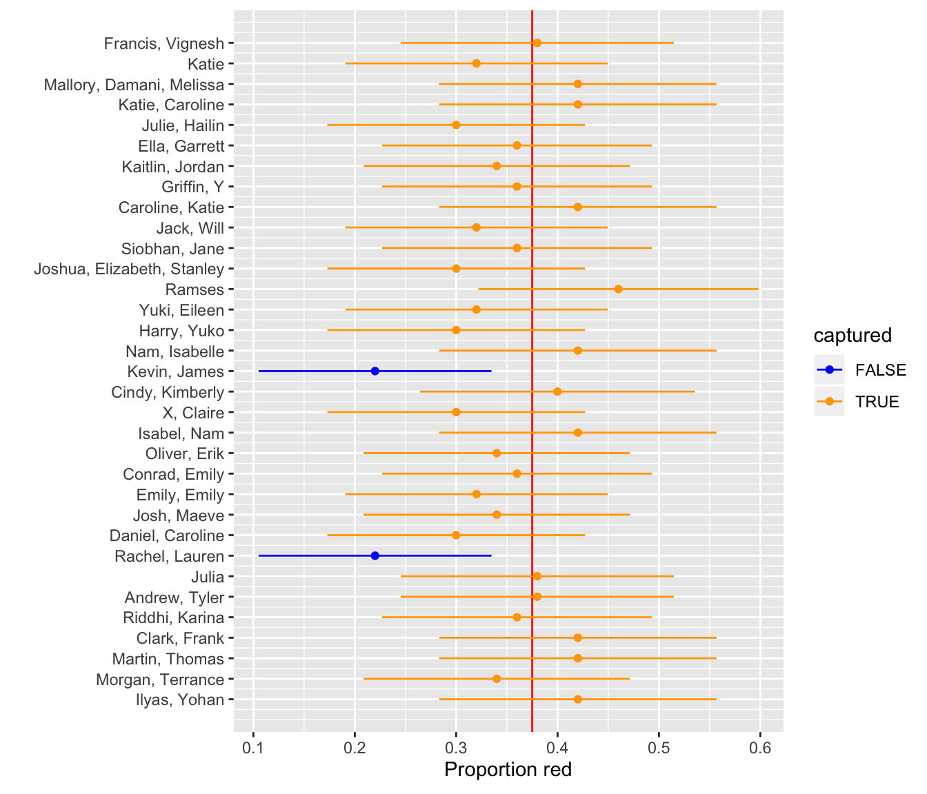
FIGURE 9.38: 33 95 percent confidence intervals based on 33 tactile samples of size n = 50.
Observe that 31 of the 33 confidence intervals “captured” the true value of \(p\), for a success rate of 31 / 33 = 93.94%. While this is not quite 95%, recall that we expect about 95% of such confidence intervals to capture \(p\), the actual observed success rate will vary.
Theoretical-based methods like this have largely been used in the past because we didn’t have the computing power to perform simulation-based methods such as bootstrapping. They are still commonly used though and if the sampling and bootstrap distributions are normality distributed, they can provide a nice option for constructing confidence intervals as well as performing hypothesis tests as we will see in Chapter 10.
9.7.3 Additional resources
An R script file of all R code used in this chapter is available here.
If you want to more examples of the infer workflow to construct confidence intervals, we suggest you check out the infer package homepage, in particular, a series of example analyses available at https://infer.netlify.com/articles/.
9.7.4 What’s to come?
Now that we’ve equipped ourselves with confidence intervals, in Chapter 10 we’ll cover the other common tool for statistical inference: hypothesis testing.