
Chapter 10 Hypothesis Testing
Now that we’ve studied one commonly used method for statistical inference, confidence intervals in the previous Section 9, we’ll now study the other commonly used method, hypothesis testing. Hypothesis tests allow us to take a sample of data from a population and infer about the plausibility of competing hypotheses. For example, in the upcoming “promotions” activity in Section 10.1, you’ll study the data collected from a psychology study in the 1970’s to infer as to whether there exists gender-based discrimination in the banking industry as a whole.
The good news is we’ve already covered many of the necessary concepts to understand hypothesis testing in Chapters 8 and 9. We will expand further on these ideas here and also provide a general framework for understanding hypothesis tests. By understanding this general framework, you’ll be able to adapt it to many different scenarios.
The same can be said for confidence intervals. There was one general framework that applies to all confidence intervals and we elaborated on this using the infer package pipeline in Chapter 9. The specifics may change slightly for each variation, but the important idea is to understand the general framework so that you can apply it to more specific problems. We believe that this approach is much better in the long-term than teaching you specific tests and confidence intervals rigorously.
If you’d like more practice or to see how this framework applies to different scenarios, you can find fully-worked out examples for many common hypothesis tests and their corresponding confidence intervals in Appendix B. We recommend that you carefully review these examples as they also cover how the general frameworks apply to traditional normal-based methodologies like the \(t\)-test and normal-theory confidence intervals. You’ll see there that these traditional methods are just approximations for the general computational frameworks, but require conditions to be met for their results to be valid. The general frameworks using randomization, simulation, and bootstrapping do not hold the same sorts of restrictions and further advance computational thinking, which is one big reason for their emphasis throughout this textbook.
Needed packages
Let’s load all the packages needed for this chapter (this assumes you’ve already installed them). Recall from our discussion in Section 5.4.1 that loading the tidyverse package by running library(tidyverse) loads the following commonly used data science packages all at once:
ggplot2for data visualizationdplyrfor data wranglingtidyrfor converting data to “tidy” formatreadrfor importing spreadsheet data into R- As well as the more advanced
purrr,tibble,stringr, andforcatspackages
If needed, read Section 2.3 for information on how to install and load R packages.
library(tidyverse)
library(infer)
library(moderndive)
library(nycflights13)
library(ggplot2movies)
10.1 Promotions activity
Let’s start with an activity studying the effect of gender on promotions at a bank.
10.1.1 Does gender affect promotions at bank?
Say you are working at a bank in the 1970’s and you are submitting your resume to apply for a promotion. Will your gender affect your chances of getting promoted? To answer this question, we’ll focus on a study published in the “Journal of Applied Psychology” in 1974 and previously used in the OpenIntro series of statistics textbooks.
To begin the study, 48 bank supervisors were asked to assume the role of a hypothetical personnel director of a bank with multiple branches. Every one of the bank supervisors was given a resume and asked whether or not the candidate on the resume was fit to be promoted to a new position in one of their branches.
However, each of these 48 resumes were identical in all respects except one: the name of the applicant at the top of the resume. 24 of the supervisors were randomly given resumes with stereotypically “male” names while 24 of the supervisors were randomly given resumes with stereotypically “female” names. Since only (binary) gender varied from resume to resume, researchers could isolate the effect of this variable in promotion rates.
Note: While many people today (including the authors) disagree with such a binary view of gender, it is important to remember that this study was conducted at a time where more nuanced views of gender were not as prevalent. Despite this imperfection, we decided to still use this example as we feel it still demonstrates relevant insight about the nature of the workplace.
The moderndive package contains the data on the 48 applicants in the promotions data frame. Let’s explore this data first:
promotions# A tibble: 48 x 3
id decision gender
<int> <fct> <fct>
1 1 promoted male
2 2 promoted male
3 3 promoted male
4 4 promoted male
5 5 promoted male
6 6 promoted male
7 7 promoted male
8 8 promoted male
9 9 promoted male
10 10 promoted male
# … with 38 more rowsThe variable id acts as an identification variable for all 48 rows, the decision variable indicates whether the applicant was selected for promotion or not, while the gender variable indicates the gender of the name used on the resume. Recall that this data does not pertain to 24 actual men and 24 actual women, but rather 48 identical resumes of which 24 were assigned stereotypically “male” names and 24 were assigned stereotypical “female” names.
Let’s perform an exploratory data analysis in Figure 10.1 of the relationship between the two categorical variables decision and gender. Recall that we saw in Section 3.8.3 that one way we can visualize such a relationship is using a stacked barplot.
ggplot(promotions, aes(x = gender, fill = decision)) +
  geom_bar() +
  labs(x = "Gender of name on resume")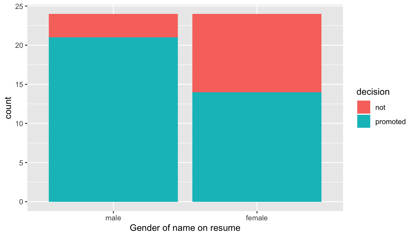
FIGURE 10.1: Barplot of relationship between gender and promotion decision.
It appears that resumes with female names were much less likely to be accepted for promotion. Let’s quantify these promotions rates by computing the proportion of resumes accepted for promotion for each group using the dplyr package for data wrangling:
promotions %>%
  group_by(gender, decision) %>%
  summarize(n = n())
# A tibble: 4 x 3
# Groups: gender [2]
gender decision n
<fct> <fct> <int>
1 male not 3
2 male promoted 21
3 female not 10
4 female promoted 14So of the 24 resumes with male names 21 were selected for promotion, for a proportion of 21/24 = 0.875 = 87.5%. On the other hand, of the 24 resumes with female names 14 were selected for promotion, for a proportion of 14/24 = 0.583 = 58.3%. Comparing these two rates of promotion, it appears that resumes with male names were selected for promotion at a rate 0.875 - 0.583 = 0.292 = 29.2% higher than resumes with female names. A clear edge for the “male” applicants.
The question is however, does this provide conclusive evidence that there is some discrimination in terms of gender in promotions at banks? Could a difference in promotion rates of 29.2% still occur by chance, even in a world of no gender-based discrimination? In other words, what is the role of sampling variation in these results? To answer this question, we’ll again rely on simulation to generate results as we did with our sampling bowl in Chapter 8 and our pennies in Chapter 9.
10.1.2 Shuffling once
First, imagine a hypothetical universe with no gender discrimination in promotions, with a big emphasis on the “hypothetical.” In such a hypothetical universe, the gender of an applicant would have no bearing on their chances of promotions. Bringing things back to our promotions data frame, the gender variable would thus be an irrelevant label. If the gender label is irrelevant, then we can randomly “shuffle” this label to no consequence!
To illustrate this idea, let’s narrow our focus to six arbitrarily chosen resumes of the 48 in Table 10.1: three resumes not resulting in a promotion and three resumes resulting in a promotion. The left-hand side of the table displays the original relationship between decision and gender that was actually observed by researchers.
However, in our hypothesized universe of no gender discrimination, gender is irrelevant and thus it is of no consequence to randomly shuffle the values of gender. The right-hand side of the table displays one such possible random shuffling. Observe how the number of male and female remains the same at three each, but they are listed in a different order.
|
|
Again, such random shuffling of gender only makes sense in the hypothesized universe of no gender discrimination. How could we extend this shuffling of the gender variable to all 48 resumes by hand? One way would be by using standard deck of 52 playing cards, which we display in Figure 10.2.

FIGURE 10.2: Standard deck of 52 playing cards.
Since half the cards are red and the other half are black, by removing 2 red cards and 2 black cards, we would end up with 24 red cards and 24 black cards. After shuffling these 48 cards as seen in Figure 10.3, we can flip the cards over one-by-one, assigning “male” for each red card and “female” for each black card.

FIGURE 10.3: Shuffling deck cards.
We’ve saved one such shuffling/permutation in the promotions_shuffled data frame of the moderndive package. If you view both the original promotions and the shuffled promotions_shuffled data frames and compare them, you’ll see that while the decision variables are identical, the gender variables are indeed different.
promotions_shuffled# A tibble: 48 x 3
id decision gender
<int> <fct> <fct>
1 1 promoted female
2 2 promoted female
3 3 promoted male
4 4 promoted female
5 5 promoted male
6 6 promoted male
7 7 promoted male
8 8 promoted female
9 9 promoted male
10 10 promoted female
# … with 38 more rowsLet’s repeat the same exploratory data analysis we did for the original promotions data on our shuffled promotions_shuffled data frame. Let’s create a barplot visualizing the relationship between decision and shuffled gender and compare this to the original unshuffled version in Figure 10.4.
ggplot(promotions_shuffled, aes(x = gender, fill = decision)) +
  geom_bar() +
  labs(x = "Gender of resume name")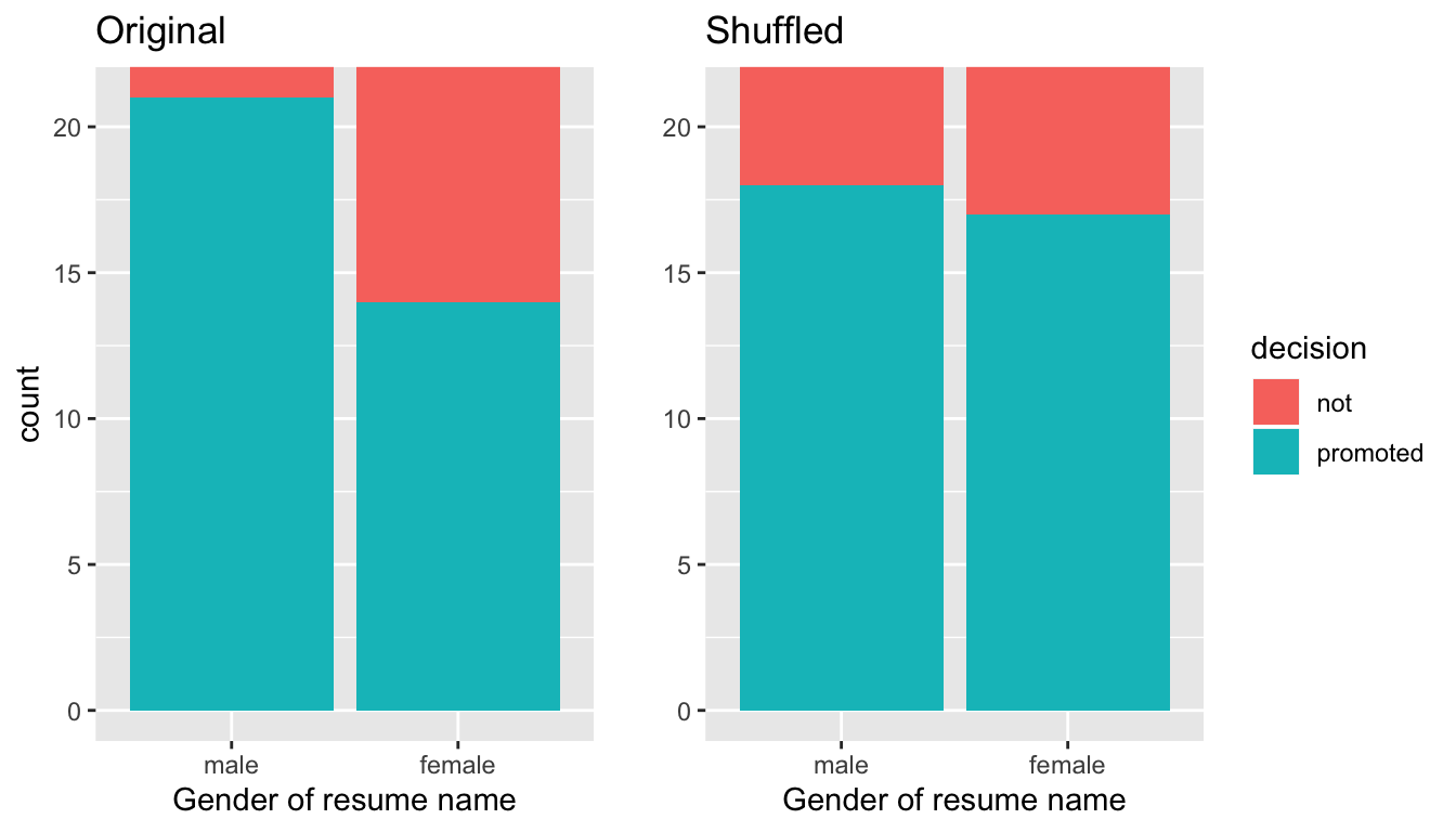
FIGURE 10.4: Barplot of relationship between shuffled gender and promotion decision.
Compared to the barplot in Figure 10.1, it appears the different in “male” vs “female” promotions rates is now different. Let’s also compute the proportion of resumes accepted for promotion for each group:
promotions_shuffled %>%
  group_by(gender, decision) %>%
  summarize(n = n())
# A tibble: 4 x 3
# Groups: gender [2]
gender decision n
<fct> <fct> <int>
1 male not 6
2 male promoted 18
3 female not 7
4 female promoted 17So in this hypothetical universe of no discrimination, 18/24 = 0.75 = 75% of “male” resumes were selected for promotion. On the other hand, 17/24 = 0.708 = 70.8% of “female” resumes were selected for promotion. Comparing these two values, it appears that resumes with male names were selected for promotion at a different rate of 0.75 - 0.708 = 0.042 = 4.2%.
Observe how this difference in rates is different than the difference in rates of 0.292 = 29.2% we originally observed. This is once again due to sampling variation. How can we better understand the effect of this sampling variation? By doing this several times!
10.1.3 Shuffling 16 times
We recruited 16 groups of our friends to repeat the above shuffling/permuting exercise. We recorded these values in a shared spreadsheet; we display a snapshot of the first 10 rows and 5 columns in Figure 10.5
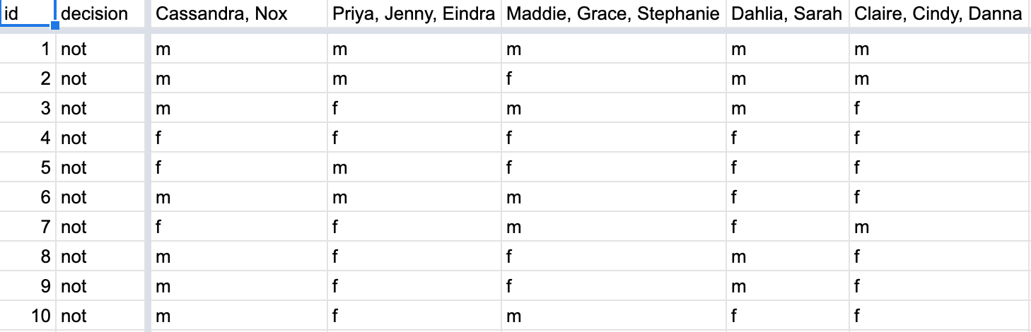
FIGURE 10.5: Snapshot of shared spreadsheet of shuffled resumes.
In Figure 10.6, we show the distribution of the 16 “shuffled” differences in promotion rates using a histogram. Remember that the histogram represents the differences in promotion rates in our hypothesized universe of no gender discrimination. We also mark the observed difference in promotion rate that happened in real-life of 0.292 = 29.2% with a red line.
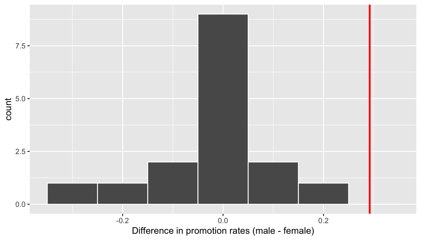
FIGURE 10.6: Distribution of “shuffled” differences in promotions.
Observe first that the histogram is both roughly centered at 0. Saying that the difference in promotion rates is 0 is equivalent to saying that both genders had the same promotion rate. In other words, these 16 values are consistent with what we would expect in our hypothesized universe of no gender discrimination. However, while the values are centered at 0, there is variation about 0. This is because even in a hypothesized universe of no gender discrimination, you still still observe small differences in promotion rates because of sampling variation. Looking at the histogram, it could even be as extreme as -0.292 or 0.208.
Turning our attention to what we observed in real-life: the difference of 0.292 = 29.2% is marked with a red line. Ask yourself: in a hypothesized world of no gender discrimination, how likely would it be that we observe this difference? In our opinion, not often! Now ask yourself: what does this say about our hypothesized universe of no gender discrimination.
10.1.4 What did we just do?
What we just demonstrated in this activity is the statistical procedure known as hypothesis testing, specifically via a permutation test. Such procedures allow us to test the validity of hypotheses using sampled data. The term “permutation” is the mathematical term for “shuffling”: take a series of values and reorder them randomly, as you did with the playing cards.
In fact, permutations are another form of resampling. While the bootstrap method involves resampling with replacement, permutation methods involve resampling without replacement. Think of our exercise involving the slips of paper representing pennies and the hat in Section 9.1: after sampling a penny, you put it back in the hat. Now think of our deck of cards, after drawing a card, you laid it out in front of you without putting it back in the hat.
In our above example, we tested the validity of the hypothesized universe of no gender discrimination. Since the evidence contained in our observed sample of 48 resumes in the promotions data frame was somewhat inconsistent with our hypothesized universe, we would be inclined to reject this hypothesized universe and declare that the evidence suggests there is gender discrimination.
Much like with our case study on whether yawning is contagious from Section 9.6, the above example involves inference about an unknown difference of population proportions: \(p_{m} - p_{f}\), where \(p_{m}\) is the population proportion of “male” resumes being recommended for promotion and \(p_{f}\) is the population proportion of “male” resumes being recommended for promotion.
So based on our sample of \(n_m\) = 24 “male” applicants and \(n_w\) = 24 “female” applicants, the point estimate for \(p_{m} - p_{f}\) is the difference of sample proportions \(\widehat{p}_{m} -\widehat{p}_{f}\) = 0.875 - 0.583 = 0.292 = 29.2%. This difference in favor of “male” resumes of 0.292 is greater than 0, suggesting discrimination in favor of men.
However the question we asked ourselves was “is this difference meaningfully different than 0?” In other words, is that difference indicative of true discrimination, or can we just attribute it to sampling variation? Hypothesis testing allows us to make such distinctions.
10.2 Understanding hypothesis tests
Much like the terminology, notation, and definitions relating to sampling you saw in Section 8.3, there is a lot of terminology, notation, and definitions related to hypothesis testing that one must know before being able to conduct hypothesis tests effectively. Learning these may seem like a very daunting task at first. However with practice, practice, and practice, anyone can master them.
First, a hypothesis is a statement about the value of an unknown population parameter. In our resume activity, our population parameter is the difference in population proportions \(p_{m} - p_{f}\). Hypothesis tests can involve any of the population parameters in Table 8.8 of the 6 inference scenarios we’ll cover in this book and more.
Second, a hypothesis test consists of a test between two competing hypotheses: 1) a null hypothesis \(H_0\) (pronounced “H-naught”) versus 2) an alternative hypothesis \(H_A\) (also denoted \(H_1\)).
Generally the null hypothesis is a claim that there really is “no effect” or “no difference.” In many cases, the null hypothesis represents the status quo or that nothing interesting is happening. Furthermore, generally the alternative hypothesis is the claim the experimenter or researcher wants to establish or find evidence for and is viewed as a “challenger” hypothesis to the null hypothesis \(H_0\). In our resume activity, an appropriate hypothesis test would be:
\[ \begin{aligned} H_0 &: \text{men and women are promoted at the same rate}\\ \text{vs } H_A &: \text{men are promoted at a higher rate than women} \end{aligned} \]
Note some of the choices we have made. First, we set the null hypothesis \(H_0\) to be that there is no difference in promotion rate and the “challenger” alternative hypothesis \(H_A\) to be that there is a difference. While it would not be wrong in principle to reverse the two, it is a convention in statistical inference that the null hypothesis is set to reflect a “null” situation where “nothing is going on,” in this case that there is no difference in promotion rates. Furthermore we set \(H_A\) to be that men are promoted at a higher rate, a subjective choice reflecting a prior suspicion we have that this is the case. We call such alternative hypotheses one-sided alternatives. If someone else however does not share such suspicions and only wants to investigate that there is a difference in rate, whether higher or lower, they we set what is known as a two-sided alternative.
We can re-express the formulation of our hypothesis test in terms of the notation for our population parameter of interest:
\[ \begin{aligned} H_0 &: p_{m} - p_{f} = 0\\ \text{vs } H_A&: p_{m} - p_{f} > 0 \end{aligned} \]
Observe how the alternative hypothesis \(H_A\) is one-sided \(p_{m} - p_{f} > 0\). Had we opted for a two-sided alternative, we would have set \(p_{m} - p_{f} \neq 0\). For the purposes of the illustration of the terminology, notation, and definitions related to hypothesis testing however, we’ll stick with the simpler one-sided alternative. We’ll present an example of a two-sided alternative in Section 10.5.
Third, a test statistic is a point estimate/sample statistic formula used for hypothesis testing, where a sample statistic is merely a summary statistic based on a sample of observations. Recall we saw in Section 4.3 that a summary statistic takes in many values and returns only one. Here, a sample would consist of \(n_m\) = 24 “male” resumes and \(n_f\) =24 “female” resumes. The point estimate of interest is the resulting difference in sample proportions \(\widehat{p}_{m} - \widehat{p}_{f}\). This quantity estimates of the unknown population parameter of interest: the difference in population proportions \(p_{m} - p_{f}\).
Fourth, the observed test statistic is the value of the test statistic that we observed in real-life. In our case we computed this value using the data saved in the promotions data frame: it was the observed difference of \(\widehat{p}_{m} -\widehat{p}_{f}\) = 0.875 - 0.583 = 0.292 = 29.2%.
Fifth, the null distribution is the sampling distribution of the test statistic assuming the null hypothesis \(H_0\) is true. Ooof! That’s a long one! Let’s unpack it slowly. The key to understanding the null distribution is that the null hypothesis \(H_0\) assumed to be true. We’re not saying that it is true at this point, merely assuming it. In our case, this corresponds to our hypothesized universe of no gender discrimination in promotion rates. Assuming the null hypothesis \(H_0\), also stated as “Under \(H_0\)”, how does the test statistic vary due to sampling variation? In our case, how will the difference in sample proportions \(\widehat{p}_{m} - \widehat{p}_{f}\) vary due to sampling? Recall from Section 8.3.2 that distributions that display how point estimates vary due to sampling variation are called sampling distributions. The only additional thing to keep in mind for null distributions is that they are sampling distributions assuming the null hypothesis \(H_0\) is true.
In our case, we previously visualized the null distribution in Figure 10.6, which we re-display below in Figure 10.7 using our new notation and terminology. It is the distribution of the 16 different difference in sample proportions our friends computed assuming a hypothetical universe of no gender discrimination.
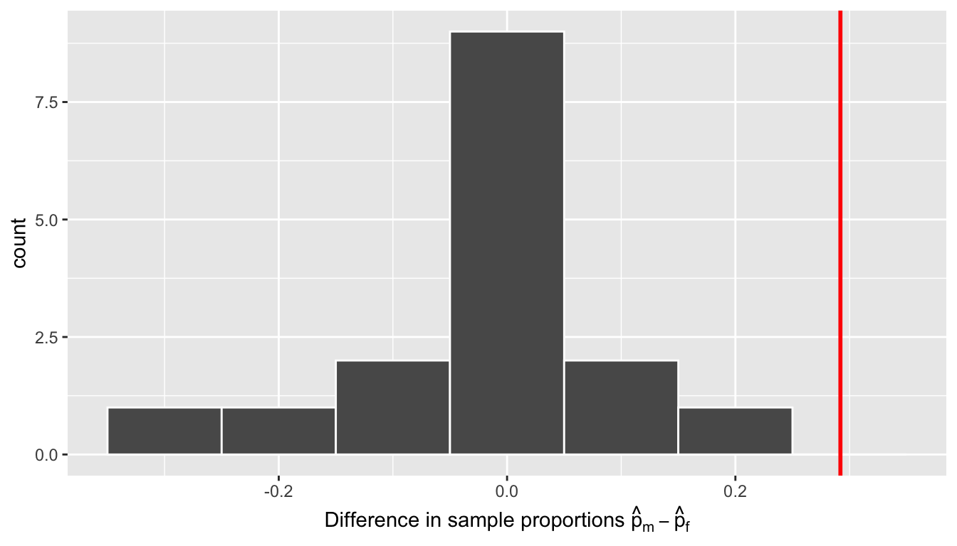
FIGURE 10.7: Null distribution and observed test statistic.
Sixth, the p-value is the probability of obtaining a test statistic just as extreme or more extreme than the observed test statistic assuming the null hypothesis \(H_0\) is true. Double ooof! Let’s unpack this slowly as well. You can think of the p-value as a quantification of “surprise”: assuming \(H_0\) is true how surprised are we at observing the test statistic we did? Or in our case, in our hypothesized universe of no gender discrimination how surprised are we that we observed a difference in promotion rates of 0.292 = 29.2%? Very surprised? Somewhat surprised?
The p-value quantifies this probability, or in the case of Figure 10.7, of our 16 difference in sample proportions, what proportion had a more “extreme” result? Here, extreme is defined in terms of the alternative hypothesis \(H_A\) that “male” applicants are promoted at a higher rate than “female” applicants. In other words, how often was the discrimination in favor of men even more pronounced than 0.875 - 0.583 = 0.292 = 29.2%?
In this case, only 0 time out of 16 did we obtain a difference in proportion greater than or equal to the observed difference of 0.292 = 29.2%. A very rare outcome of only 1 time in 16! Given the rarity of such a pronounced in difference in promotion rates in our hypothesized universe of no gender discrimination, we’re inclined to reject this hypothesis in favor of the one saying there is discrimination in favor of the “male” applicants. We’ll see later on however, the p-value isn’t quite 1/16, but rather (0 + 1)/(16 + 1) = 1/17 = 0.059 as we need to include the the observed test statistic in our calculation.
Seventh and lastly, in many hypothesis testing procedures, it is common to and recommended to set the significance level of the test beforehand. It is denoted by the Greek letter \(\alpha\). This value acts as a cutoff on the p-values, where if the p-value falls below \(\alpha\), we would reject the null hypothesis \(H_0\). Alternatively, if the p-value does not fall below \(\alpha\), we would fail to reject \(H_0\). Note this statement is not quite the same as saying we “accept” \(H_0\). This distinction is rather subtle and not immediately obvious, so we’ll revisit it later in Section 10.4.
While different fields tend to use different values of \(\alpha\), some commonly used values for \(\alpha\) are 0.1, 0.01, and 0.05, with 0.05 being the choice people often make when people don’t put much thought into it. We’ll talk more about \(\alpha\) significance levels in Section 10.4, but first let’s fully conduct the hypothesis test corresponding to our promotions activity in the next section.
10.3 Conducting hypothesis tests
In Section 9.4, we showed you how to construct confidence intervals. We first illustrated how to do this using raw dplyr data wrangling verbs and the rep_sample_n() function which we introduced in Section 8.2.3 when illustrating the use of the virtual shovel. In particular, we constructed confidence intervals by resampling with replacement by setting the replace = TRUE argument to the rep_sample_n() function.
We then showed you how to perform the same task using the infer package workflow. While the end result of both workflows are the same, a bootstrap distribution from which we can construct a confidence interval, the infer package workflow emphasizes each of the steps in the overall process in Figure 10.8 using function names that are intuitively named:
specify()the variables of interest in your data framegenerate()replicates of bootstrap resamples with replacementcalculate()the summary statistic of interestvisualize()the resulting bootstrap distribution and the confidence interval.
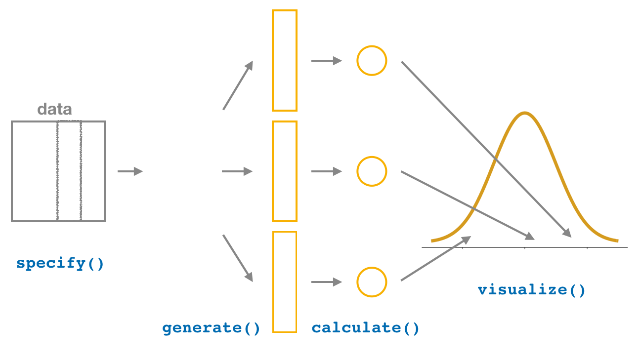
FIGURE 10.8: Confidence intervals via the infer package.
In this section, we now show you how to extend and modify the previously seen infer pipeline to conduct hypothesis tests. You’ll notice that the basic outline of the workflow is almost identical, except for an additional hypothesize() step between specify() and generate(), as can be seen in Figure 10.9.
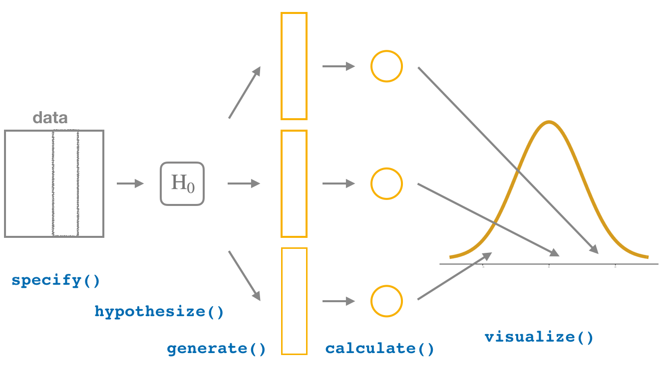
FIGURE 10.9: Hypothesis testing via the infer package.
Furthermore, we’ll use a pre-specified significance level \(\alpha\) = 0.001 for this hypothesis test. Let’s leave the justification of this choice of \(\alpha\) until later on in Section 10.4.
10.3.1 infer package workflow
1. specify variables
Recall that we use the specify() verb to denote the response and, if needed, explanatory variables for our study. In this case, since we are interested in any potential effects of gender on promotion decisions, we set decision as the response variable and gender as the explanatory variable using the formula argument using the notation <response> ~ <explanatory> where <response> is the name of the response variable in the data frame and <explanatory> is the name of the explanatory variable. So in our case it is decision ~ gender. Lastly, since we are interested in the proportions of resumes "promoted" and not proportions of resumes not promoted, we set the argument success = "promoted"
promotions %>%
  specify(formula = decision ~ gender, success = "promoted")
Response: decision (factor)
Explanatory: gender (factor)
# A tibble: 48 x 2
decision gender
<fct> <fct>
1 promoted male
2 promoted male
3 promoted male
4 promoted male
5 promoted male
6 promoted male
7 promoted male
8 promoted male
9 promoted male
10 promoted male
# … with 38 more rowsAgain, notice how the promotions data itself doesn’t change, but the Response: decision (factor) and Explanatory: gender (factor) meta-data do. This is similar to how the group_by() verb from dplyr doesn’t change the data, but only adds “grouping” meta-data as we saw in Section 4.4.
2. hypothesize the null
In order to conduct hypothesis tests using the infer workflow, we need a new step: hypothesize(). Recall from Section 10.2 that our hypothesis test was
\[ \begin{aligned} H_0 &: p_{m} - p_{f} = 0\\ \text{vs } H_A&: p_{m} - p_{f} > 0 \end{aligned} \]
In other words, the null hypothesis \(H_0\) corresponding to our “hypothesized universe” stated that there was no difference in gender-based discrimination rates. We set this null hypothesis \(H_0\) in our infer workflow by setting the null argument of the hypothesize() function to either:
"point"for hypotheses involving a single sample or"independence"for hypotheses involving two samples
In our case, since we have two samples (the “male” and “female” applicants), we set null = "independence".
promotions %>%
  specify(formula = decision ~ gender, success = "promoted") %>%
  hypothesize(null = "independence")
# A tibble: 48 x 2
decision gender
<fct> <fct>
1 promoted male
2 promoted male
3 promoted male
4 promoted male
5 promoted male
6 promoted male
7 promoted male
8 promoted male
9 promoted male
10 promoted male
# … with 38 more rowsAgain, the data has not changed yet. This will occur at the upcoming generate() step; we’re merely setting meta-data for now.
Where do the terms “point” and “independence” come from? These are two technical statistics terms. The term “point” relates from the fact that for a single group of observations, you will test the value of the point. Going back to the pennies example from Chapter 9, say we wanted to test if the mean year of all US pennies was equal to 1993 or not, we would be testing the “point” value \(\mu\) as follows
\[ \begin{aligned} H_0 &: \mu = 1993\\ \text{vs } H_A&: \mu \neq 1993 \end{aligned} \]
The term “independence” relates to the fact that for two groups of observations, you are testing whether or not the response variable is independent of the explanatory variable that assigns the group. In our case, we are testing whether the decision response variable is “independent” of the explanatory variable gender that assigns each resume to either one of the two groups.
3. generate replicates
After we have set the null hypothesis, we simulate observations assuming the null hypothesis is true by repeating the shuffling exercise you performed in Section 10.1 several times. Instead of merely doing it 16 times as our groups of friends did, let’s use the computer to repeat this 1000 times by setting reps = 1000 in the generate() function. However, unlike with confidence intervals where we generated replicates using type = "bootstrap" resampling with replacement, we’ll now perform shuffles/permutations by setting type = "permute". Recall that shuffles/permutations are a form of resampling without replacement.
promotions %>%
  specify(formula = decision ~ gender, success = "promoted") %>%
  hypothesize(null = "independence") %>%
  generate(reps = 1000, type = "permute")
Response: decision (factor)
Explanatory: gender (factor)
Null Hypothesis: independence
# A tibble: 48,000 x 3
# Groups: replicate [1,000]
decision gender replicate
<fct> <fct> <int>
1 promoted male 1
2 not male 1
3 promoted male 1
4 promoted female 1
5 promoted female 1
6 promoted female 1
7 promoted female 1
8 promoted female 1
9 promoted female 1
10 not female 1
# … with 47,990 more rowsNote the the resulting data frame has 48,000 rows. This is because we performed shuffles/permutations of the 48 values of gender 1000 times and thus 48,000 = 1000 \(\times\) 48. Accordingly the variable replicate, indicating which resample each row belongs to, has the value 1 48 times, the value 2 48 times, all the way through to the value 1000 48 times.
4. calculate summary statistics
Now that we have 1000 replicated “shuffles” assuming the null hypothesis that both “male” and “female” applicants were promoted at the same rate, let’s calculate() the appropriate summary statistic for each of our 1000 shuffles. Recall from Section 10.2 that point estimates/summary statistics relating to hypothesis testing have a specific name: test statistics. Since the unknown population parameter of interest is the difference in population proportions \(p_{m} - p_{f}\), the test statistic of interest here is the difference in sample proportions \(\widehat{p}_{m} - \widehat{p}_{f}\).
For each of our 1000 shuffles, we can calculate this test statistic by setting stat = "diff in props". Furthermore, since we are interested in \(\widehat{p}_{m} - \widehat{p}_{f}\) and not the reverse-ordered \(\widehat{p}_{f} - \widehat{p}_{m}\), we set order = c("male", "female"). Let’s save the result in a data frame called null_distribution:
null_distribution <- promotions %>%
  specify(formula = decision ~ gender, success = "promoted") %>%
  hypothesize(null = "independence") %>%
  generate(reps = 1000, type = "permute") %>%
  calculate(stat = "diff in props", order = c("male", "female"))
null_distribution
# A tibble: 1,000 x 2
replicate stat
<int> <dbl>
1 1 -0.208333
2 2 0.291667
3 3 0.125
4 4 -0.208333
5 5 -0.125
6 6 0.0416667
7 7 -0.0416667
8 8 0.291667
9 9 0.0416667
10 10 0.125
# … with 990 more rowsObserve that we have 1000 values of stat, each representing one “shuffled” instance of \(\widehat{p}_{m} - \widehat{p}_{f}\) in a hypothesized world of no gender discrimination. Note as well we chose the name of this data frame carefully: null_distribution. Recall once again from Section 10.2 that such sampling distributions when the null hypothesis \(H_0\) is assumed to be true have a special name: the null distribution.
But wait! What happened in real-life? What was the observed difference in promotions rates? In other words, what was the observed test statistic \(\widehat{p}_{m} - \widehat{p}_{f}\)? Recall from Section 10.1 that we computed this observed difference by hand to be 0.875 - 0.583 = 0.292 = 29.2%. We can also achieve this using the code above but with the hypothesize() and generate() steps removed. Let’s save this in obs_diff_prop
obs_diff_prop <- promotions %>%
  specify(decision ~ gender, success = "promoted") %>%
  calculate(stat = "diff in props", order = c("male", "female"))
obs_diff_prop
# A tibble: 1 x 1
stat
<dbl>
1 0.2916675. visualize the p-value
The final step is to measure how surprised would we be by a promotion difference of 29.2% in a hypothesized universe of no gender discrimination. If very surprised, then we would be inclined to reject the validity of our hypothesized universe.
We start by visualizing the null distribution of our 1000 values of \(\widehat{p}_{m} - \widehat{p}_{f}\) using visualize() in Figure 10.10. Recall that these are values of the difference in promotion rate assuming \(H_0\) is true, in other words in our hypothesized universe of no gender discrimination.
visualize(null_distribution, binwidth = 0.1)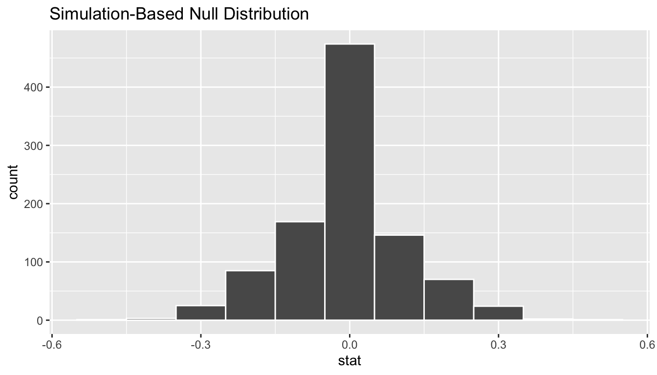
FIGURE 10.10: Bootstrap distribution
Let’s now add what happened in real-life to Figure 10.10, the observed difference in promotions rates of 0.875 - 0.583 = 0.292 = 29.2%. However, instead of merely adding a vertical line using geom_vline(), let’s use the shade_p_value() function with obs_stat set to the observed test statistic value we saved in obs_diff_prop and direction = "right":
visualize(null_distribution, bins = 10) +
  shade_p_value(obs_stat = obs_diff_prop, direction = "right")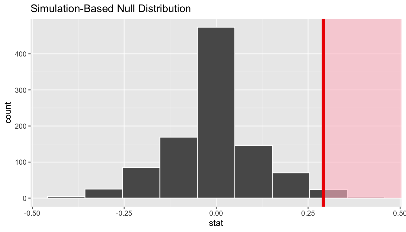
FIGURE 10.11: Shaded histogram to show p-value.
In the resulting Figure 10.11, the solid red line marks 0.292 = 29.2%. However, what does the shaded-region correspond to? This is the p-value. Recall the definition of the p-value from Section 10.2:
A p-value is the probability of obtaining a test statistic just as or more extreme than the observed test statistic assuming the null hypothesis \(H_0\) is true.
Recall our alternative hypothesis \(H_A\) is that \(p_{m} - p_{f} > 0\) i.e. there is a difference in promotion rates in favor of men. So “more extreme” corresponds to differences that are “bigger” or “more positive” or “more to the right.” Hence we set the direction argument of shade_p_value() to be "right". Had our alternative hypothesis \(H_A\) been the other possible one-sided alternative \(p_{m} - p_{f} < 0\) suggesting discrimination in favor of “female” applicants, we would’ve set direction = "left". Had our alternative hypothesis \(H_A\) been two-sided \(p_{m} - p_{f} \neq 0\) suggesting discrimination in either direction, we would’ve set direction = "both".
So judging by the shaded region in Figure 10.11, it seems we would somewhat rarely observe differences in promotion rates of 0.292 = 29.2% or more in a hypothesized universe of no gender discrimination. In other words, the p-value is somewhat small. Hence, we would be inclined to reject this hypothesized universe, or in statistical language: reject \(H_0\).
What fraction of the null distribution is shaded? In other words, what is the exact p-value? We can compute its numerical value using the get_p_value() function using the exact same arguments as with the visualize() code above:
null_distribution %>%
  get_p_value(obs_stat = obs_diff_prop, direction = "right")
# A tibble: 1 x 1
p_value
<dbl>
1 0.027In other words, the probability of observing a difference in promotion rates as large as 0.292 = 29.2% due to sampling variation alone is only 0.027 = 2.7%. Since this p-value is greater than our pre-specified significance level \(\alpha\) = 0.001, we fail to reject the null hypothesis \(H_0: p_{m} - p_{f} = 0\). In other words, this p-value wasn’t sufficiently small to reject our hypothesized universe of no gender discrimination.
10.3.2 Comparison with confidence intervals
One of the great things about the infer pipeline is that we can jump between hypothesis tests and confidence intervals with minimal changes! Recall from the previous section that to create the null distribution needed to compute the p-value, we ran the following code:
null_distribution <- promotions %>%
  specify(formula = decision ~ gender, success = "promoted") %>%
  hypothesize(null = "independence") %>%
  generate(reps = 1000, type = "permute") %>%
  calculate(stat = "diff in props", order = c("male", "female"))
To create the corresponding bootstrap distribution needed to construct a 95% confidence interval for \(p_{m} - p_{f}\), we only need to make two changes. First, we remove the hypothesize() step since we are no longer assuming a null hypothesis \(H_0\) is true when we bootstrap. We do this by commenting out the hypothesize() line of code. Second, we switch the type of resampling in the generate() step to be "bootstrap" instead of "permute".
bootstrap_distribution <- promotions %>%
  specify(formula = decision ~ gender, success = "promoted") %>%
  # Change 1 - Remove hypothesize():
  # hypothesize(null = "independence") %>%
  # Change 2 - Switch type from "permute" to "bootstrap":
  generate(reps = 1000, type = "bootstrap") %>%
  calculate(stat = "diff in props", order = c("male", "female"))
Using bootstrap_distribution, we first compute the percentile-based confidence intervals:
percentile_ci <- bootstrap_distribution %>%
  get_confidence_interval(level = 0.95, type = "percentile")
percentile_ci
# A tibble: 1 x 2
`2.5%` `97.5%`
<dbl> <dbl>
1 0.0414187 0.522222Using our shorthand interpretation for 95% confidence intervals from Section 9.5.2, we are 95% “confident” that the true difference in population proportions \(p_{m} - p_{f}\) is between (0.041, 0.522). Let’s visualize bootstrap_distribution and this percentile-based 95% confidence interval for \(p_{m} - p_{f}\) in Figure 10.12.
visualize(bootstrap_distribution) +
  shade_confidence_interval(endpoints = percentile_ci)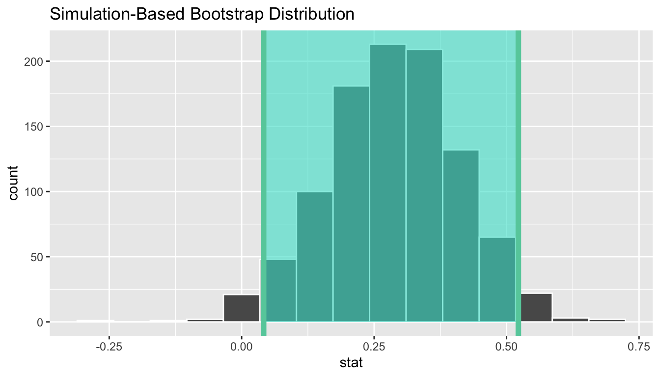
FIGURE 10.12: Percentile-based 95 percent confidence interval.
Notice a key value that is not included in the 95% confidence interval for \(p_{m} - p_{f}\): 0. In other words, a difference of 0 is not included in our net, suggesting that \(p_{m}\) and \(p_{f}\) are different!
Since the bootstrap distribution appears to be roughly normally shaped, we can also used the standard error based confidence intervals, being sure to specify point_estimate as the observed difference in promotion rates 0.292 = 29.2% saved in obs_diff_prop:
se_ci <- bootstrap_distribution %>%
  get_confidence_interval(level = 0.95, type = "se",
                          point_estimate = obs_diff_prop)
se_ci
# A tibble: 1 x 2
lower upper
<dbl> <dbl>
1 0.0490607 0.534273Let’s visualize bootstrap_distribution again and now the standard error based 95% confidence interval for \(p_{m} - p_{f}\) in Figure 10.13. Again, notice how the value 0 is not included in our confidence interval, again suggesting that \(p_{m}\) and \(p_{f}\) are different!
visualize(bootstrap_distribution) +
  shade_confidence_interval(endpoints = se_ci)
FIGURE 10.13: Standard error-based 95 percent confidence interval.
Learning check
(LC10.1) Conduct the same analysis comparing male and female promotion rates using the median rating instead of the mean rating? What was different and what was the same?
(LC10.2) Describe in a paragraph how we used Allen Downey’s diagram to conclude if a statistical difference existed between the promotion rate of males and females using this study.
(LC10.3) Why are we relatively confident that the distributions of the sample proportions will be good approximations of the population distributions of promotion proportions for the two genders?
(LC10.4) Using the definition of “\(p\)-value”, write in words what the \(p\)-value represents for the hypothesis test above comparing the promotion rates for males and females.
(LC10.5) What is the value of the \(p\)-value for the hypothesis test comparing the mean rating of romance to action movies? How can it be interpreted in the context of the problem?
10.3.3 “There is only one test”
Let’s recap the steps necessary to conduct a hypothesis test using the terminology, notation, and definitions related to sampling you saw in Section 10.2 and the infer workflow from Section #ref(infer-workflow-ht):
specify()the variables of interest in your observed data.hypothesize()the null hypothesis \(H_0\). In other words, set a “model” for the universe assuming \(H_0\) is true.generate()shuffles assuming \(H_0\) is true. In other words, simulate data assuming \(H_0\) in true.calculate()the test statistic of interest, both for the observed data and your simulated data.visualize()the resulting null distribution and compute the p-value by comparing the null distribution to the observed test statistic.
While this is a lot to digest, especially the first time you encounter hypothesis testing, the nice is thing is once you understand this framework, then you can understand any hypothesis test. In a famous blog post, computer scientist Allen Downey called this the “There is only one test” framework, which he displayed in Figure 10.14.
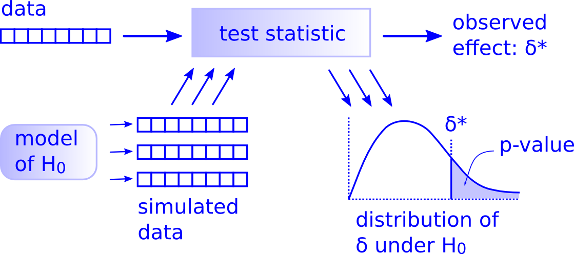
FIGURE 10.14: Hypothesis Testing Framework.
Notice a similarity with the “hypothesis testing via infer” diagram you saw in Figure 10.9? That’s because the infer package was explicitly designed to match the “There is only one test” framework. So if you can understand the framework, you can easily generalize these ideals for all hypothesis testing scenarios, whether for population proportions \(p\), population means \(\mu\), differences in population proportions \(p_1 - p_2\), differences in population means \(\mu_1 - \mu_2\), and as you’ll see in Chapter 11 on inference for regression, population regression intercepts \(\beta_0\) and population regression slopes \(\beta_1\) as well.
10.4 Interpreting hypothesis tests
Hypothesis tests are often challenging to understand at first. In this section, we’ll focus on ways to help with deciphering the process and address some common misconceptions.
10.4.1 Two possible outcomes
In Section 10.2, we mentioned that given a pre-specified significance level \(\alpha\) there are two possible outcomes of a hypothesis test:
- If the p-value is less than \(\alpha\), we reject the null hypothesis \(H_0\) in favor of \(H_A\).
- If the p-value is greater than or equal to \(\alpha\), we fail to reject the null hypothesis \(H_0\).
Unfortunately, the latter result is often misinterpreted as “accepting” the null hypothesis \(H_0\). While at first glance it may seem to be saying the same thing, there is a subtle difference. Saying that we “accept the null hypothesis \(H_0\)” is equivalent to stating “we think the null hypothesis \(H_0\) is true.” However, saying that we “fail to reject the null hypothesis \(H_0\)” is saying something else: “\(H_0\) may still be false, we don’t have any evidence to say so.” In other words, there is an absence of proof. However absence of proof is not proof of absence.
As an analogy to this distinction, let’s use the United States criminal justice system as an analogy. A criminal trial in the United States is a similar situation in which a choice between two contradictory claims must be made about a defendant who is on trial.
- The defendant is truly either “innocent” or “guilty.”
- The defendant is presumed “innocent until proven guilty.”
- The defendant is found guilty only if there is strong evidence that the defendant is guilty. The phrase “beyond a reasonable doubt” is often used to set the cutoff value for when enough evidence exists to find the defendant guilty.
- The defendant is found to be either “not guilty” or “guilty” in the ultimate verdict.
In other words, “not guilty” verdicts are not suggesting the defendant is “innocent”, but instead that “while the defendant may still actually be guilty, there wasn’t enough evidence to prove this fact.” Now let’s make the connections with hypothesis tests.
- Either the null hypothesis \(H_0\) or the alternative hypothesis \(H_A\) is true.
- Hypothesis tests are always conducted assuming the null hypothesis \(H_0\) is true.
- We reject the null hypothesis \(H_0\) in favor of \(H_A\) only if the evidence found in the sample suggests that \(H_A\) is true. The significance level \(\alpha\) is used to set the threshold on how strong evidence we require.
- We ultimately decide to either “fail to reject \(H_0\)” or “reject \(H_0\).”
So while gut instinct may suggest “fail to reject \(H_0\)” and “accept \(H_0\)” are equivalent statements, they are not. “Accepting \(H_0\)” is equivalent to finding a defendant innocent. We cannot show that a person is innocent; we can only say that there was not enough substantial evidence to find the person guilty.
So going back to our promotions activity, recall in Section 10.3 that our hypothesis test was \(H_0: p_{m} - p_{f} = 0\) versus \(H_A: p_{m} - p_{f} > 0\), we used a pre-specified significance level of \(\alpha\) = 0.001, and we found a p-value of 0.027. Since the p-value was greater than \(\alpha\) = 0.001, we fail to reject \(H_0\). In other words, while \(H_0\) may actually be false, we didn’t find any evidence in this particular sample of 48 to suggest so. We also state this conclusion using non-statistical language: we found no evidence in the data to suggest that there was no gender discrimination.
10.4.2 Types of errors
Unfortunately, there is some chance a jury or a judge can make an incorrect decision in a criminal trial by reaching the wrong verdict. This often stems from the fact that prosecutors don’t have all the relevant evidence, but are limited to what evidence the police can find. The same holds for hypothesis testing. We can make incorrect decisions about a population parameter because we only have a sample of data from the population and thus sampling variation can lead us to incorrect conclusions.
There are two possible erroneous conclusions in a criminal trial: either 1) a truly innocent person is found guilty or 2) a truly guilty person is found not guilty. Similarly, there are two possible errors in a hypothesis test: either 1) rejecting \(H_0\) when in fact \(H_0\) is true called a Type I error or 2) failing to reject \(H_0\) when in fact \(H_0\) is false called a Type II error. Another term used for “Type I error” is “false positive” while another term for “Type II error” include “false negative.”
This risk of error is the price researchers pay for basing inference about a population on a sample. The only way we could be absolutely certain about our conclusion is to perform a full census of the population, but as we’ve seen in our numerous examples and activities so far, this is often very expensive and other impossible. This in any hypothesis test based on a sample, we tolerate the chance that a Type I error will be made and some chance that a Type II error will occur.
To help understand the concepts of Type I error and Type II errors, we apply these terms in our criminal justice analogy in Figure 10.15.
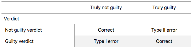
FIGURE 10.15: Type I and Type II errors in criminal trials.
Thus a Type I error corresponds to incorrectly putting a truly innocent person in jail whereas a Type II error corresponds to letting a truly guilty person go free. Let’s show the corresponding table for hypothesis tests
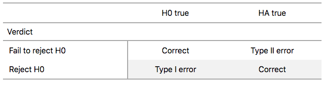
FIGURE 10.16: Type I and Type II errors in hypothesis tests.
10.4.3 How do we choose alpha?
We stated earlier if we are using sample data to make inferences about a population, we run the risk of making mistakes. For confidence intervals, this would be obtaining a constructed confidence interval that doesn’t contain the true value of the population parameter. For hypothesis tests, this would be making either a Type I or Type II error. Obviously, we want to minimize the probability of either error; we want a small probability of drawing an incorrect conclusion:
- The probability of a Type I Error occurring is denoted by \(\alpha\) and is the significance level of the hypothesis test we defined in Section 10.2
- The probability of a Type II Error is denoted by \(\beta\). \(1-\beta\) is known as the power of the hypothesis test.
In other words,
- \(\alpha\) corresponds to the probability of incorrectly rejecting \(H_0\) when in fact \(H_0\) is true.
- \(\beta\) corresponds to the probability of incorrectly failing to reject \(H_0\) when in fact \(H_0\) is false.
Ideally, we want \(\alpha = 0\) and \(\beta = 0\), meaning that the chance of making either error is 0. However, this can never be the case in any situation where we are sampling for inference. We will always have the possibility of at least one error existing when we use sample data. Furthermore, these two error probabilities are inversely related. As the probability of a Type I error goes down, the probability of a Type II error goes up.
What is typically done is we fix the probability of a Type I error by pre-specifying \(\alpha\) and try to minimize \(\beta\). In other words, we will tolerate a certain fraction of incorrect rejections of the null hypothesis \(H_0\). This is analogous to setting the confidence level of a confidence interval. So for example if we used \(\alpha\) = 0.01, we would be are using a hypothesis testing procedure that in the long run would incorrectly reject the null hypothesis \(H_0\) one percent of the time.
So what value should you use for \(\alpha\)? Different fields have different conventions, but some commonly used values include 0.10, 0.05, 0.01, and 0.001. However, it is important to keep in mind that if you use a relatively small value of \(\alpha\), then all things being equal p-values will have a harder time being less than \(\alpha\), and thus we would reject the null hypothesis less often. In other words, we would reject the null hypothesis \(H_0\) only if we have very strong evidence to do so. This is known as a “conservative” test. On the other hand, if we used a relatively large value of \(\alpha\), then all things being equal p-values will have an easier time being less than \(\alpha\), and thus we would reject the null hypothesis more often. In other words, we would reject the null hypothesis \(H_0\) even if we only have mild evidence to do so. This is known as a “liberal” test.
Learning check
(LC10.6) What is wrong about saying “The defendant is innocent.” based on the US system of criminal trials?
(LC10.7) What is the purpose of hypothesis testing?
(LC10.8) What are some flaws with hypothesis testing? How could we alleviate them?
10.5 Case study: Are action or romance movies rated higher?
Let’s apply our knowledge of hypothesis testing to answer the question: “Are action or romance movies rated higher on IMDb?” IMDb is an internet movie database providing information on movie and television show casts, plot summaries, trivia, and ratings. We’ll investigate if on average action or romance movies get a higher rating on IMDb.
10.5.1 IMDb ratings data
The movies dataset in the ggplot2movies package contains information on 58,788 movies that have been rated by users of IMDB.com.
movies# A tibble: 58,788 x 24
title year length budget rating votes r1 r2 r3 r4 r5 r6
<chr> <int> <int> <int> <dbl> <int> <dbl> <dbl> <dbl> <dbl> <dbl> <dbl>
1 $ 1971 121 NA 6.4 348 4.5 4.5 4.5 4.5 14.5 24.5
2 $100… 1939 71 NA 6 20 0 14.5 4.5 24.5 14.5 14.5
3 $21 … 1941 7 NA 8.200 5 0 0 0 0 0 24.5
4 $40,… 1996 70 NA 8.200 6 14.5 0 0 0 0 0
5 $50,… 1975 71 NA 3.4 17 24.5 4.5 0 14.5 14.5 4.5
6 $pent 2000 91 NA 4.3 45 4.5 4.5 4.5 14.5 14.5 14.5
7 $win… 2002 93 NA 5.3 200 4.5 0 4.5 4.5 24.5 24.5
8 '15' 2002 25 NA 6.7 24 4.5 4.5 4.5 4.5 4.5 14.5
9 '38 1987 97 NA 6.6 18 4.5 4.5 4.5 0 0 0
10 '49-… 1917 61 NA 6 51 4.5 0 4.5 4.5 4.5 44.5
# … with 58,778 more rows, and 12 more variables: r7 <dbl>, r8 <dbl>, r9 <dbl>,
# r10 <dbl>, mpaa <chr>, Action <int>, Animation <int>, Comedy <int>,
# Drama <int>, Documentary <int>, Romance <int>, Short <int>We’ll focus on a random sample of 68 movies that are classified as either “action” or “romance” movies but not both. We disregard movies that are classified as both so that we can assign all 68 movies into either category. Furthermore, since the original movies dataset was a little messy, we provided a pre-wrangled version of our data in the movies_sample data frame included in the moderndive package (you can look at the code to do this data wrangling here):
movies_sample# A tibble: 68 x 4
title year rating genre
<chr> <int> <dbl> <chr>
1 Underworld 1985 3.1 Action
2 Love Affair 1932 6.3 Romance
3 Junglee 1961 6.8 Romance
4 Eversmile, New Jersey 1989 5 Romance
5 Search and Destroy 1979 4 Action
6 Secreto de Romelia, El 1988 4.9 Romance
7 Amants du Pont-Neuf, Les 1991 7.4 Romance
8 Illicit Dreams 1995 3.5 Action
9 Kabhi Kabhie 1976 7.7 Romance
10 Electric Horseman, The 1979 5.8 Romance
# … with 58 more rowsThe variables include the title and year the movie was filmed. Furthermore, we have a numerical variable rating, which is the IMDb rating out of 10 stars, and a binary categorical variable genre indicating if the movie was an Action or Romance movie. We are interested in whether Action or Romance movies got on average a higher rating.
Let’s perform an exploratory data analysis of this data. Recall from Section 3.7.1 that a boxplot one visualization we can use to show the relationship between a numerical and a categorical variable. Another option you saw in Section 3.6 would be to use a faceted histogram. However, in the interest of brevity let’s visualize just the boxplot in Figure 10.17.
ggplot(data = movies_sample, aes(x = genre, y = rating)) +
  geom_boxplot() +
  labs(y = "IMDb rating")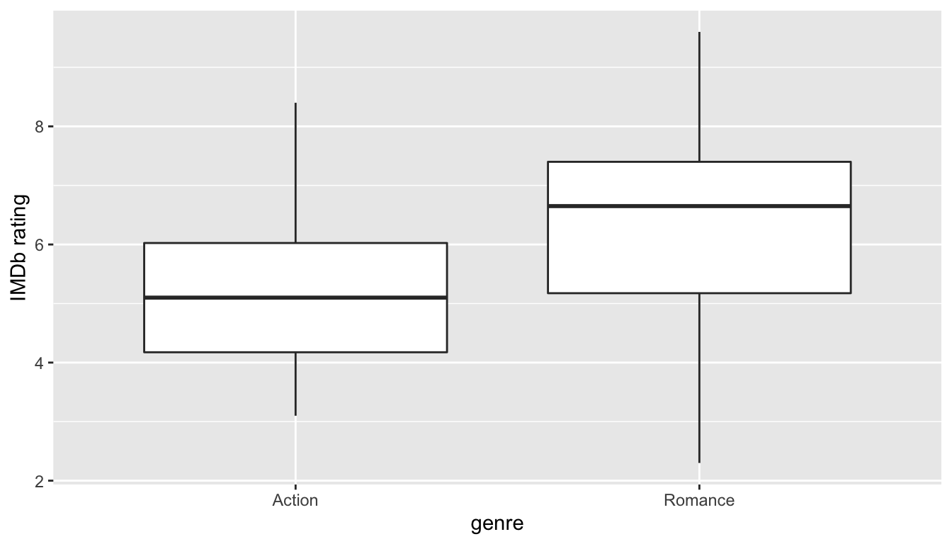
FIGURE 10.17: Boxplot of IMDb rating vs genre.
Eyeballing Figure 10.17, it appears that romance movies have a higher median rating. Do we have reason to believe however, that there is a significant difference between the mean rating for action movies compared to romance movies? It’s hard to say just based on the plots. The boxplot does show that the median sample rating is higher for romance movies. Let’s now calculate the number of movies, the mean rating, and the standard deviation split by the binary variable genre. We’ll do this using dplyr data wrangling verbs, in particular the count of each type of movies using the n() summary statistic function.
movies_sample %>%
  group_by(genre) %>%
  summarize(n = n(), mean_rating = mean(rating), std_dev = sd(rating))
# A tibble: 2 x 4
genre n mean_rating std_dev
<chr> <int> <dbl> <dbl>
1 Action 32 5.275 1.36121
2 Romance 36 6.32222 1.60963So we have 36 movies with an average rating of 6.32 stars out of 10 and n_action movies with a sample mean rating of 5.28 stars out of 10. The difference in these average ratings is thus 6.32 - 5.28 = 1.05. So there appears to be an edge of 1.05 stars in romance movie ratings. The question is however, are these results indicative of a true difference for all romance and action movies? Or could this difference be attributable to chance an sampling variation?
10.5.2 Sampling scenario
Let’s tie things in back with our sampling idea in Chapter 8. Recall our sampling bowl with \(N\) = 2400 balls. Our population parameter of interest was the population proportion of these balls that were red, denoted mathematically by \(p\). In order to estimate \(p\), we extracted a sample of 50 balls using the shovel and computed the relevant point estimate: the sample proportion of these 50 balls that were red, denoted mathematically by \(\widehat{p}\).
What is the study population here? It is all movies in the IMDb database that are either action or romance (but not both). In other words, of all 58,788 in the movies data frame included in the ggplot2movies package, our study population are those movie who are either Action or Romance. What is the sample here? It is the 68 movies included in the movies_sample dataset. Since this sample was randomly taken from the population movies, it is representative of all romance and action movies, and thus any analysis and results based on movies_sample can generalize to the entire population. Recall you studied these ideas in Section 8.3.1.
What are the relevant population parameter and point estimates? We introduce the fourth sampling scenario in Table 10.2.
| Scenario | Population parameter | Notation | Point estimate | Notation. |
|---|---|---|---|---|
| 1 | Population proportion | \(p\) | Sample proportion | \(\widehat{p}\) |
| 2 | Population mean | \(\mu\) | Sample mean | \(\overline{x}\) or \(\widehat{\mu}\) |
| 3 | Difference in population proportions | \(p_1 - p_2\) | Difference in sample proportions | \(\widehat{p}_1 - \widehat{p}_2\) |
| 4 | Difference in population means | \(\mu_1 - \mu_2\) | Difference in sample means | \(\overline{x}_1 - \overline{x}_2\) |
So whereas the sampling bowl exercise in Section 8.1 concerned proportions, the pennies exercise in Section 9.1 concerned means, the case study on whether yawning is contagious in Section 9.6 and the promotions activity in Section 10.1 concerned differences in proportions, we are now concerned with differences in means.
In other words, the population parameter of interest is the difference in population mean ratings \(\mu_a - \mu_r\), where \(\mu_a\) is the mean rating of all action movies on IMDb and similarly \(\mu_r\) is the mean rating of all romance movies. Thus, the point estimate/sample statistic of interest is the difference in sample means \(\overline{x}_a - \overline{x}_r\), where \(\overline{x}_a\) is the mean rating of the \(n_a\) = n_action movies in our sample and \(\overline{x}_r\) is the mean rating of the \(n_r\) = n_romance in our sample. Based on our earlier exploratory data analysis, our estimate \(\overline{x}_a - \overline{x}_r\) is 5.28 - 6.32 = -1.05.
So there appears to be a slight difference of -1.05 in favor of romance movies. The question is however, could this difference of -1.05 be merely due to chance and sampling variation? Or are these results indicative of a true difference in mean ratings for all romance and action movies? To answer this question, we’ll use hypothesis testing.
10.5.3 Conducting the hypothesis test
We’ll be testing
\[ \begin{aligned} H_0 &: \mu_a - \mu_r = 0\\ \text{vs } H_A&: \mu_a - \mu_r \neq 0 \end{aligned} \]
In other words, the null hypothesis \(H_0\) suggests that both romance and action movies have the same mean rating. This is the “hypothesized universe” we’ll assume is true. The alternative hypothesis \(H_A\) suggests on the other hand that there is a difference. Note that unlike the one-sided alternative we used in the promotions exercise \(H_a: p_m - p_f > 0\), we are now considering a two-sided alternative of \(H_A: \mu_a - \mu_r \neq 0\).
Furthermore, we’ll pre-specify a relatively high significance level \(\alpha\) = 0.2. By setting this value high, all things being equal there is a higher chance that the p-value will be less than this value, and thus there is a higher chance that we’ll reject the null hypothesis \(H_0\) in favor of the alternative hypothesis \(H_A\). In other words, we’ll reject the hypothesis that there is no difference in mean ratings for all action and romance movies even if we only have mild evidence.
1. specify variables
We first specify() the variables of interest in the movies_sample data frame using the rating ~ genre. This tells infer that the numerical variable rating is the outcome variable while the binary categorical variable genre is the explanatory variable. Note here however, than unlike when we are interested in proportions, since we are interested in the mean of a numerical variable, we do not need to set the success argument.
movies_sample %>%
  specify(formula = rating ~ genre)
Response: rating (numeric)
Explanatory: genre (factor)
# A tibble: 68 x 2
rating genre
<dbl> <fct>
1 3.1 Action
2 6.3 Romance
3 6.8 Romance
4 5 Romance
5 4 Action
6 4.9 Romance
7 7.4 Romance
8 3.5 Action
9 7.7 Romance
10 5.8 Romance
# … with 58 more rows2. hypothesize the null
We set the null hypothesis \(H_0: \mu_a - \mu_r = 0\) by using the hypothesize() function. Since we have two samples, the action and romance movies, we set null = "independence" as we described in Section 10.3.
movies_sample %>%
  specify(formula = rating ~ genre) %>%
  hypothesize(null = "independence")
# A tibble: 68 x 2
rating genre
<dbl> <fct>
1 3.1 Action
2 6.3 Romance
3 6.8 Romance
4 5 Romance
5 4 Action
6 4.9 Romance
7 7.4 Romance
8 3.5 Action
9 7.7 Romance
10 5.8 Romance
# … with 58 more rows3. generate replicates
After we have set the null hypothesis, we simulate observations assuming the null hypothesis is true by repeating the shuffling/permutation exercise you performed in Section 10.1. We’ll repeat this resampling of type = "permute" a total of reps = 1000 times .
movies_sample %>%
  specify(formula = rating ~ genre) %>%
  hypothesize(null = "independence") %>%
  generate(reps = 1000, type = "permute")
Response: rating (numeric)
Explanatory: genre (factor)
Null Hypothesis: independence
# A tibble: 68,000 x 3
# Groups: replicate [1,000]
rating genre replicate
<dbl> <fct> <int>
1 4.4 Action 1
2 5.2 Romance 1
3 7.3 Romance 1
4 4.9 Romance 1
5 4.100 Action 1
6 7.4 Romance 1
7 5 Romance 1
8 5.100 Action 1
9 4.4 Romance 1
10 8 Romance 1
# … with 67,990 more rowsObserve that it is at this point our output differs from the original movies_sample data frame. The resulting data frame has 68,000 rows. This is because we performed shuffles/permutations of the 68 values of genre 1000 times and thus 68,000 = 1000 \(\times\) 68.
4. calculate summary statistics
Now that we have 1000 replicated “shuffles” assuming the null hypothesis that both Action and Romance movies on average have the same ratings on IMDb, let’s calculate() the appropriate summary statistic for each of our 1000 shuffles. Recall from Section 10.2 that point estimates/summary statistics relating to hypothesis testing have a specific name: test statistics. Since the unknown population parameter of interest is the difference in population means \(\mu_{a} - \mu_{r}\), the test statistic of interest here is the difference in sample means \(\overline{x}_{a} - \overline{x}_{r}\).
For each of our 1000 shuffles, we can calculate this test statistic by setting stat = "diff in means". Furthermore, since we are interested in \(\overline{x}_{a} - \overline{x}_{r}\) and not the reverse-ordered \(\overline{x}_{r} - \overline{x}_{a}\), we set order = c("Action", "Romance"). Let’s save the result in a data frame called null_distribution_movies:
null_distribution_movies <- movies_sample %>%
  specify(formula = rating ~ genre) %>%
  hypothesize(null = "independence") %>%
  generate(reps = 1000, type = "permute") %>%
  calculate(stat = "diff in means", order = c("Action", "Romance"))
null_distribution_movies
# A tibble: 1,000 x 2
replicate stat
<int> <dbl>
1 1 -0.923264
2 2 0.363542
3 3 0.404861
4 4 0.463889
5 5 -0.610417
6 6 -0.279861
7 7 -0.262153
8 8 -0.291667
9 9 -0.114583
10 10 0.398958
# … with 990 more rowsObserve that we have 1000 values of stat, each representing one “shuffled” instance of \(\overline{x}_{a} - \overline{x}_{r}\) in a hypothesized world of no difference in movie ratings between romance and action movies.
But wait! What happened in real-life? What was the observed difference in promotions rates? In other words, what was the observed test statistic \(\overline{x}_{a} - \overline{x}_{r}\)? Recall our earlier data wrangling from earlier, this observed difference in means was 5.28 - 6.32 = -1.05. We can also achieve this using the code above but with the hypothesize() and generate() steps removed. Let’s save this in obs_diff_means
obs_diff_means <- movies_sample %>%
  specify(formula = rating ~ genre) %>%
  calculate(stat = "diff in means", order = c("Action", "Romance"))
obs_diff_means
# A tibble: 1 x 1
stat
<dbl>
1 -1.047225. visualize the p-value
Lastly to compute the p-value, we have to assess how “extreme” the observed difference in means -1.05 is by comparing it to our null distribution constructed in a hypothesized universe of no difference in movie ratings. Let’s visualize the p-value in Figure 10.18. Unlike our example in Section 10.3.1 involving promotions, since we have a two-sided alternative hypothesis \(H_A: \mu_a - \mu_r \neq 0\), we have to allow for both possibilities for “more extreme”, so we set direction = "both".
visualize(null_distribution_movies, bins = 10) +
  shade_p_value(obs_stat = obs_diff_means, direction = "both")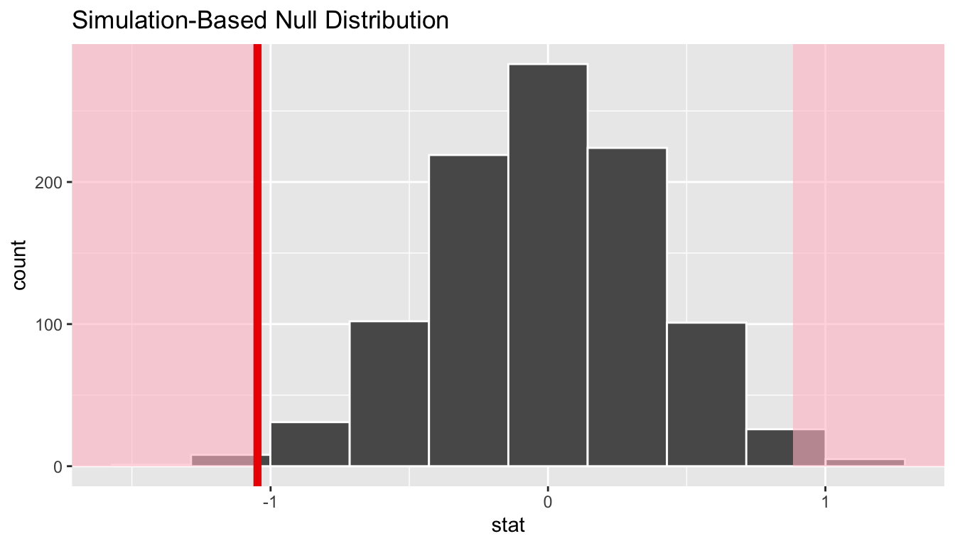
FIGURE 10.18: Null distribution, observed test statistic, and p-value.
Recall the tree elements of this plot. First, the histogram is the null distribution, which is the technical term for the sampling distribution of the “shuffled” difference in sample means \(\overline{x}_{a} - \overline{x}_{r}\) assuming \(H_0\) is true. Second, the solid line is the observed test statistic, or the difference in sample means we observed in real-life of 5.28 - 6.32 = -1.05. Notice where this solid line is located in the null distribution: it very plausible to observe such a value. Third, the shaded area is the p-value, or the probability of obtaining a test statistic just as or more extreme than the observed test statistic assuming the null hypothesis \(H_0\) is true.
What proportion of the null distribution is shaded? In other words, what is the numerical value of the p-value? We use the get_p_value() function to compute this value:
null_distribution_movies %>%
  get_p_value(obs_stat = obs_diff_means, direction = "both")
# A tibble: 1 x 1
p_value
<dbl>
1 0.016This p-value of 0.016 is very small. In other words, there is a small chance that we’d observe a sample with a difference of 5.28 - 6.32 = -1.05 in a universe where there was truly no difference in ratings. This p-value is in fact much small that our pre-specified \(\alpha\) significance level of 0.2, and thus we are very inclined to reject the null hypothesis \(H_0: \mu_a - \mu_r = 0\) in favor of the alternative hypothesis \(H_A: \mu_a - \mu_r \neq 0\). In non-statistical language, the conclusion is: the evidence in this sample of data suggests we should reject the hypothesis that there is no difference in mean IMDb ratings between romance and action movies in favor of the hypothesis that there is a difference.
Learning check
(LC10.9) Conduct the same analysis comparing action movies versus romantic movies using the median rating instead of the mean rating. What was different and what was the same?
(LC10.10) What conclusions can you make from viewing the faceted histogram looking at rating versus genre that you couldn’t see when looking at the boxplot?
(LC10.11) Describe in a paragraph how we used Allen Downey’s diagram to conclude if a statistical difference existed between mean movie ratings for action and romance movies.
(LC10.12) Why are we relatively confident that the distributions of the sample ratings will be good approximations of the population distributions of ratings for the two genres?
(LC10.13) Using the definition of “\(p\)-value”, write in words what the \(p\)-value represents for the hypothesis test above comparing the mean rating of romance to action movies.
(LC10.14) What is the value of the \(p\)-value for the hypothesis test comparing the mean rating of romance to action movies?
(LC10.15) Do the results of the hypothesis test match up with the original plots we made looking at the population of movies? Why or why not?
10.6 Conclusion
10.6.1 Theory-based hypothesis tests
Much as we did in Section 9.7.2 when we showed you a theory-based method for constructing confidence intervals that involved mathematical formulas, we now present an example of a traditional theory-based method to conduct the hypothesis test to determining if there is a statistically significant difference in the mean rating of Action versus Romance movies. This method rely on probability models, probability distributions, and a few assumptions to construct the null distribution. This is contrast to the approach we used in Section 10.3 where we relied on simulations to construct the null distribution.
These traditional theory-based methods have been used for decades mostly because researchers didn’t have access to computers that could run thousands of simulations quickly and efficiently. Now that computing power is much cheaper and much more accessible, simulation-based methods are much more feasible, however many fields and researchers continue to use theory-based methods. Hence we make it a point to include discussion about them here.
As we’ll show in this section, any theory-based method is ultimately an approximation to the simulation-based method. The theory-based method we’ll focus on is known as the two-sample \(t\)-test for testing differences in sample means where the test statistic of interest isn’t the difference in sample means \(\overline{x}_1 - \overline{x}_2\), but the related two-sample \(t\)-statistic. The data we’ll use will once again be the movies_sample data of action and romance movies where the outcome variable of interest are movies’ IMDb ratings.
Two-sample t-statistic
A common task in statistics is the process of “standardizing a variable.” By standardizing different variables, we can make them more comparable. For example, say you are interested in studying the distribution of temperature recordings from Portland, Oregon, USA with temperature recordings in Montreal, Quebec, Canada. Given that the US temperatures are generally recorded in degrees Fahrenheit and Canadian temperatures are generally recorded in degrees Celsius, how can we make them comparable? On the one hand, we could convert the degrees Fahrenheit into Celsius, or vice versa. On the other, we could convert them both to a common “standardized” scale.
One common method for standardization from probability theory is computing the \(z\)-score:
\[Z = \frac{x - \mu}{\sigma}\]
where \(x\) represent the value of a variable, \(\mu\) represents the mean of the variable, and \(\sigma\) represents the standard deviation of the variable. You first subtract the mean \(\mu\) from each value of \(x\) and then divide \(x - \mu\) by the standard deviation \(\sigma\). These operations will have the effect of “re-centering” your variable around 0 and “re-scaling” your variable \(x\) to have what are known as “standard units.”
Thus, if your variable has 10 elements, each one has a corresponding \(z\)-score that gives how many standard deviations away that value is from its mean. \(z\)-scores are normally distributed with mean 0 and standard deviation 1. Such a curve is called a “\(z\)-distribution” as well a “standard normal” curve and they have the common, bell-shaped pattern from Figure 10.19.
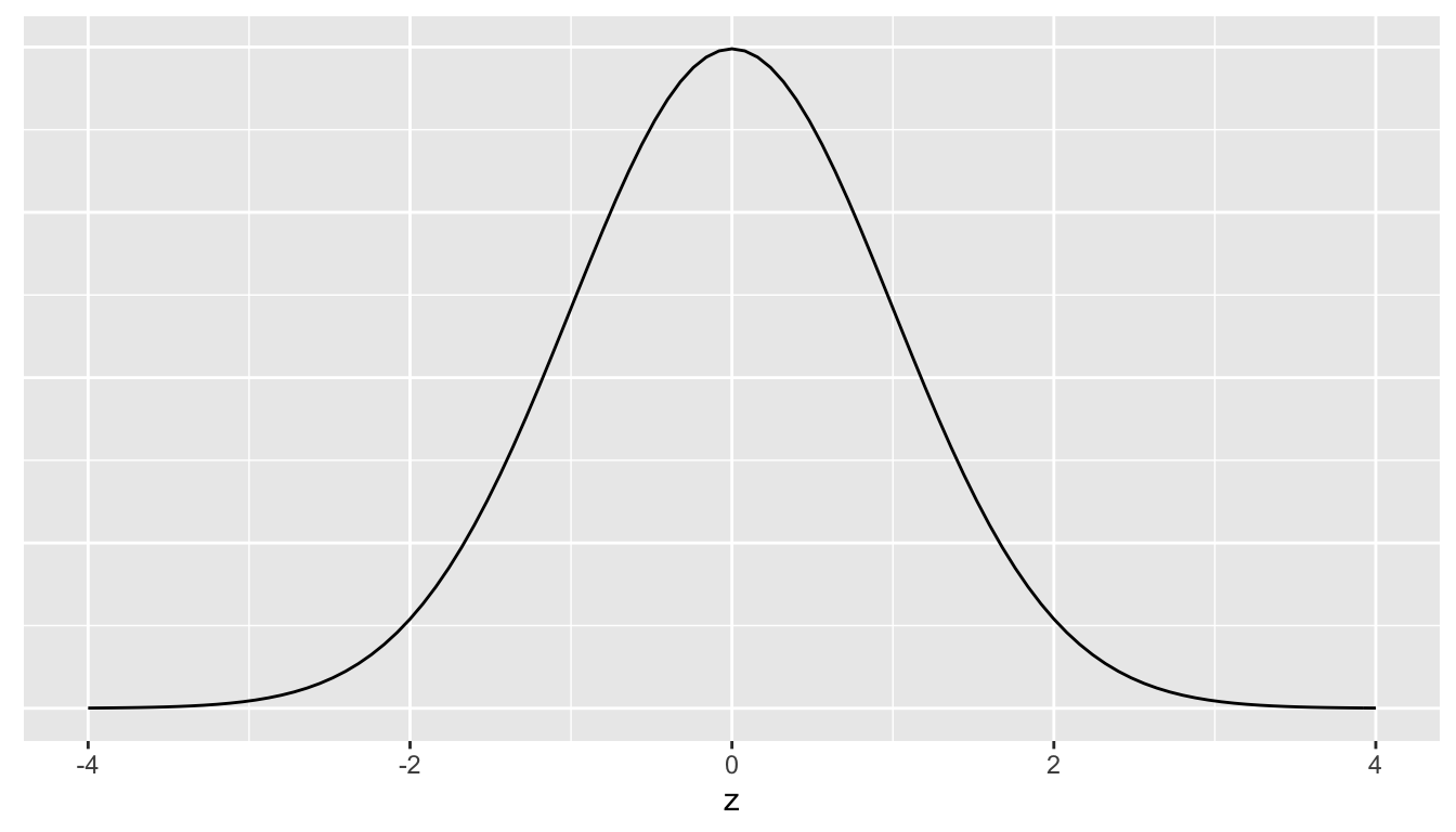
FIGURE 10.19: Standard normal z curve.
Bringing these back to the difference of sample mean ratings \(\overline{x}_a - \overline{x}_r\) of action versus romance movies, how would we standardize this variable? By once again subtracting it’s mean and standard deviation. Building on ideas from Section 8.3.3 that: 1) If the sampling was done in representative fashion, then the sampling distribution of \(\overline{x}_a - \overline{x}_r\) would be centered at the true population parameter: the difference in population means \(\mu_a - \mu_r\). 2) The standard deviation of point estimates like \(\overline{x}_a - \overline{x}_r\) have a special name: the standard error
Applying these ideas, we present the two-sample \(t\)-statistic:
\[t = \dfrac{ (\bar{x}_a - \bar{x}_r) - (\mu_a - \mu_r)}{ \text{SE}_{\bar{x}_a - \bar{x}_r} } = \dfrac{ (\bar{x}_a - \bar{x}_r) - (\mu_a - \mu_r)}{ \sqrt{\dfrac{{s_a}^2}{n_a} + \dfrac{{s_r}^2}{n_r}} }\]
Oofda! There is a lot to try to unpack here! Let’s go slowly. In the numerator \(\bar{x}_a-\bar{x}_r\) is the difference in sample means while \(\mu_a - \mu_r\) is the difference in population means. In the denominator \(s_a\) and \(s_r\) are the sample standard deviations of the action and romance movies in our sample movies_sample while \(n_a\) and \(n_r\) is the sample sizes of the action and romance movies. Putting the above together gives us the standard error \(\text{SE}_{\bar{x}_a - \bar{x}_r}\).
Look closely at the formula for \(\text{SE}_{\bar{x}_a - \bar{x}_r}\) in the denominator: the sample sizes \(n_a\) and \(n_r\) are there. So as the sample sizes increase, the standard error goes down. We’ve seen this concept numerous times now, in particular in our simulations using the three shovels with \(n\) = 25, 50, and 100 slots in Figure 8.15 and in Section 9.5.3 where we studied the effect of using larger sample sizes on the widths of confidence intervals.
So how can we use the two-sample \(t\)-statistic as a test statistic in our hypothesis test? First, assuming the null hypothesis \(H_0: \mu_a - \mu_r = 0\) is true, the right-hand side of the numerator becomes 0. Second, similarly to how the Central Limit Theorem from Section 8.5.2 states that sample means follow a normal distribution, it can be mathematically proven that \(T\) follows a \(t\) distribution with degrees of freedom “roughly equal” to \(df = n_a + n_r - 2\). We display three examples of \(t\)-distributions in Figure 10.20 along with the standard normal \(z\) curve.
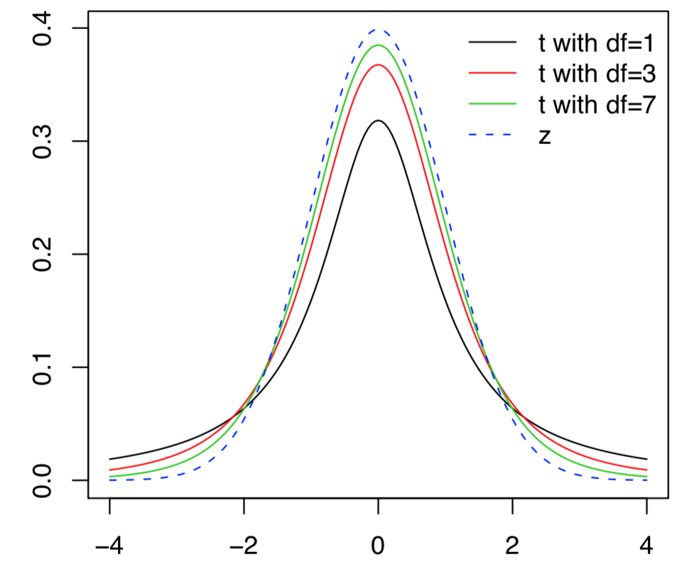
FIGURE 10.20: Examples of t-distributions and the z curve.
Begin by looking at the center of the plot at 0 on the horizontal axis. Note that the bottom curve corresponds to 1 degrees of freedom, the curve above it is for 3 degrees of freedom, the curve above that is for 10 degrees of freedom, and lastly the dashed curve is the standard normal \(z\) curve.
Observe that all four curves have a bell shape, are centered at 0, and that as the degrees of freedom increase, the \(t\)-distribution resembles the standard normal \(z\) curve. The “degrees of freedom” can be thought of measuring how different the \(t\) distribution will be compared to a normal distribution. The “roughly equal” above indicates that the equation \(df = n_a + n_r - 2\) is a “good enough” approximation to the true degrees of freedom. The true formula is a bit more complicated than this simple expression, but we’ve found the formula to be beyond the scope of this book since it does little to build the intuition of the \(t\)-test. The message to remain however is that small sample sizes lead to small degrees of freedom and thus lead to \(t\) distributions that are slightly different than the \(z\) curve: they have more values in the tails of their distributions. On the other hand, large sample sizes lead to large degrees of freedom and thus lead to \(t\) distributions that closely align with the standard normal \(z\)-curve.
So, assuming the null hypothesis \(H_0\) is true, our formula for the test statistic simplifies a bit:
\[t = \dfrac{ (\bar{x}_a - \bar{x}_r) - 0}{ \sqrt{\dfrac{{s_a}^2}{n_a} + \dfrac{{s_r}^2}{n_r}} } = \dfrac{ \bar{x}_a - \bar{x}_r}{ \sqrt{\dfrac{{s_a}^2}{n_a} + \dfrac{{s_r}^2}{n_r}} }\]
Recall the summary statistics we computed during our exploratory data analysis in Section 10.5.1.
movies_sample %>%
  group_by(genre) %>%
  summarize(n = n(), mean_rating = mean(rating), std_dev = sd(rating))
# A tibble: 2 x 4
genre n mean_rating std_dev
<chr> <int> <dbl> <dbl>
1 Action 32 5.275 1.36121
2 Romance 36 6.32222 1.60963Using these values, we can show that the observed two-sample \(t\)-test statistic is -2.906. Great! How can we compute the p-value using this theory-based test statistic? We need to compare it to a null distribution, which we construct next.
Null distribution
Let’s revisit the null distribution for the test statistic \(\bar{x}_a - \bar{x}_r\) we constructed in Section 10.5.
# Construct null distribution of xbar_a - xbar_m:
null_distribution_movies <- movies_sample %>%
  specify(formula = rating ~ genre) %>%
  hypothesize(null = "independence") %>%
  generate(reps = 1000, type = "permute") %>%
  calculate(stat = "diff in means", order = c("Action", "Romance"))
# Visualize:
visualize(null_distribution_movies, bins = 10)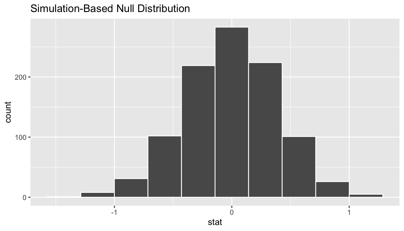
FIGURE 10.21: Null distribution using difference in means.
The infer package also includes some built-in theory-based test statistics as well. So instead of calculating the test statistic of interest as the "diff in means" \(\bar{x}_a - \bar{x}_r\), we can calculate the above defined \(t\)-statistic by setting stat = "t":
# Construct null distribution of t:
null_distribution_movies_t <- movies_sample %>%
  specify(formula = rating ~ genre) %>%
  hypothesize(null = "independence") %>%
  generate(reps = 1000, type = "permute") %>%
  # Notice we switched stat from "diff in means" to "t"
  calculate(stat = "t", order = c("Action", "Romance"))
# Visualize:
visualize(null_distribution_movies_t, bins = 10)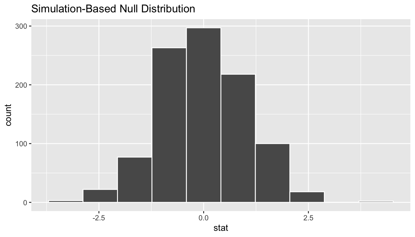
FIGURE 10.22: Null distribution using t-statistic.
Observe that while the shape of the stat = "diff in means" null distribution is the similar to stat = "t" null distribution, the scale on the x-axis has changed with the \(t\) values having less spread than the difference in means.
However, a traditional theory-based \(t\)-test doesn’t look at the simulated histogram in null_distribution_movies_t, but instead it looks at the \(t\)-distribution curve with degrees of freedom equal to roughly 65.85. This calculation is based on the complicated formula referenced above which we approximated with \(df = n_a + n_r - 2\) = 32 + 36 - 2 = 66. We overlay this \(t\)-distribution curve over the top of our simulated \(t\)-statistics using the method = "both" argument in visualize().
visualize(null_distribution_movies_t, bins = 10, method = "both")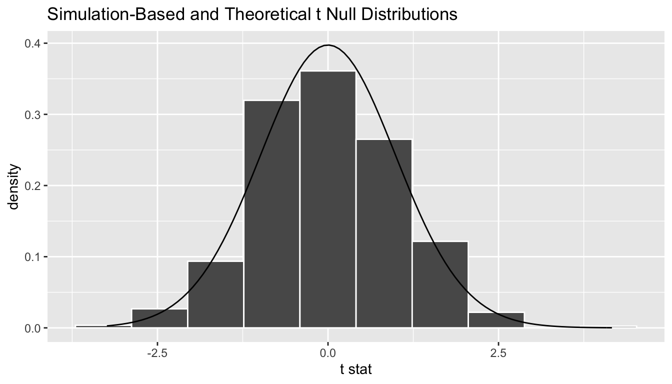
FIGURE 10.23: Null distribution using t-statistic and t-distribution.
Observe that the curve does a good job of approximating the histogram here. To calculate the \(p\)-value in this case, we need to figure out how much of the total area under the \(t\)-distribution curve is at our observed \(t\)-statistic or is “more extreme.” Since our alternative hypothesis \(H_A: \mu_a - \mu_r \neq 0\) is a two-sided alternative, we need add up the areas at both tails.
We first compute the observed two-sample \(t\)-statistic using infer verbs:
obs_two_sample_t <- movies_sample %>%
  specify(formula = rating ~ genre) %>%
  calculate(stat = "t", order = c("Action", "Romance"))
obs_two_sample_t
# A tibble: 1 x 1
stat
<dbl>
1 -2.90589So we are interested in finding the percentage of values that are at or above obs_two_sample_t = -2.906 or at or below -obs_two_sample_t = 2.906. We do this using the shade_p_value() function with the direction argument set to "both":
visualize(null_distribution_movies_t, method = "both") +
  shade_p_value(obs_stat = obs_two_sample_t, direction = "both")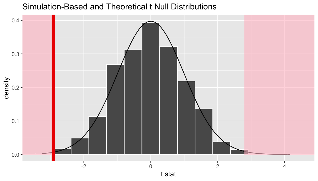
FIGURE 10.24: Null distribution using t-statistic and t-distribution with p-value shaded.
What is the p-value? We apply get_p_value() to our null distribution saved in null_distribution_movies_t:
null_distribution_movies_t %>%
  get_p_value(obs_stat = obs_two_sample_t, direction = "both")
# A tibble: 1 x 1
p_value
<dbl>
1 0.004However, to be able to use the t-test and other such theoretical methods, there are always a few conditions to check. The infer package does not automatically check these conditions, hence the warning message we received above. These conditions are necessary so that the underlying mathematical theory holds. In order for the results of our two-sample \(t\)-test to be valid, three conditions must be met:
- Nearly normal populations or large sample sizes. A general rule of thumb that works in many (but not all) situations is that \(n\) should be greater than 30.
- Both samples are selected independently of each other.
- All observations are independent from each other.
Let’s see if these conditions hold for our movies_sample data:
- This is met since \(n_a\) = 32 and \(n_r\) = 36 are both larger than 30, satisfying our rule of thumb.
- This is met since we sampled the action and romance movies at random and in an unbiased fashion from the database of all IMDb movies.
- Unfortunately, we don’t know how IMDb computes the ratings. For example, if the same person rated multiple movies, then those observations would be related and hence not independent.
Assuming all three conditions are met, we can be reasonably certain that the theory-based \(t\)-test results are valid. If any of the conditions were not met, we couldn’t put as much faith into any conclusions.
10.6.2 When inference is not needed
We’ve now walked through a several different examples of how to use the infer package to perform statistical inference: construct confidence intervals and conduct hypothesis tests. For each of these examples, we made it a point to always perform an exploratory data analysis (EDA) first, specifically using data visualization via ggplot2 and data wrangling via dplyr beforehand. We highly encourage you to always do the same. As a beginner to statistics, EDA helps you develop intuition as to what statistical methods like confidence intervals and hypothesis tests can tell us. Even as a seasoned practitioner of statistics, EDA helps guide your statistical investigations. In particular, is statistical inference even needed?
Let’s consider an example. Say we’re interested in the following question: Of flights leaving a New York City airport, are Hawaiian Airlines flights in the air for longer than Alaska Airlines flights? Furthermore, let’s assume that 2013 flights are a representative sample of all such flights and thus we can use the data in the flights data frame in the nycflights13 package we introduced in Section 2.4. Let’s filter this data frame to only consider Hawaiian HA and Alaska AS using their carrier codes as listed in the airlines data frame.
flights_sample <- flights %>%
  filter(carrier %in% c("HA", "AS"))
There are two possible statistical inference methods we could use to answer such questions. First, we could construct a 95% confidence interval for the difference in population means \(\mu_{HA} - \mu_{AS}\), where \(\mu_{HA}\) is the mean air time of all Hawaiian Airlines flights and \(\mu_{AS}\) is the mean air time of all Alaska Airlines flights. We could then check if the entirety of the interval is greater than 0, suggesting \(\mu_{HA} - \mu_{AS} > 0\) i.e. \(\mu_{HA} > \mu_{AS}\). Second, we could perform a hypothesis test of the null hypothesis \(H_0: \mu_{HA} - \mu_{AS} = 0\) versus the alternative hypothesis \(H_A: \mu_{HA} - \mu_{AS} > 0\).
However, let’s first construct an exploratory visualization as we suggest. Since air_time is numerical and carrier is categorical, a boxplot can display the relationship between these two variables, which we display in Figure 10.25
ggplot(data = flights_sample, mapping = aes(x = carrier, y = air_time)) +
  geom_boxplot() +
  labs(x = "Carrier", y = "Air Time")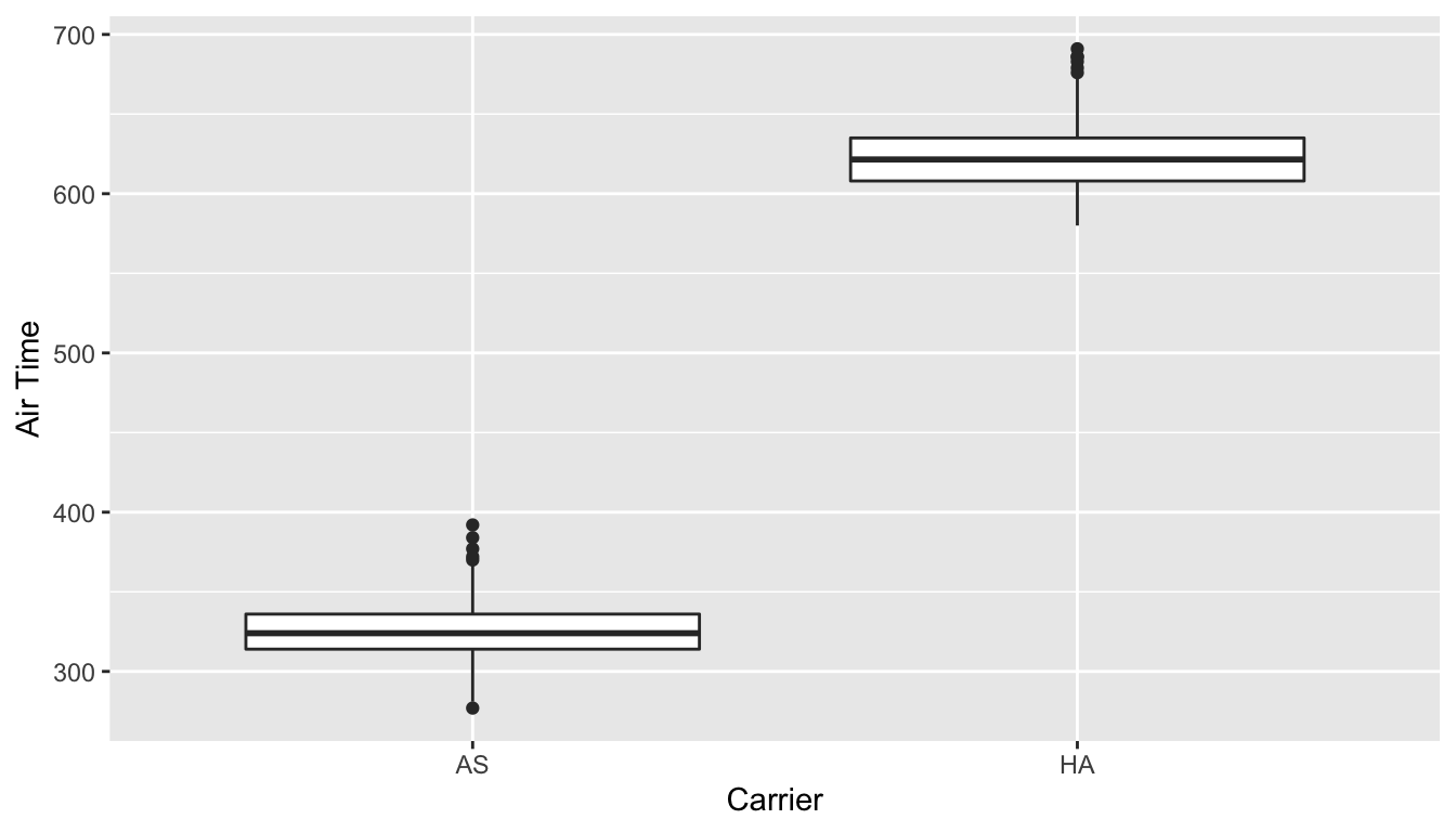
FIGURE 10.25: Air time for Hawaiian and Alaska Airlines flights departing NYC in 2013.
This is what we like to call “you don’t need no PhD in statistics” moments. You don’t need to be an expert in statistics to know that Alaska Airlines and Hawaiian Airlines have significantly different air times. The two boxes don’t even overlap! Constructing a confidence interval or conducting a hypothesis test would frankly not provide much more information.
In our example, why do we observe such a clear cut difference between these two airlines? Let’s delve a little deeper using data wrangling. Let’s first group by the rows of flights_sample by not only carrier but also destination dest. Subsequently we’ll compute two summary statistics: the number of observations using n() and the mean airtime:
flights_sample %>%
  group_by(carrier, dest) %>%
  summarize(n = n(), mean_time = mean(air_time, na.rm =TRUE))
# A tibble: 2 x 4
# Groups: carrier [2]
carrier dest n mean_time
<chr> <chr> <int> <dbl>
1 AS SEA 714 325.618
2 HA HNL 342 623.088It turns out that Alaska only flies to SEA (Seattle) from New York City (NYC) while Hawaiian only flies to HNL (Honolulu) from NYC. Given the clear difference in distance from New York City to Seattle versus New York City to Honolulu, it is not surprising that we observe such different air times in flights.
This is a clear example of not needing to do anything more than some simple exploratory data analysis with data visualization and descriptive statistics to get an appropriate inferential conclusion. This is why we highly recommend you perform an EDA of any sample data first before going to the trouble of running statistical methods like confidence intervals and hypothesis testing.
Learning check
(LC10.16) Could we make the same type of immediate conclusion that SFO had a statistically greater air_time if, say, its corresponding standard deviation was 200 minutes? What about 100 minutes? Explain.
10.6.3 Problems with p-values
On top of the many common misunderstandings about hypothesis testing and p-values we listed in Section 10.4, another unfortunate consequence of the expanded use of p-values and hypothesis testing is a phenomenon known as “p-hacking.” p-hacking is act of “cherry-picking” only results that are “statistically significant” while dismissing those that aren’t, even if at the expense of the scientific ideas. There are lots of articles and much has been written recently about misunderstandings and the problems with p-values that we encourage readers to check out and to ponder on. Here are just a few:
- Misunderstandings of \(p\)-values
- What a nerdy debate about p-values shows about science - and how to fix it
- Statisticians issue warning over misuse of \(P\) values
- You Can’t Trust What You Read About Nutrition
- A Litany of Problems with p-values
In fact, the American Statistical Association put out a statement in 2016 titled “The ASA Statement on p-Values: Context, Process, and Purpose” with six principles underlying the proper use and interpretation of the p-value. The ASA released this guidance on p-values to improve the conduct and interpretation of quantitative science and inform the growing emphasis on reproducibility of science research.
We as authors much prefer the use of confidence intervals for statistical inference, as they are in our opinions much less prone to misinterpretations. However, many fields still use \(p\)-values exclusively for statistical inference and thus we still included them in our text. We also encourage to learn more about “p-hacking” and its implication for science.
10.6.4 Additional resources
An R script file of all R code used in this chapter is available here.
If you want to more examples of the infer workflow to construct confidence intervals, we suggest you check out the infer package homepage, in particular, a series of example analyses available at https://infer.netlify.com/articles/.
10.6.5 What’s to come
We conclude by showing the infer pipeline diagram for hypothesis testing.
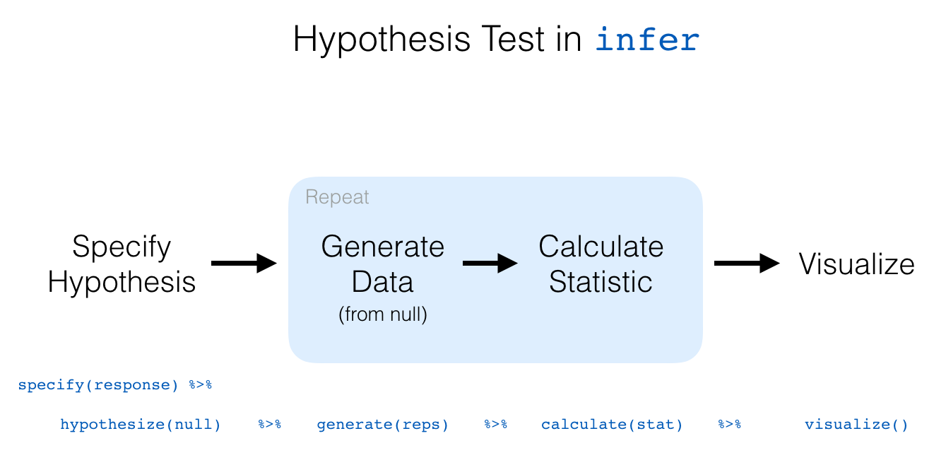
FIGURE 10.26: infer package workflow for hypothesis testing.
In Chapter 11, we’ll revisit the regression models we studied in Chapters 6 on basic regression and 7. Armed with our understanding of confidence intervals from Chapter 9 and hypothesis tests from this chapter, we’ll study inference for regression. For example, recall Table 6.2, where we displayed the regression table corresponding to our regression model for teaching score as a function of beauty score.
# Fit regression model:
score_model <- lm(score ~ bty_avg, data = evals)
# Get regression table:
get_regression_table(score_model)| term | estimate | std_error | statistic | p_value | lower_ci | upper_ci |
|---|---|---|---|---|---|---|
| intercept | 3.880 | 0.076 | 50.96 | 0 | 3.731 | 4.030 |
| bty_avg | 0.067 | 0.016 | 4.09 | 0 | 0.035 | 0.099 |
We previously saw in Section 6.1.2 that the values in the estimate column are the fitted intercept \(b_0\) and fitted slope for beauty score \(b_1\). In Chapter 11, we’ll unpack the remaining columns: std_error which is the standard error, statistic which is the observed standardized test statistic to compute the p_value, and the 95% confidence intervals as given by lower_ci and upper_ci.