
Chapter 4 Data Importing & “Tidy” Data
In Subsection 1.2.1, we introduced the concept of a data frame in R: a rectangular spreadsheet-like representation of data where the rows correspond to observations and the columns correspond to variables describing each observation. In Section 1.4, we started exploring our first data frame: the flights data frame included in the nycflights13 package. In Chapter 2 we created visualizations based on the data included in flights and other data frames such as weather. In Chapter 3, we learned how to wrangle data, in other words take existing data frames and transform/modify them to suit our ends.
In this final chapter of the “Data Science via the tidyverse” portion of the book, we extend some of these ideas by discussing a type of data formatting called “tidy” data. You will see that having data stored in “tidy” format is about more than what the everyday definition of the term “tidy” might suggest: having your data “neatly organized.” Instead, we define the term “tidy” as it’s used by data scientists who use R, outlining a set of rules by which data is saved.
Knowledge of this type of data formatting was not necessary for our treatment of data visualization in Chapter 2 and data wrangling in Chapter 3. This is because all the data used was already in “tidy” format. In this chapter, we’ll now see that this format is essential to using the tools we covered up until now. Furthermore, it will also be useful for all subsequent chapters in this book when we cover regression and statistical inference. First however, we’ll show you how to import spreadsheet data in R.
Needed packages
Let’s load all the packages needed for this chapter (this assumes you’ve already installed them). If needed, read Section 1.3 for information on how to install and load R packages.
4.1 Importing data
Up to this point, we’ve almost entirely used data stored inside of an R package. Say instead you have your own data saved on your computer or somewhere online? How can you analyze this data in R? Spreadsheet data is often saved in one of the following three formats.
First, a Comma Separated Values .csv file. You can think of a .csv file as a bare-bones spreadsheet where:
- Each line in the file corresponds to one row of data/one observation.
- Values for each line are separated with commas. In other words, the values of different variables are separated by commas.
- The first line is often, but not always, a header row indicating the names of the columns/variables.
Second, an Excel .xlsx spreadsheet file. This format is based on Microsoft’s proprietary Excel software. As opposed to a bare-bones .csv file, an .xlsx Excel files contains a lot of meta-data, or in other words, data about data. Recall we saw a previous example of meta-data in Section 3.4 when adding “group structure” meta-data to a data frame by using the group_by() verb. Some examples of Excel spreadsheet meta-data include the use of bold and italic fonts, colored cells, different column widths, and formula macros.
Third, a Google Sheets file, which is a “cloud” or online-based way to work with a spreadsheet. Google Sheets allows you to download your data in both comma separated values .csv and Excel .xlsx formats. One way to import Google Sheets data is to go to the Google Sheets menu bar -> File -> Download as -> Select “Microsoft Excel” or “Comma-separated values” and then load that data into R.
We’ll cover two methods for importing .csv and .xlsx spreadsheet data in R: one using the console and the other using RStudio’s graphical user interface, abbreviated by “GUI.”
4.1.1 Using the console
First, let’s import a Comma Separated Values .csv file that exists on the internet. The .csv file dem_score.csv contains ratings of the level of democracy in different countries spanning 1952 to 1992 and is accessible at https://moderndive.com/data/dem_score.csv. Let’s use the read_csv() function from the readr (Wickham, Hester, and Francois 2018) package to read it off the web, import it into R, and save it in a data frame called dem_score.
# A tibble: 96 x 10
   country    `1952` `1957` `1962` `1967` `1972` `1977` `1982` `1987` `1992`
   <chr>       <dbl>  <dbl>  <dbl>  <dbl>  <dbl>  <dbl>  <dbl>  <dbl>  <dbl>
 1 Albania        -9     -9     -9     -9     -9     -9     -9     -9      5
 2 Argentina      -9     -1     -1     -9     -9     -9     -8      8      7
 3 Armenia        -9     -7     -7     -7     -7     -7     -7     -7      7
 4 Australia      10     10     10     10     10     10     10     10     10
 5 Austria        10     10     10     10     10     10     10     10     10
 6 Azerbaijan     -9     -7     -7     -7     -7     -7     -7     -7      1
 7 Belarus        -9     -7     -7     -7     -7     -7     -7     -7      7
 8 Belgium        10     10     10     10     10     10     10     10     10
 9 Bhutan        -10    -10    -10    -10    -10    -10    -10    -10    -10
10 Bolivia        -4     -3     -3     -4     -7     -7      8      9      9
# … with 86 more rows
In this dem_score data frame, the minimum value of -10 corresponds to a highly autocratic nation whereas a value of 10 corresponds to a highly democratic nation. Note also that backticks surround the different variable names. Variable names in R by default are not allowed to start with a number nor include spaces, but we can get around this fact by surrounding the column name with backticks. We’ll revisit the dem_score data frame in a case study in the upcoming Section 4.3.
Note that the read_csv() function included in the readr package is different than the read.csv() function that comes installed with R. While the difference in the names might seem trivial (an _ instead of a .), the read_csv() function is, in our opinion, easier to use since it can more easily read data off the web and generally imports data at a much faster speed. Furthermore, the read_csv() function included in the readr saves data frames as tibbles by default. tibble is short for “tidy table”; we’ll discuss what it makes for data to be “tidy” shortly in the upcoming Section 4.2.
4.1.2 Using RStudio’s interface
Let’s read in the exact same data, but this time from an Excel file saved on your computer. Furthermore, we’ll do this using RStudio’s graphical interface instead of running read_csv() in the console. First, download the Excel file dem_score.xlsx by going to https://moderndive.com/data/dem_score.xlsx, then
- Go to the Files pane of RStudio.
- Navigate to the directory (i.e. folder on your computer) where the downloaded
dem_score.xlsxExcel file is saved. For example, this might be in your Downloads folder. - Click on
dem_score.xlsx. - Click “Import Dataset…”
At this point you should see a screen pop-up like in Figure 4.1. After clicking on the “Import” button on the bottom right of Figure 4.1, RStudio will save this spreadsheet’s data in a data frame called dem_score and display its contents in the spreadsheet viewer.
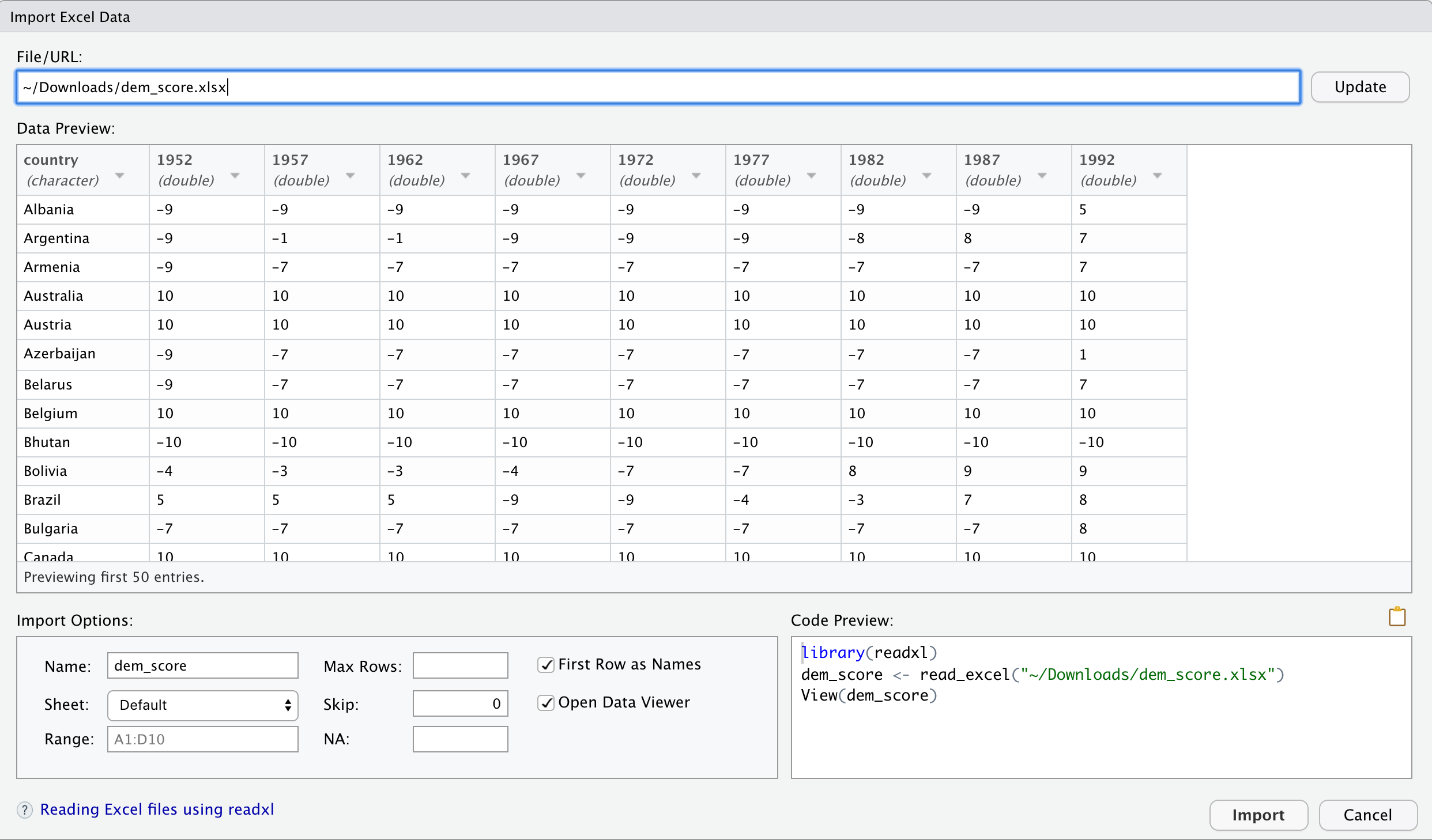
FIGURE 4.1: Importing an Excel file to R.
Furthermore, note the “Code Preview” block in the bottom right of Figure 4.1. You can copy and paste this code to reload your data again later automatically, instead of repeating this manual point-and-click process.
4.2 Tidy data
Let’s now switch gears and learn about the concept of “tidy” data format with a motivating example from the fivethirtyeight package. The fivethirtyeight package (Kim, Ismay, and Chunn 2019) provides access to the datasets used in many articles published by data journalism website FiveThirtyEight.com. For a complete list of all 127 data sets included in the fivethirtyeight package, check out the package webpage by going to https://fivethirtyeight-r.netlify.com/articles/fivethirtyeight.html.
Let’s focus our attention on the drinks data frame:
# A tibble: 193 x 5
   country      beer_servings spirit_servings wine_servings total_litres_of_pur…
   <chr>                <int>           <int>         <int>                <dbl>
 1 Afghanistan              0               0             0                  0
 2 Albania                 89             132            54                  4.9
 3 Algeria                 25               0            14                  0.7
 4 Andorra                245             138           312                 12.4
 5 Angola                 217              57            45                  5.9
 6 Antigua & B…           102             128            45                  4.9
 7 Argentina              193              25           221                  8.3
 8 Armenia                 21             179            11                  3.8
 9 Australia              261              72           212                 10.4
10 Austria                279              75           191                  9.7
# … with 183 more rows
After reading the help file by running ?drinks, you’ll see that drinks is a data frame containing results from a survey of the average number of servings of beer, spirits, and wine consumed in 193 countries. This data was originally reported on FiveThirtyEight.com in Mona Chalabi’s article “Dear Mona Followup: Where Do People Drink The Most Beer, Wine And Spirits?”
Let’s apply some of the data wrangling verbs we learned in Chapter 3 on the drinks data frame:
filter()thedrinksdata frame to only consider 4 countries: the United States, China, Italy, and Saudi Arabia thenselect()all columns excepttotal_litres_of_pure_alcoholby using the-sign, thenrename()the variablesbeer_servings,spirit_servings, andwine_servingstobeer,spirit, andwinerespectively.
and save the resulting data frame in drinks_smaller:
drinks_smaller <- drinks %>%
  filter(country %in% c("USA", "China", "Italy", "Saudi Arabia")) %>%
  select(-total_litres_of_pure_alcohol) %>%
  rename(beer = beer_servings, spirit = spirit_servings, wine = wine_servings)
drinks_smaller
# A tibble: 4 x 4
country beer spirit wine
<chr> <int> <int> <int>
1 China 79 192 8
2 Italy 85 42 237
3 Saudi Arabia 0 5 0
4 USA 249 158 84Let’s now ask ourselves a question: “Using the drinks_smaller data frame, how would we create the side-by-side (i.e. dodged) barplot in Figure 4.2?” Recall we saw barplots displaying two categorical variables in Section 2.8.3.
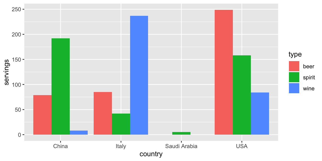
FIGURE 4.2: Comparing alcohol consumption in 4 countries.
Let’s break down the Grammar of Graphics we introduced in Section 2.1:
- The categorical variable
countrywith four levels (China, Italy, Saudi Arabia, USA) would have to be mapped to thex-position of the bars. - The numerical variable
servingswould have to be mapped to they-position of the bars (the height of the bars). - The categorical variable
typewith three levels (beer, spirit, wine) would have to be mapped to thefillcolor of the bars.
Observe however that drinks_smaller has three separate variables beer, spirit, and wine. In order to use the ggplot() function to recreate the barplot in Figure 4.2 however, we need a single variable type with three possible values: beer, spirit, and wine. We could then map this type variable to the fill aesthetic of our plot. In other words, to recreate the barplot in Figure 4.2, our data frame would have to look like this:
# A tibble: 12 x 3
country type servings
<chr> <chr> <int>
1 China beer 79
2 Italy beer 85
3 Saudi Arabia beer 0
4 USA beer 249
5 China spirit 192
6 Italy spirit 42
7 Saudi Arabia spirit 5
8 USA spirit 158
9 China wine 8
10 Italy wine 237
11 Saudi Arabia wine 0
12 USA wine 84Let’s compare drinks_smaller_tidy to the drinks_smaller data frame from earlier:
# A tibble: 4 x 4
  country       beer spirit  wine
  <chr>        <int>  <int> <int>
1 China           79    192     8
2 Italy           85     42   237
3 Saudi Arabia     0      5     0
4 USA 249 158 84Observe that while drinks_smaller and drinks_smaller_tidy are both rectangular in shape and contain the same 12 numerical values (3 alcohol types \(\times\) 4 countries), they are formatted differently. drinks_smaller is formatted in what’s known as “wide” format, whereas drinks_smaller_tidy is formatted in what’s known as “long/narrow” format.
In the context of doing data science in R, long/narrow format is also known as “tidy” format. In order to use the ggplot2 and dplyr packages for data visualization and data wrangling, your input data frames must be in “tidy” format. Thus, all non-“tidy” data must be converted to “tidy” format first.
Before we show you how to convert non-“tidy” data frames like drinks_smaller to “tidy” data frames like drinks_smaller_tidy, let’s go over the explicit definition of “tidy” data.
4.2.1 Definition of “tidy” data
You have surely heard the word “tidy” in your life:
- “Tidy up your room!”
- “Please write your homework in a tidy way so that it is easier to grade and to provide feedback.”
- Marie Kondo’s best-selling book The Life-Changing Magic of Tidying Up: The Japanese Art of Decluttering and Organizing and Netflix TV series Tidying Up with Marie Kondo.
- “I am not by any stretch of the imagination a tidy person, and the piles of unread books on the coffee table and by my bed have a plaintive, pleading quality to me - ‘Read me, please!’” - Linda Grant
What does it mean for your data to be “tidy”? While “tidy” has a clear English meaning of “organized”, “tidy” in the context of data science using R means that your data follows a standardized format. We will follow Hadley Wickham’s definition of tidy data (Wickham 2014).
A dataset is a collection of values, usually either numbers (if quantitative) or strings AKA text data (if qualitative/categorical). Values are organised in two ways. Every value belongs to a variable and an observation. A variable contains all values that measure the same underlying attribute (like height, temperature, duration) across units. An observation contains all values measured on the same unit (like a person, or a day, or a city) across attributes.
“Tidy” data is a standard way of mapping the meaning of a dataset to its structure. A dataset is messy or tidy depending on how rows, columns and tables are matched up with observations, variables and types. In tidy data:
- Each variable forms a column.
- Each observation forms a row.
- Each type of observational unit forms a table.
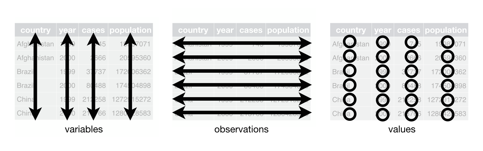
FIGURE 4.3: Tidy data graphic from R for Data Science.
For example, say you have the following table of stock prices in Table 4.1:
| Date | Boeing stock price | Amazon stock price | Google stock price |
|---|---|---|---|
| 2009-01-01 | $173.55 | $174.90 | $174.34 |
| 2009-01-02 | $172.61 | $171.42 | $170.04 |
Although the data are neatly organized in a rectangular spreadsheet-type format, they do not follow the definition of data in “tidy” format. While there are three variables corresponding to three unique pieces of information (date, stock name, and stock price), there are not three columns. In “tidy” data format each variable should be its own column, as shown in Table 4.2. Notice that both tables present the same information, but in different formats.
| Date | Stock name | Stock price |
|---|---|---|
| 2009-01-01 | Boeing | $173.55 |
| 2009-01-02 | Boeing | $172.61 |
| 2009-01-01 | Amazon | $174.90 |
| 2009-01-02 | Amazon | $171.42 |
| 2009-01-01 | $174.34 | |
| 2009-01-02 | $170.04 |
Now we have the requisite three columns Date, Stock Name, and Stock Price. On the other hand, consider the data in Table 4.3.
| Date | Boeing Price | Weather |
|---|---|---|
| 2009-01-01 | $173.55 | Sunny |
| 2009-01-02 | $172.61 | Overcast |
In this case, even though the variable “Boeing Price” occurs just like in our non-“tidy” data in Table 4.1, the data is “tidy” since there are three variables corresponding to three unique pieces of information: Date, Boeing stock price, and the weather that particular day.
Learning check
(LC4.1) What are common characteristics of “tidy” data frames?
(LC4.2) What makes “tidy” data frames useful for organizing data?
4.2.2 Converting to “tidy” data
In this book so far, you’ve only seen data frames that were already in “tidy” format. Furthermore, for the rest of this book, you’ll mostly only see data frames that are already in “tidy” format as well. This is not always the case however with all datasets in the world. If your original data frame is in wide i.e. non-“tidy” format and you would like to use the ggplot2 or dplyr packages, you will first have to convert it “tidy” format using the gather() function in the tidyr package (Wickham and Henry 2019).
Going back to our drinks_smaller data frame from earlier:
# A tibble: 4 x 4
  country       beer spirit  wine
  <chr>        <int>  <int> <int>
1 China           79    192     8
2 Italy           85     42   237
3 Saudi Arabia     0      5     0
4 USA 249 158 84We convert it to “tidy” format by using the gather() function from the tidyr package as follows:
drinks_smaller_tidy <- drinks_smaller %>%
  gather(key = type, value = servings, -country)
drinks_smaller_tidy
# A tibble: 12 x 3
country type servings
<chr> <chr> <int>
1 China beer 79
2 Italy beer 85
3 Saudi Arabia beer 0
4 USA beer 249
5 China spirit 192
6 Italy spirit 42
7 Saudi Arabia spirit 5
8 USA spirit 158
9 China wine 8
10 Italy wine 237
11 Saudi Arabia wine 0
12 USA wine 84We set the arguments to gather() as follows:
keyis the name of the variable in the new “tidy” data frame that will contain the column names of the original data. Observe how we setkey = type. In the resultingdrinks_smaller_tidy, the columntypecontains the three types of alcoholbeer,spirit, andwine.valueis the name of the variable in the new “tidy” data frame that will contain the rows and columns of values of the original data. Observe how we setvalue = servings. In the resultingdrinks_smaller_tidy, the columnvaluecontains the 4 \(\times\) 3 = 12 numerical values.- The third argument is the columns you either want to or don’t want to tidy. Observe how we set this to
-countryindicating that we don’t want to tidy thecountryvariable indrinks_smallerand rather onlybeer,spirit, andwine.
The third argument is a little nuanced, so let’s consider code that’s written slightly differently but that produces the same output:
drinks_smaller_tidy <- drinks_smaller %>%
  gather(key = type, value = servings, c(beer, spirit, wine))
drinks_smaller_tidy
Note that the third argument now specifies which columns we want to tidy c(beer, spirit, wine), instead of the columns we don’t want to tidy using -country. We use the c() function to create a vector of the columns in drinks_smaller that we’d like to tidy.
With our drinks_smaller_tidy “tidy” formatted data frame, we can now produce the barplot you saw in Figure 4.2 using geom_col(). Recall from Section 2.8 on barplots that we use geom_col() and not geom_bar(), since we would like to map the “pre-counted” servings variable to the y-aesthetic of the bars.
ggplot(drinks_smaller_tidy,
       aes(x = country, y = servings, fill = type)) +
  geom_col(position = "dodge")
FIGURE 4.4: Comparing alcohol consumption in 4 countries.
Converting “wide” format data to “tidy” format often confuses new R users. The only way to learn to get comfortable with the gather() function is with practice, practice, and more practice. For example, run ?gather and look at the examples in the bottom of the help file. We’ll show another example of using gather() to convert a “wide” formatted data frame to “tidy” format in Section 4.3. For other examples of converting a dataset into “tidy” format, check out the different functions available for data tidying and a case study using data from the World Health Organization in R for Data Science (Grolemund and Wickham 2016).
Learning check
(LC4.3) Take a look the airline_safety data frame included in the fivethirtyeight data package. Run the following:
After reading the help file by running ?airline_safety, we see that airline_safety is a data frame containing information on different airlines companies’ safety records. This data was originally reported on the data journalism website FiveThirtyEight.com in Nate Silver’s article “Should Travelers Avoid Flying Airlines That Have Had Crashes in the Past?”. Let’s ignore the incl_reg_subsidiaries and avail_seat_km_per_week variables for simplicity:
airline_safety_smaller <- airline_safety %>%
  select(-c(incl_reg_subsidiaries, avail_seat_km_per_week))
airline_safety_smaller
# A tibble: 56 x 7
airline incidents_85_99 fatal_accidents… fatalities_85_99 incidents_00_14
<chr> <int> <int> <int> <int>
1 Aer Li… 2 0 0 0
2 Aerofl… 76 14 128 6
3 Aeroli… 6 0 0 1
4 Aerome… 3 1 64 5
5 Air Ca… 2 0 0 2
6 Air Fr… 14 4 79 6
7 Air In… 2 1 329 4
8 Air Ne… 3 0 0 5
9 Alaska… 5 0 0 5
10 Alital… 7 2 50 4
# … with 46 more rows, and 2 more variables: fatal_accidents_00_14 <int>,
# fatalities_00_14 <int>This data frame is not in “tidy” format. How would you convert this data frame to be in “tidy” format, in particular so that it has a variable incident_type_years indicating the incident type/year and a variable count of the counts?
4.2.3 nycflights13 package
Recall the nycflights13 package we introduced in Section 1.4 with data about all domestic flights departing from New York City in 2013. Let’s revisit the flights data frame by running View(flights). We saw that flights has a rectangular shape, with each of its 336,776 rows corresponding to a flight and each of its 22 columns corresponding to different characteristics/measurements of each flight. This satisfied the first two criteria of the definition of “tidy” data from Subsection 4.2.1: that “Each variable forms a column” and “Each observation forms a row.” But what about the third property of “tidy” data that “Each type of observational unit forms a table”?
Recall that we also saw in Section 1.4.3 that the observational unit for the flights data frame is an individual flight. In other words, the rows of the flights data frame refer to characteristics/measurements of individual flights. Also included in the nycflights13 package are other data frames with their rows representing different observational units (Wickham 2019):
airlines: translation between two letter IATA carrier codes and airline company names (16 in total). The observational unit is an airline company.planes: aircraft information about each of 3,322 planes used. i.e. the observational unit is an aircraft.weather: hourly meteorological data (about 8705 observations) for each of the three NYC airports. i.e. the observational unit is an hourly measurement of weather at one of the three airports.airports: airport names and locations. i.e. the observational unit is an airport.
The organization of the information into these five data frames follow the third “tidy” data property: observations corresponding to the same observational unit should be saved in the same table i.e. data frame. You could think of this property as the old English expression: “birds of a feather flock together.”
4.3 Case study: Democracy in Guatemala
In this section, we’ll show you another example of how to convert a data frame that isn’t in “tidy” format (in other words is in “wide” format) to a data frame that is in “tidy” format (in other words is in “long/narrow” format). We’ll do this using the gather() function from the tidyr package again.
Furthermore, we’ll make use of functions from the ggplot2 and dplyr packages to produce a time-series plot showing how the democracy scores have changed over the 40 years from 1952 to 1992 for Guatemala. Recall that we saw time-series plots in Section 2.4 on creating linegraphs using geom_line().
Let’s use the dem_score data frame we imported in Section 4.1, but focus on only data corresponding to Guatemala.
# A tibble: 1 x 10
  country   `1952` `1957` `1962` `1967` `1972` `1977` `1982` `1987` `1992`
  <chr>      <dbl>  <dbl>  <dbl>  <dbl>  <dbl>  <dbl>  <dbl>  <dbl>  <dbl>
1 Guatemala      2     -6     -5      3      1     -3     -7      3      3
Let’s lay out the Grammar of Graphics we saw in Section 2.1.
First we know we need to set data = guat_dem and use a geom_line() layer, but what is the aesthetic mapping of variables. We’d like to see how the democracy score has changed over the years, so we need to map:
yearto the x-position aesthetic anddemocracy_scoreto the y-position aesthetic
Now we are stuck in a predicament, much like with our drinks_smaller example in Section 4.2. We see that we have a variable named country, but its only value is "Guatemala". We have other variables denoted by different year values. Unfortunately, the guat_dem data frame is not “tidy” and hence is not in the appropriate format to apply the Grammar of Graphics and thus we cannot use the ggplot2 package just yet.
We need to take the values of the columns corresponding to years in guat_dem and convert them into a new “key” variable called year. Furthermore, we need to take the democracy score values in the inside of the data frame and turn them into a new “value” variable called democracy_score. Our resulting data frame will thus have three columns: country, year, and democracy_score. Recall that the gather() function in the tidyr package can complete this task for us:
# A tibble: 9 x 3
  country   year  democracy_score
  <chr>     <chr>           <dbl>
1 Guatemala 1952                2
2 Guatemala 1957               -6
3 Guatemala 1962               -5
4 Guatemala 1967                3
5 Guatemala 1972                1
6 Guatemala 1977               -3
7 Guatemala 1982               -7
8 Guatemala 1987                3
9 Guatemala 1992                3
We set the arguments to gather() as follows:
keyis the name of the variable in the new “tidy” data frame that will contain the column names of the original data. Observe how we setkey = year. In the resultingguat_dem_tidy, the columnyearcontains the years where Guatemala’s democracy scores were measured.valueis the name of the variable in the new “tidy” data frame that will contain the rows and columns of values of the original data. Observe how we setvalue = democracy_score. In the resultingguat_dem_tidythe columndemocracy_scorecontains the 1 \(\times\) 9 = 9 democracy scores.- The third argument is the columns you either want to or don’t want to tidy. Observe how we set this to
-countryindicating that we don’t want to tidy thecountryvariable inguat_demand rather only variables1952through1992.
However, observe in the output for guat_dem_tidy that the year variable is of type chr or character. Before we can plot this variable on the x-axis, we need to convert it into a numerical variable using the as.numeric() function within the mutate() function, which we saw in Section 3.5 on mutating existing variables to create new ones.
We can now create the time-series plot to visualize how democracy scores in Guatemala have changed from 1952 to 1992 using a geom_line().
ggplot(guat_dem_tidy, aes(x = year, y = democracy_score)) +
  geom_line() +
  labs(x = "Year", y = "Democracy Score")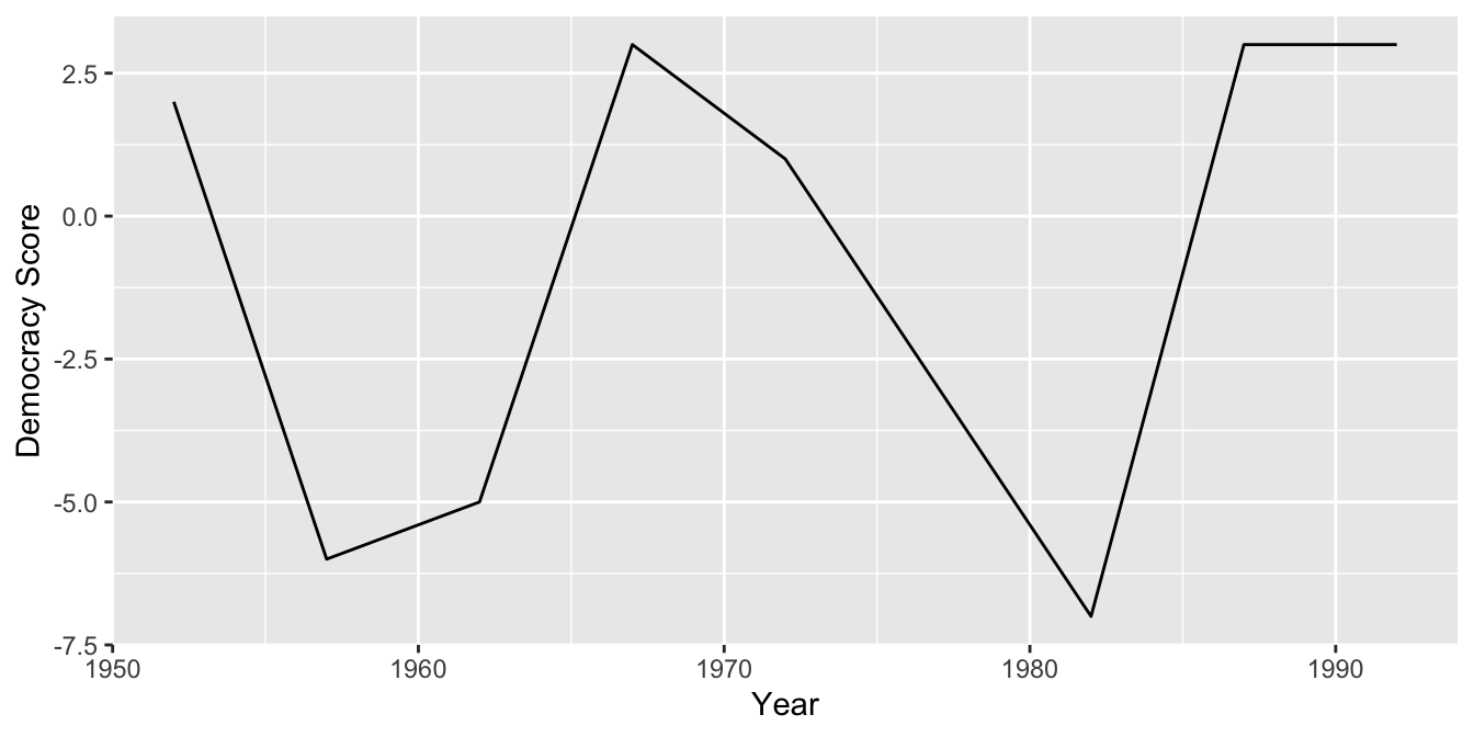
FIGURE 4.5: Democracy scores in Guatemala 1952-1992.
Learning check
(LC4.4) Convert the dem_score data frame into
a tidy data frame and assign the name of dem_score_tidy to the resulting long-formatted data frame.
(LC4.5) Read in the life expectancy data stored at https://moderndive.com/data/le_mess.csv and convert it to a tidy data frame.
4.4 tidyverse package
Notice at the beginning of the chapter we loaded the following four packages, which are among the four of the most frequently used R packages for data science:
There is a much quicker way to load these packages than by individually loading them: by installing and loading the tidyverse package. The tidyverse package acts as an “umbrella” package whereby installing/loading it will install/load multiple packages at once for you.
After installing the tidyverse package as you would a normal package via install.packages("tidyverse"), running:
would be the same as running:
library(ggplot2)
library(dplyr)
library(tidyr)
library(readr)
library(purrr)
library(tibble)
library(stringr)
library(forcats)
You’ve seen the first 4 of these packages: ggplot2 for data visualization, dplyr for data wrangling, tidyr for converting data to “tidy” format, and readr for importing spreadsheet data into R. The remaining packages (purrr, tibble, stringr, and forcats) are left for a more advanced book; check out R for Data Science to learn about these packages.
For the remainder of this book, we’ll start every chapter by running library(tidyverse), instead of loading the various component packages individually. The tidyverse “umbrella” package gets its name from the fact that all the functions in all its packages are designed to have common inputs and outputs: data frames are in “tidy” format. This standardization of input and output data frames makes transitions between different functions in the different packages as seamless as possible. For more information, check out the tidyverse.org webpage for the package.
4.5 Conclusion
4.5.1 Additional resources
An R script file of all R code used in this chapter is available here.
If you want to learn more about using the readr and tidyr package, we suggest you that you check out RStudio’s “Data Import Cheat Sheet.”
You can access these cheatsheets by going to the RStudio Menu Bar -> Help -> Cheatsheets -> “Browse Cheatsheets” -> Scroll down the page to the “Data Import Cheat Sheet”. The first page of this cheatsheet has information on using the readr package to import data while the second page has information on using the tidyr package to “tidy” data. You can see a preview of both cheatsheets in the figures below.
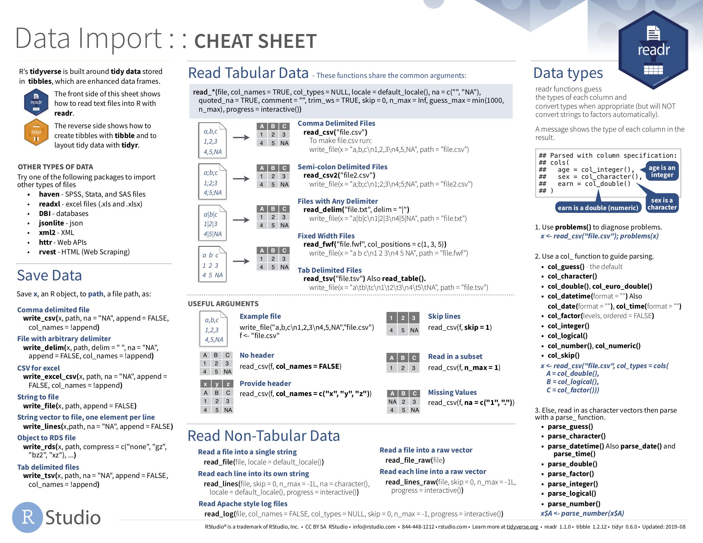
FIGURE 4.6: Data Import cheatsheet (first page): readr package.
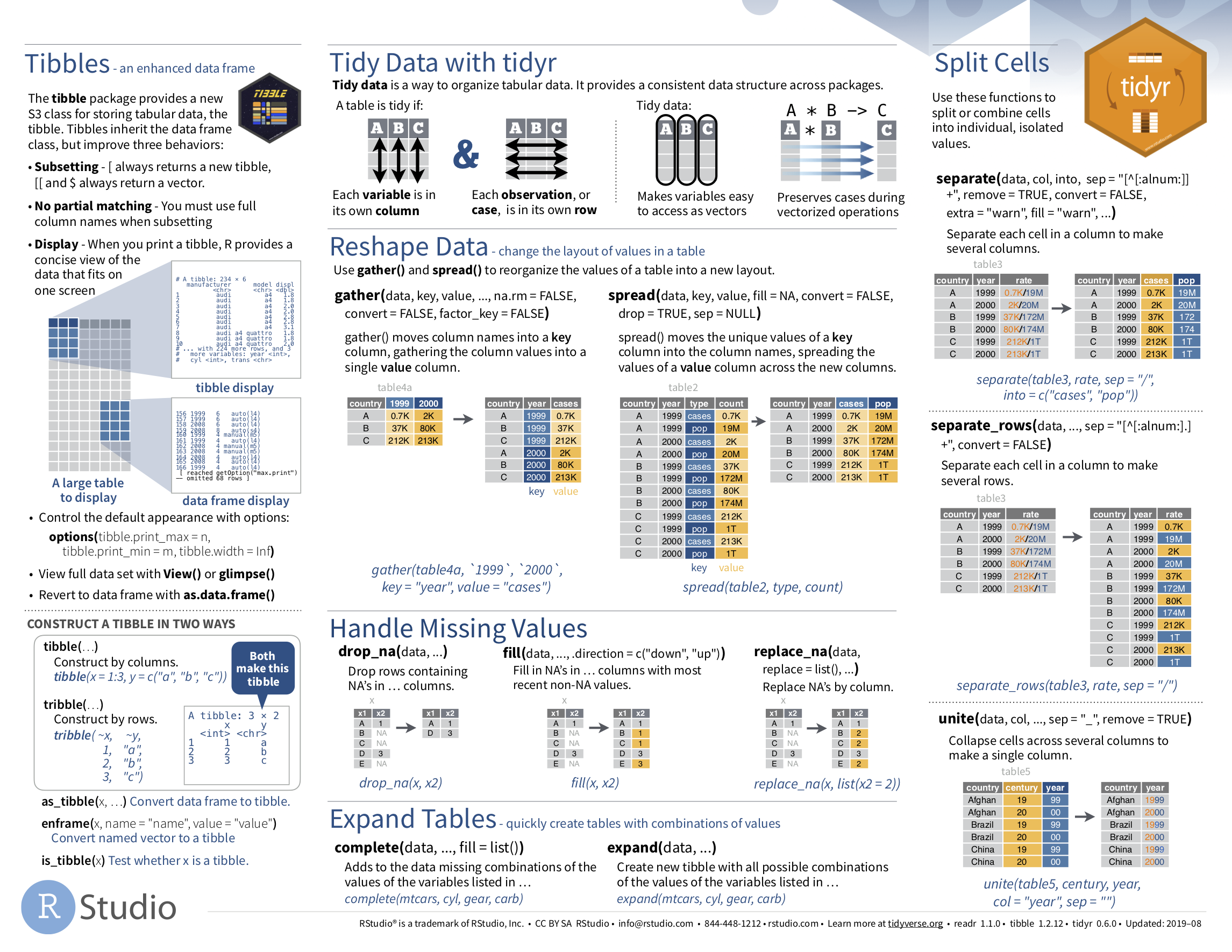
FIGURE 4.7: Data Import cheatsheet (second page): tidyr package.
4.5.2 What’s to come?
Congratulations! You’ve completed the “Data Science with tidyverse” portion of this book! We’ll now move to the “Data modeling with moderndive” portion of this book in Chapters 5 and 6, where you’ll leverage your data visualization and wrangling skills to model relationships between different variables in data frames.
However, we’re going to leave the Chapter 10 on “Inference for Regression” until after we’ve covered statistical inference in Chapters 7, 8, and 9. Onwards and upwards!
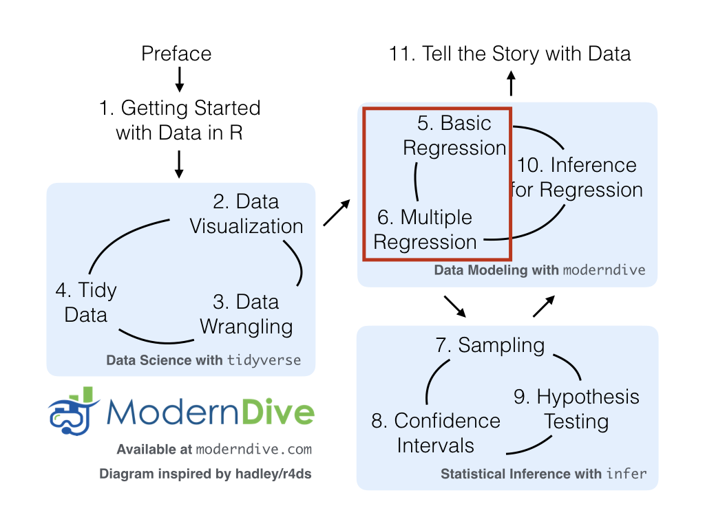
FIGURE 4.8: ModernDive flowchart - On to Part II!
References
Grolemund, Garrett, and Hadley Wickham. 2016. R for Data Science. http://r4ds.had.co.nz/.
Kim, Albert Y., Chester Ismay, and Jennifer Chunn. 2019. Fivethirtyeight: Data and Code Behind the Stories and Interactives at ’Fivethirtyeight’. https://github.com/rudeboybert/fivethirtyeight.
Wickham, Hadley. 2014. “Tidy Data.” Journal of Statistical Software Volume 59 (Issue 10). https://www.jstatsoft.org/index.php/jss/article/view/v059i10/v59i10.pdf.
Wickham, Hadley. 2019. Nycflights13: Flights That Departed Nyc in 2013. https://CRAN.R-project.org/package=nycflights13.
Wickham, Hadley, and Lionel Henry. 2019. Tidyr: Tidy Messy Data. https://CRAN.R-project.org/package=tidyr.
Wickham, Hadley, Jim Hester, and Romain Francois. 2018. Readr: Read Rectangular Text Data. https://CRAN.R-project.org/package=readr.