
Chapter 7 Multiple Regression
In Chapter 6 we introduced ideas related to modeling, in particular that the fundamental premise of modeling is to make explicit the relationship between an outcome variable \(y\) and an explanatory/predictor variable \(x\). Recall further the synonyms that we used to also denote \(y\) as the dependent variable and \(x\) as an independent variable or covariate.
There are many modeling approaches one could take, among the most well-known being linear regression, which was the focus of the last chapter. Whereas in the last chapter we focused solely on regression scenarios where there is only one explanatory/predictor variable, in this chapter, we now focus on modeling scenarios where there is more than one. This case of regression more than one explanatory variable is known as multiple regression. You can imagine when trying to model a particular outcome variable, like teaching evaluation score as in Section 6.1 or life expectancy as in Section 6.2, it would be very useful to incorporate more than one explanatory variable.
Since our regression models will now consider more than one explanatory/predictor variable, the interpretation of the associated effect of any one explanatory/predictor variables must be made in conjunction with the others. For example, say we are modeling individuals’ incomes as a function of their number of years of education and their parents’ wealth. When interpreting the effect of education on income, one has to consider the effect of their parents’ wealth at the same time, as these two variables are almost certainly related. Make note of this throughout this chapter and as you work on interpreting the results of multiple regression models into the future.
Needed packages
Let’s load all the packages needed for this chapter (this assumes you’ve already installed them). Read Section 2.3 for information on how to install and load R packages.
library(ggplot2)
library(dplyr)
library(moderndive)
library(ISLR)
library(skimr)
7.1 Two numerical explanatory variables
Let’s now attempt to identify factors that are associated with how much credit card debt an individual will have. The textbook An Introduction to Statistical Learning with Applications in R by Gareth James, Daniela Witten, Trevor Hastie, and Robert Tibshirani is an intermediate-level textbook on statistical and machine learning freely available here. It has an accompanying R package called ISLR with datasets that the authors use to demonstrate various machine learning methods. One dataset that is frequently used by the authors is the Credit dataset where predictions are made on the credit card balance held by \(n = 400\) credit card holders. These predictions are based on information about them like income, credit limit, and education level. Note that this dataset is not based on actual individuals, it is a simulated dataset used for educational purposes.
Since no information was provided as to who these \(n\) = 400 individuals are and how they came to be included in this dataset, it will be hard to make any scientific claims based on this data. Recall our discussion from the previous chapter that correlation does not necessarily imply causation. That being said, we’ll still use Credit to demonstrate multiple regression with:
- A numerical outcome variable \(y\), in this case credit card balance.
- Two explanatory variables:
- A first numerical explanatory variable \(x_1\). In this case, their credit limit.
- A second numerical explanatory variable \(x_2\). In this case, their income (in thousands of dollars).
In the forthcoming Learning Checks, we’ll consider a different scenario:
- The same numerical outcome variable \(y\): credit card balance.
- Two new explanatory variables:
- A first numerical explanatory variable \(x_1\): their credit rating.
- A second numerical explanatory variable \(x_2\): their age.
7.1.1 Exploratory data analysis
Let’s load the Credit data and select() only the needed subset of variables.
library(ISLR)
Credit <- Credit %>%
  select(Balance, Limit, Income, Rating, Age)
Let’s look at the raw data values both by bringing up RStudio’s spreadsheet viewer and the glimpse() function. Although in Table 7.1 we only show 5 randomly selected credit card holders out of 400:
View(Credit)| Balance | Limit | Income | Rating | Age |
|---|---|---|---|---|
| 98 | 1551 | 22.6 | 134 | 43 |
| 1677 | 11200 | 140.7 | 817 | 46 |
| 283 | 4270 | 36.9 | 299 | 63 |
| 50 | 3327 | 35.0 | 253 | 54 |
| 450 | 4442 | 30.4 | 316 | 30 |
glimpse(Credit)Observations: 400
Variables: 5
$ Balance <int> 333, 903, 580, 964, 331, 1151, 203, 872, 279, 1350, 1407, 0, …
$ Limit <int> 3606, 6645, 7075, 9504, 4897, 8047, 3388, 7114, 3300, 6819, 8…
$ Income <dbl> 14.9, 106.0, 104.6, 148.9, 55.9, 80.2, 21.0, 71.4, 15.1, 71.1…
$ Rating <int> 283, 483, 514, 681, 357, 569, 259, 512, 266, 491, 589, 138, 3…
$ Age <int> 34, 82, 71, 36, 68, 77, 37, 87, 66, 41, 30, 64, 57, 49, 75, 5…Let’s look at some summary statistics, again using the skim() function from the skimr package:
Credit %>%
  select(Balance, Limit, Income) %>%
  skim()
Skim summary statistics
n obs: 400
n variables: 3
── Variable type:integer ──────────────────────────────────────────────────────
variable missing complete n mean sd p0 p25 p50 p75 p100
Balance 0 400 400 520.01 459.76 0 68.75 459.5 863 1999
Limit 0 400 400 4735.6 2308.2 855 3088 4622.5 5872.75 13913
hist
▇▃▃▃▂▁▁▁
▅▇▇▃▂▁▁▁
── Variable type:numeric ──────────────────────────────────────────────────────
variable missing complete n mean sd p0 p25 p50 p75 p100
Income 0 400 400 45.22 35.24 10.35 21.01 33.12 57.47 186.63
hist
▇▃▂▁▁▁▁▁We observe for example:
- The mean and median credit card balance are $520.01 and $459.50 respectively.
- 25% of card holders had debts of $68.75 or less.
- The mean and median credit card limit are $4735.6 and $4622.50 respectively.
- 75% of these card holders had incomes of $57,470 or less.
Since our outcome variable Balance and the explanatory variables Limit and
Income are numerical, we can compute the correlation coefficient between pairs
of these variables. First, we could run the get_correlation() command as seen
in Subsection 6.1.1 twice, once for each explanatory variable:
Credit %>%
  get_correlation(Balance ~ Limit)
Credit %>%
  get_correlation(Balance ~ Income)
Or we can simultaneously compute them by returning a correlation matrix in Table 7.2. We can read off the correlation coefficient for any pair of variables by looking them up in the appropriate row/column combination.
Credit %>%
  select(Balance, Limit, Income) %>%
cor()| Balance | Limit | Income | |
|---|---|---|---|
| Balance | 1.000 | 0.862 | 0.464 |
| Limit | 0.862 | 1.000 | 0.792 |
| Income | 0.464 | 0.792 | 1.000 |
For example, the correlation coefficient of:
Balancewith itself is 1 as we would expect based on the definition of the correlation coefficient.BalancewithLimitis 0.862. This indicates a strong positive linear relationship, which makes sense as only individuals with large credit limits can accrue large credit card balances.BalancewithIncomeis 0.464. This is suggestive of another positive linear relationship, although not as strong as the relationship betweenBalanceandLimit.- As an added bonus, we can read off the correlation coefficient of the two explanatory variables,
LimitandIncomeof 0.792. In this case, we say there is a high degree of collinearity between these two explanatory variables.
Collinearity (or multicollinearity) is a phenomenon in which one explanatory variable in a multiple regression model can be linearly predicted from the others with a substantial degree of accuracy. So in this case, if we knew someone’s credit card Limit and since Limit and Income are highly correlated, we could make a fairly accurate guess as to that person’s Income. Or put loosely, these two variables provided redundant information. For now let’s ignore any issues related to collinearity and press on.
Let’s visualize the relationship of the outcome variable with each of the two explanatory variables in two separate plots:
ggplot(Credit, aes(x = Limit, y = Balance)) +
  geom_point() +
  labs(x = "Credit limit (in $)", y = "Credit card balance (in $)",
       title = "Relationship between balance and credit limit") +
  geom_smooth(method = "lm", se = FALSE)

ggplot(Credit, aes(x = Income, y = Balance)) +
  geom_point() +
  labs(x = "Income (in $1000)", y = "Credit card balance (in $)",
       title = "Relationship between balance and income") +
  geom_smooth(method = "lm", se = FALSE)
FIGURE 7.1: Relationship between credit card balance and credit limit/income
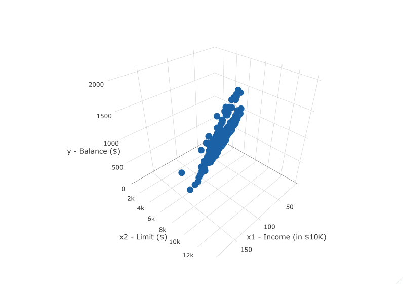
First, there is a positive relationship between credit limit and balance, since as credit limit increases so also does credit card balance; this is to be expected given the strongly positive correlation coefficient of 0.862. In the case of income, the positive relationship doesn’t appear as strong, given the weakly positive correlation coefficient of 0.464. However the two plots in Figure 7.1 only focus on the relationship of the outcome variable with each of the explanatory variables independently. To get a sense of the joint relationship of all three variables simultaneously through a visualization, let’s display the data in a 3-dimensional (3D) scatterplot, where
- The numerical outcome variable \(y\)
Balanceis on the z-axis (vertical axis) - The two numerical explanatory variables form the “floor” axes. In this case
- The first numerical explanatory variable \(x_1\)
Incomeis on of the floor axes. - The second numerical explanatory variable \(x_2\)
Limitis on the other floor axis.
- The first numerical explanatory variable \(x_1\)
Click on the following image to open an interactive 3D scatterplot in your browser:
Previously in Figure 6.6, we plotted a “best-fitting” regression line through a set of points where the numerical outcome variable \(y\) was teaching score and a single numerical explanatory variable \(x\) was bty_avg. What is the analogous concept when we have two numerical predictor variables? Instead of a best-fitting line, we now have a best-fitting plane, which is a 3D generalization of lines which exist in 2D. Click here to open an interactive plot of the regression plane shown below in your browser. Move the image around, zoom in, and think about how this plane generalizes the concept of a linear regression line to three dimensions.
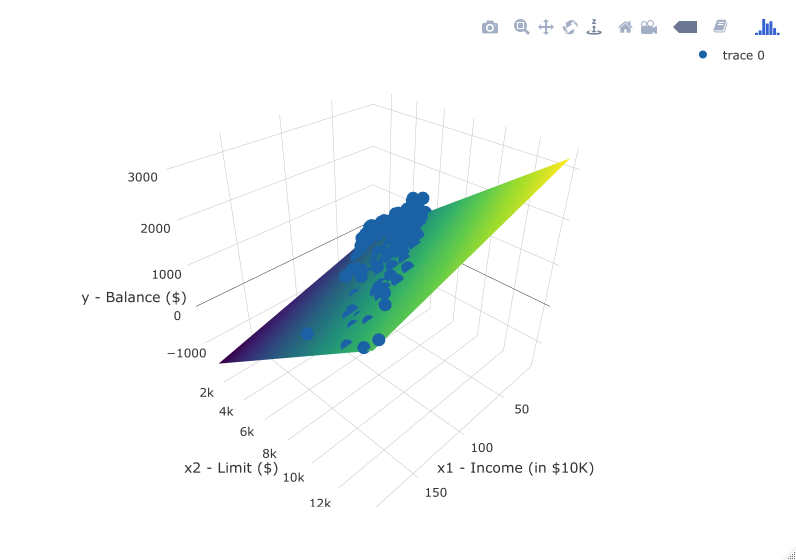
FIGURE 7.2: Regression plane
Learning check
(LC7.1) Conduct a new exploratory data analysis with the same outcome variable \(y\) being Balance but with Rating and Age as the new explanatory variables \(x_1\) and \(x_2\). Remember, this involves three things:
- Looking at the raw values
- Computing summary statistics of the variables of interest.
- Creating informative visualizations
What can you say about the relationship between a credit card holder’s balance and their credit rating and age?
7.1.2 Multiple regression
Just as we did when we had a single numerical explanatory variable \(x\) in Subsection 6.1.2 and when we had a single categorical explanatory variable \(x\) in Subsection 6.2.2, we fit a regression model and obtained the regression table in our two numerical explanatory variable scenario. To fit a regression model and get a table using get_regression_table(), we now use a + to consider multiple explanatory variables. In this case since we want to perform a regression of Limit and Income simultaneously, we input Balance ~ Limit + Income.
Balance_model <- lm(Balance ~ Limit + Income, data = Credit)
get_regression_table(Balance_model)| term | estimate | std_error | statistic | p_value | lower_ci | upper_ci |
|---|---|---|---|---|---|---|
| intercept | -385.179 | 19.465 | -19.8 | 0 | -423.446 | -346.912 |
| Limit | 0.264 | 0.006 | 45.0 | 0 | 0.253 | 0.276 |
| Income | -7.663 | 0.385 | -19.9 | 0 | -8.420 | -6.906 |
How do we interpret these three values that define the regression plane?
- Intercept: -$385.18 (rounded to two decimal points to represent cents). The intercept in our case represents the credit card balance for an individual who has both a credit
Limitof $0 andIncomeof $0. In our data however, the intercept has limited practical interpretation as no individuals hadLimitorIncomevalues of $0 and furthermore the smallest credit card balance was $0. Rather, it is used to situate the regression plane in 3D space. - Limit: $0.26. Now that we have multiple variables to consider, we have to add
a caveat to our interpretation: taking all other variables in our model into account, for every increase of one unit in credit
Limit(dollars), there is an associated increase of on average $0.26 in credit card balance. Note:- Just as we did in Subsection 6.1.2, we are not making any causal statements, only statements relating to the association between credit limit and balance
- We need to preface our interpretation of the associated effect of
Limitwith the statement “taking all other variables into account”, in this caseIncome, to emphasize that we are now jointly interpreting the associated effect of multiple explanatory variables in the same model and not in isolation.
- Income: -$7.66. Similarly, taking all other variables into account, for every increase of one unit in
Income(in other words, $1000 in income), there is an associated decrease of on average $7.66 in credit card balance.
However, recall in Figure 7.1 that when considered separately, both Limit and Income had positive relationships with the outcome variable Balance. As card holders’ credit limits increased their credit card balances tended to increase as well, and a similar relationship held for incomes and balances. In the above multiple regression, however, the slope for Income is now -7.66, suggesting a negative relationship between income and credit card balance. What explains these contradictory results?
This is known as Simpson’s Paradox, a phenomenon in which a trend appears in several different groups of data but disappears or reverses when these groups are combined. We expand on this in Subsection 7.3.2 where we’ll look at the relationship between credit Limit and credit card balance but split by different income bracket groups.
Learning check
(LC7.2) Fit a new simple linear regression using lm(Balance ~ Rating + Age, data = Credit) where Rating and Age are the new numerical explanatory variables \(x_1\) and \(x_2\). Get information about the “best-fitting” line from the regression table by applying the get_regression_table() function. How do the regression results match up with the results from your exploratory data analysis above?
7.1.3 Observed/fitted values and residuals
As we did previously in Table 7.4, let’s unpack the output of the get_regression_points() function for our model for credit card balance for all 400 card holders in the dataset. Recall that each card holder corresponds to one of the 400 rows in the Credit data frame and also for one of the 400 3D points in the 3D scatterplots in Subsection 7.1.1.
regression_points <- get_regression_points(Balance_model)
regression_points| ID | Balance | Limit | Income | Balance_hat | residual |
|---|---|---|---|---|---|
| 1 | 333 | 3606 | 14.9 | 454 | -120.8 |
| 2 | 903 | 6645 | 106.0 | 559 | 344.3 |
| 3 | 580 | 7075 | 104.6 | 683 | -103.4 |
| 4 | 964 | 9504 | 148.9 | 986 | -21.7 |
| 5 | 331 | 4897 | 55.9 | 481 | -150.0 |
Recall the format of the output:
Balancecorresponds to \(y\) (the observed value)Balance_hatcorresponds to \(\widehat{y}\) (the fitted value)residualcorresponds to \(y - \widehat{y}\) (the residual)
7.2 One numerical & one categorical explanatory variable
Let’s revisit the instructor evaluation data introduced in Section 6.1, where we studied the relationship between instructor evaluation scores and their beauty scores. This analysis suggested that there is a positive relationship between bty_avg and score, in other words as instructors had higher beauty scores, they also tended to have higher teaching evaluation scores. Now let’s say instead of bty_avg we are interested in the numerical explanatory variable \(x_1\) age and furthermore we want to use a second explanatory variable \(x_2\), the (binary) categorical variable gender.
Note: This study only focused on the gender binary of "male" or "female" when the data was collected and analyzed years ago. It has been tradition to use gender as an “easy” binary variable in the past in statistical analyses. We have chosen to include it here because of the interesting results of the study, but we also understand that a segment of the population is not included in this dichotomous assignment of gender and we advocate for more inclusion in future studies to show representation of groups that do not identify with the gender binary. We now resume our analyses using this evals data and hope that others find these results interesting and worth further exploration.
Our modeling scenario now becomes
- A numerical outcome variable \(y\). As before, instructor evaluation score.
- Two explanatory variables:
- A numerical explanatory variable \(x_1\): in this case, their age.
- A categorical explanatory variable \(x_2\): in this case, their binary gender.
7.2.1 Exploratory data analysis
Let’s reload the evals data and select() only the needed subset of variables. Note that these are different than the variables chosen in Chapter 6. Let’s given this the name evals_ch7.
evals_ch7 <- evals %>%
  select(score, age, gender)
Let’s look at the raw data values both by bringing up RStudio’s spreadsheet viewer and the glimpse() function, although in Table 7.5 we only show 5 randomly selected instructors out of 463:
View(evals_ch7)| score | age | gender |
|---|---|---|
| 3.6 | 34 | male |
| 4.9 | 43 | male |
| 3.3 | 47 | male |
| 4.4 | 33 | female |
| 4.7 | 60 | male |
Let’s look at some summary statistics using the skim() function from the skimr package:
evals_ch7 %>%
  skim()
Skim summary statistics
n obs: 463
n variables: 3
── Variable type:factor ───────────────────────────────────────────────────────
variable missing complete n n_unique top_counts ordered
gender 0 463 463 2 mal: 268, fem: 195, NA: 0 FALSE
── Variable type:integer ──────────────────────────────────────────────────────
variable missing complete n mean sd p0 p25 p50 p75 p100 hist
age 0 463 463 48.37 9.8 29 42 48 57 73 ▅▅▅▇▅▇▂▁
── Variable type:numeric ──────────────────────────────────────────────────────
variable missing complete n mean sd p0 p25 p50 p75 p100 hist
score 0 463 463 4.17 0.54 2.3 3.8 4.3 4.6 5 ▁▁▂▃▅▇▇▆Furthermore, let’s compute the correlation between two numerical variables we have score and age. Recall that correlation coefficients only exist between numerical variables. We observe that they are weakly negatively correlated.
evals_ch7 %>%
  get_correlation(formula = score ~ age)
# A tibble: 1 x 1
correlation
<dbl>
1 -0.107In Figure 7.3, we plot a scatterplot of score over age. Given that gender is a binary categorical variable in this study, we can make some interesting tweaks:
- We can assign a color to points from each of the two levels of
gender: female and male. - Furthermore, the
geom_smooth(method = "lm", se = FALSE)layer automatically fits a different regression line for each since we have providedcolor = genderat the top level inggplot(). This allows for allgeom_etries that follow to have the same mapping ofaes()thetics to variables throughout the plot.
ggplot(evals_ch7, aes(x = age, y = score, color = gender)) +
  geom_jitter() +
  labs(x = "Age", y = "Teaching Score", color = "Gender") +
  geom_smooth(method = "lm", se = FALSE)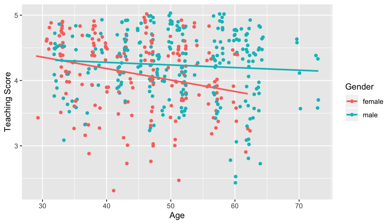
FIGURE 7.3: Instructor evaluation scores at UT Austin split by gender (jittered)
We notice some interesting trends:
- There are almost no women faculty over the age of 60. We can see this by the lack of red dots above 60.
- Fitting separate regression lines for men and women, we see they have different slopes. We see that the associated effect of increasing age seems to be much harsher for women than men. In other words, as women age, the drop in their teaching score appears to be faster.
7.2.2 Multiple regression: Parallel slopes model
Much like we started to consider multiple explanatory variables using the + sign in Subsection 7.1.2, let’s fit a regression model and get the regression table. This time we provide the name of score_model_2 to our regression model fit, in so as to not overwrite the model score_model from Section 6.1.2.
score_model_2 <- lm(score ~ age + gender, data = evals_ch7)
get_regression_table(score_model_2)| term | estimate | std_error | statistic | p_value | lower_ci | upper_ci |
|---|---|---|---|---|---|---|
| intercept | 4.484 | 0.125 | 35.79 | 0.000 | 4.238 | 4.730 |
| age | -0.009 | 0.003 | -3.28 | 0.001 | -0.014 | -0.003 |
| gendermale | 0.191 | 0.052 | 3.63 | 0.000 | 0.087 | 0.294 |
The modeling equation for this scenario is:
\[\begin{align} \widehat{y} &= b_0 + b_1 \cdot x_1 + b_2 \cdot x_2 \\ \widehat{\mbox{score}} &= b_0 + b_{\mbox{age}} \cdot \mbox{age} + b_{\mbox{male}} \cdot \mathbb{1}_{\mbox{is male}}(x) \end{align}\]
where \(\mathbb{1}_{\mbox{is male}}(x)\) is an indicator function for sex == male. In other words, \(\mathbb{1}_{\mbox{is male}}(x)\) equals one if the current observation corresponds to a male professor, and 0 if the current observation corresponds to a female professor. This model can be visualized in Figure 7.4.

FIGURE 7.4: Instructor evaluation scores at UT Austin by gender: same slope
We see that:
- Females are treated as the baseline for comparison for no other reason than “female” is alphabetically earlier than “male.” The \(b_{male} = 0.1906\) is the vertical “bump” that men get in their teaching evaluation scores. Or more precisely, it is the average difference in teaching score that men get relative to the baseline of women.
- Accordingly, the intercepts (which in this case make no sense since no instructor can have an age of 0) are :
- for women: \(b_0\) = 4.484
- for men: \(b_0 + b_{male}\) = 4.484 + 0.191 = 4.675
- Both men and women have the same slope. In other words, in this model the associated effect of age is the same for men and women. So for every increase of one year in age, there is on average an associated change of \(b_{age}\) = -0.009 (a decrease) in teaching score.
But wait, why is Figure 7.4 different than Figure 7.3! What is going on? What we have in the original plot is known as an interaction effect between age and gender. Focusing on fitting a model for each of men and women, we see that the resulting regression lines are different. Thus, gender appears to interact in different ways for men and women with the different values of age.
7.2.3 Multiple regression: Interaction model
We say a model has an interaction effect if the associated effect of one variable depends on the value of another variable. These types of models usually prove to be tricky to view on first glance because of their complexity. In this case, the effect of age will depend on the value of gender. Put differently, the effect of age on teaching scores will differ for men and for women, as was suggested by the different slopes for men and women in our visual exploratory data analysis in Figure 7.3.
Let’s fit a regression with an interaction term. Instead of using the + sign in the enumeration of explanatory variables, we use the * sign. Let’s fit this regression and save it in score_model_3, then we get the regression table using the get_regression_table() function as before.
score_model_interaction <- lm(score ~ age * gender, data = evals_ch7)
get_regression_table(score_model_interaction)| term | estimate | std_error | statistic | p_value | lower_ci | upper_ci |
|---|---|---|---|---|---|---|
| intercept | 4.883 | 0.205 | 23.80 | 0.000 | 4.480 | 5.286 |
| age | -0.018 | 0.004 | -3.92 | 0.000 | -0.026 | -0.009 |
| gendermale | -0.446 | 0.265 | -1.68 | 0.094 | -0.968 | 0.076 |
| age:gendermale | 0.014 | 0.006 | 2.45 | 0.015 | 0.003 | 0.024 |
The modeling equation for this scenario is:
\[\begin{align} \widehat{y} &= b_0 + b_1 \cdot x_1 + b_2 \cdot x_2 + b_3 \cdot x_1 \cdot x_2\\ \widehat{\mbox{score}} &= b_0 + b_{\mbox{age}} \cdot \mbox{age} + b_{\mbox{male}} \cdot \mathbb{1}_{\mbox{is male}}(x) + b_{\mbox{age,male}} \cdot \mbox{age} \cdot \mathbb{1}_{\mbox{is male}}(x) \end{align}\]
Oof, that’s a lot of rows in the regression table output and a lot of terms in the model equation. The fourth term being added on the right hand side of the equation corresponds to the interaction term. Let’s simplify things by considering men and women separately. First, recall that \(\mathbb{1}_{\mbox{is male}}(x)\) equals 1 if a particular observation (or row in evals_ch7) corresponds to a male instructor. In this case, using the values from the regression table the fitted value of \(\widehat{\mbox{score}}\) is:
\[\begin{align} \widehat{\mbox{score}} &= b_0 + b_{\mbox{age}} \cdot \mbox{age} + b_{\mbox{male}} \cdot \mathbb{1}_{\mbox{is male}}(x) + b_{\mbox{age,male}} \cdot \mbox{age} \cdot \mathbb{1}_{\mbox{is male}}(x) \\ &= b_0 + b_{\mbox{age}} \cdot \mbox{age} + b_{\mbox{male}} \cdot 1 + b_{\mbox{age,male}} \cdot \mbox{age} \cdot 1 \\ &= \left(b_0 + b_{\mbox{male}}\right) + \left(b_{\mbox{age}} + b_{\mbox{age,male}} \right) \cdot \mbox{age} \\ &= \left(4.883 + -0.446\right) + \left(-0.018 + 0.014 \right) \cdot \mbox{age} \\ &= 4.437 -0.004 \cdot \mbox{age} \end{align}\]
Second, recall that \(\mathbb{1}_{\mbox{is male}}(x)\) equals 0 if a particular observation corresponds to a female instructor. Again, using the values from the regression table the fitted value of \(\widehat{\mbox{score}}\) is:
\[\begin{align} \widehat{\mbox{score}} &= b_0 + b_{\mbox{age}} \cdot \mbox{age} + b_{\mbox{male}} \cdot \mathbb{1}_{\mbox{is male}}(x) + b_{\mbox{age,male}} \cdot \mbox{age} \cdot \mathbb{1}_{\mbox{is male}}(x) \\ &= b_0 + b_{\mbox{age}} \cdot \mbox{age} + b_{\mbox{male}} \cdot 0 + b_{\mbox{age,male}}\mbox{age} \cdot 0 \\ &= b_0 + b_{\mbox{age}} \cdot \mbox{age}\\ &= 4.883 -0.018 \cdot \mbox{age} \end{align}\]
Let’s summarize these values in a table:
| Gender | Intercept | Slope for age |
|---|---|---|
| Male instructors | 4.44 | -0.004 |
| Female instructors | 4.88 | -0.018 |
We see that while male instructors have a lower intercept, as they age, they have a less steep associated average decrease in teaching scores: 0.004 teaching score units per year as opposed to -0.018 for women. This is consistent with the different slopes and intercepts of the red and blue regression lines fit in Figure 7.3. Recall our definition of a model having an interaction effect: when the associated effect of one variable, in this case age, depends on the value of another variable, in this case gender.
But how do we know when it’s appropriate to include an interaction effect? For example, which is the more appropriate model? The regular multiple regression model without an interaction term we saw in Section 7.2.2 or the multiple regression model with the interaction term we just saw? We’ll revisit this question in Chapter 11 on “inference for regression.”
7.2.4 Observed/fitted values and residuals
Now say we want to apply the above calculations for male and female instructors for all 463 instructors in the evals_ch7 dataset. As our multiple regression models get more and more complex, computing such values by hand gets more and more tedious. The get_regression_points() function spares us this tedium and returns all fitted values and all residuals. For simplicity, let’s focus only on the fitted interaction model, which is saved in score_model_interaction.
regression_points <- get_regression_points(score_model_interaction)
regression_points| ID | score | age | gender | score_hat | residual |
|---|---|---|---|---|---|
| 1 | 4.7 | 36 | female | 4.25 | 0.448 |
| 2 | 4.1 | 36 | female | 4.25 | -0.152 |
| 3 | 3.9 | 36 | female | 4.25 | -0.352 |
| 4 | 4.8 | 36 | female | 4.25 | 0.548 |
| 5 | 4.6 | 59 | male | 4.20 | 0.399 |
Recall the format of the output:
scorecorresponds to \(y\) the observed valuescore_hatcorresponds to \(\widehat{y} = \widehat{\mbox{score}}\) the fitted valueresidualcorresponds to the residual \(y - \widehat{y}\)
7.3 Related topics
7.3.1 More on the correlation coefficient
Recall from Table 7.2 that we saw the correlation
coefficient between Income in thousands of dollars and credit card Balance
was 0.464. What if in instead we looked at the correlation coefficient between
Income and credit card Balance, but where Income was in dollars and not
thousands of dollars? This can be done by multiplying Income by 1000.
library(ISLR)
data(Credit)
Credit %>%
  select(Balance, Income) %>%
  mutate(Income = Income * 1000) %>%
cor()| Balance | Income | |
|---|---|---|
| Balance | 1.000 | 0.464 |
| Income | 0.464 | 1.000 |
We see it is the same! We say that the correlation coefficient is invariant to linear transformations! In other words,
- the correlation between \(x\) and \(y\) will be the same as
- the correlation between \(a\times x + b\) and \(y\) where \(a\) and \(b\) are numerical values (real numbers in mathematical terms).
7.3.2 Simpson’s Paradox
Recall in Section 7.1, we saw the two following seemingly contradictory results when studying the relationship between credit card balance, credit limit, and income. On the one hand, the right hand plot of Figure 7.1 suggested that credit card balance and income were positively related:
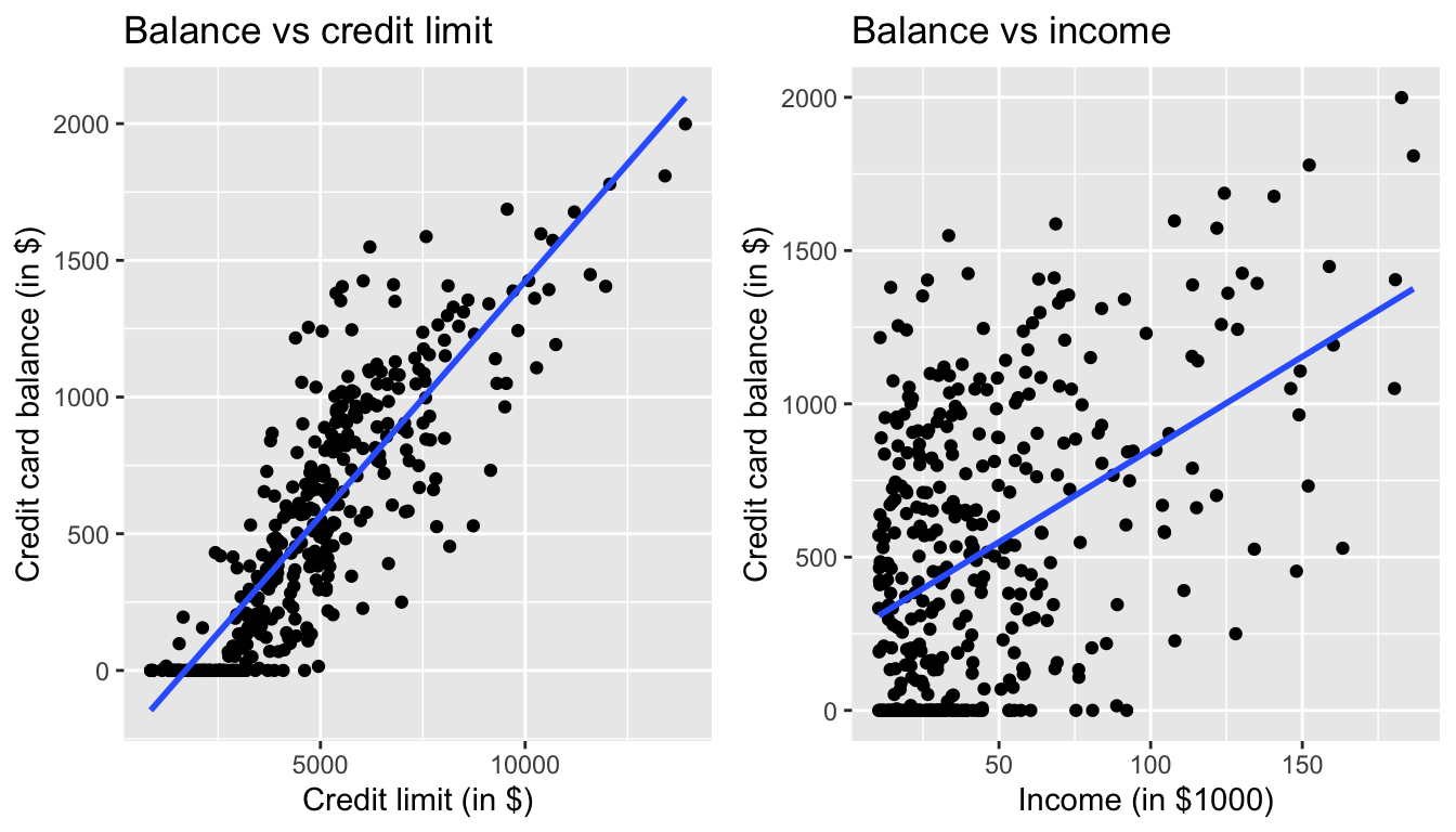
FIGURE 7.5: Relationship between credit card balance and credit limit/income
On the other hand, the multiple regression in Table 7.3, suggested that when modeling credit card balance as a function of both credit limit and income at the same time, credit limit has a negative relationship with balance, as evidenced by the slope of -7.66. How can this be?
First, let’s dive a little deeper into the explanatory variable Limit. Figure 7.6 shows a histogram of all 400 values of Limit, along with vertical red lines that cut up the data into quartiles, meaning:
- 25% of credit limits were between $0 and $3088. Let’s call this the “low” credit limit bracket.
- 25% of credit limits were between $3088 and $4622. Let’s call this the “medium-low” credit limit bracket.
- 25% of credit limits were between $4622 and $5873. Let’s call this the “medium-high” credit limit bracket.
- 25% of credit limits were over $5873. Let’s call this the “high” credit limit bracket.
`stat_bin()` using `bins = 30`. Pick better value with `binwidth`.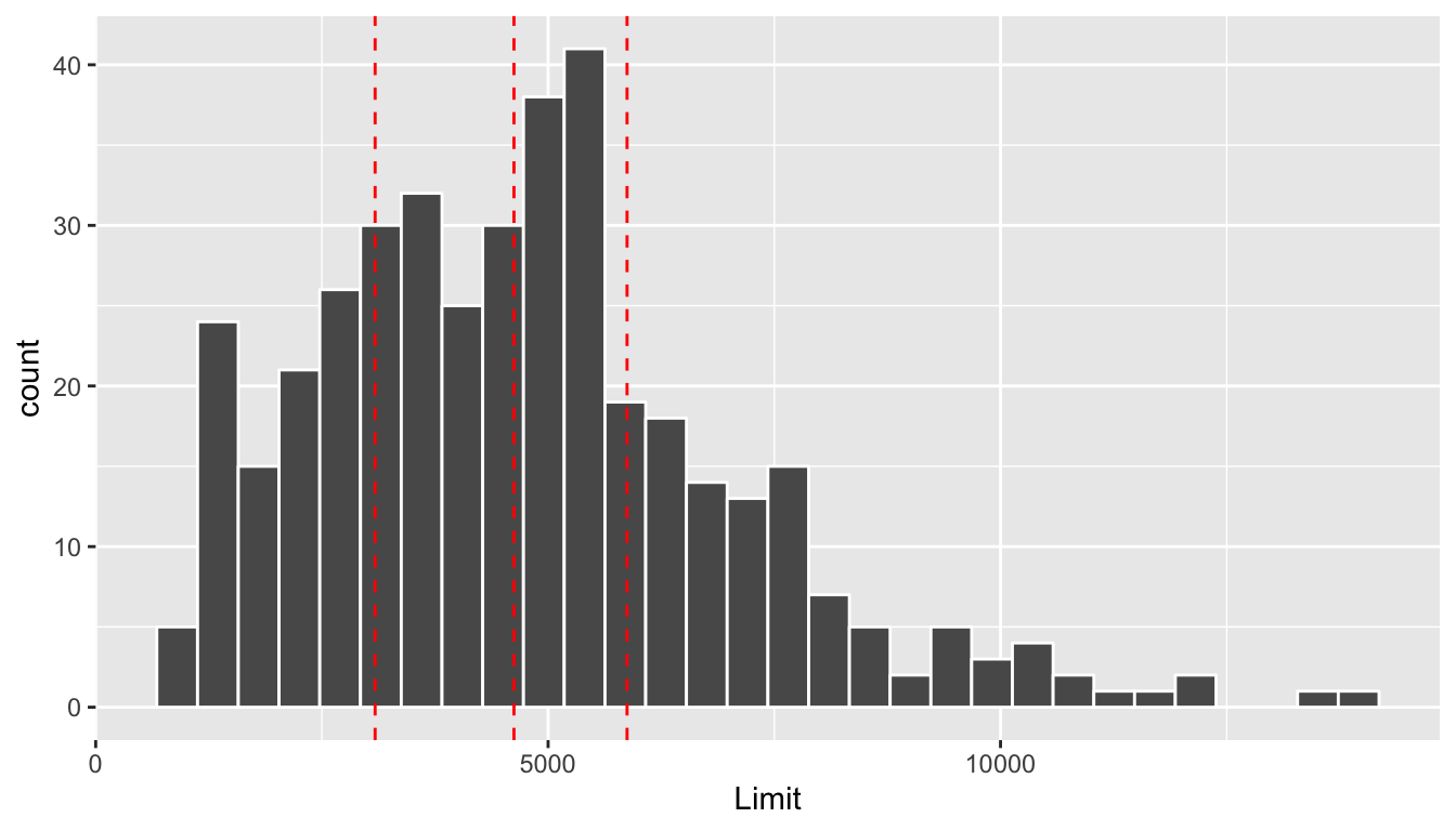
FIGURE 7.6: Histogram of credit limits and quartiles
Let’s now display
- The scatterplot showing the relationship between credit card balance and limit (the right-hand plot of Figure 7.1).
- The scatterplot showing the relationship between credit card balance and limit now with a color aesthetic added corresponding to the credit limit bracket.
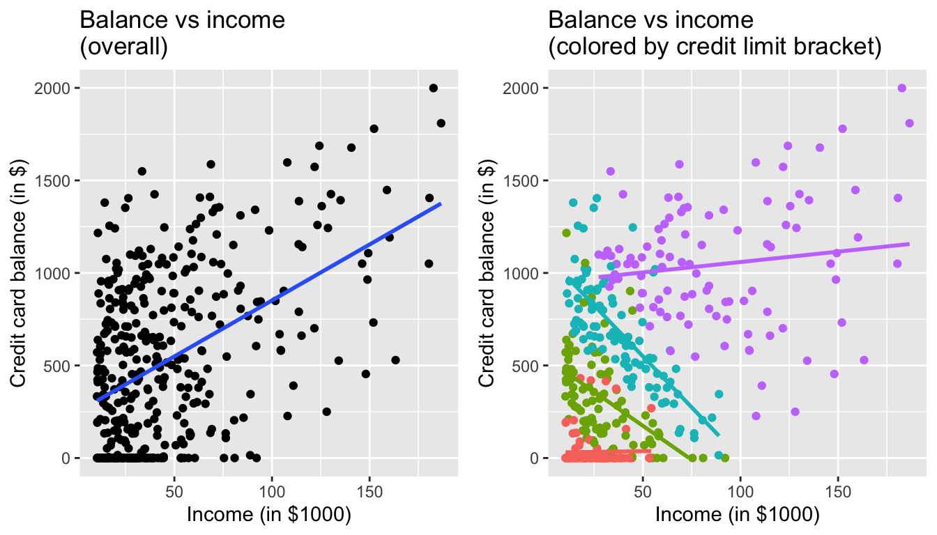
FIGURE 7.7: Relationship between credit card balance and income for different credit limit brackets
In the right-hand plot, the
- Red points (bottom-left) correspond to the low credit limit bracket.
- Green points correspond to the medium-low credit limit bracket.
- Blue points correspond to the medium-high credit limit bracket.
- Purple points (top-right) correspond to the high credit limit bracket.
The left-hand plot focuses of the relationship between balance and income in aggregate, but the right-hand plot focuses on the relationship between balance and income broken down by credit limit bracket. Whereas in aggregate there is an overall positive relationship, when broken down we now see that for the low (red points), medium-low (green points), and medium-high (blue points) income bracket groups, the strong positive relationship between credit card balance and income disappears! Only for the high bracket does the relationship stay somewhat positive. In this example, credit limit is a confounding variable for credit card balance and income.
7.4 Conclusion
7.4.1 Additional resources
An R script file of all R code used in this chapter is available here.
7.4.2 What’s to come?
Congratulations! We’re ready to proceed to the third portion of this book: “statistical inference” using a new package called infer. Once we’ve covered Chapters 8 on sampling, 9 on confidence intervals, and 10 on hypothesis testing, we’ll come back to the models we’ve seen in “data modeling” in Chapter 11 on inference for regression. As we said at the end of Chapter 6, we’ll see why we’ve been conducting the residual analyses from Subsections 11.4.3 and 11.4.4. We are actually verifying some very important assumptions that must be met for the std_error (standard error), p_value, conf_low and conf_high (the end-points of the confidence intervals) columns in our regression tables to have valid interpretation. Up next:
