4 Data Visualization via ggplot2
In Chapter 3, we discussed the importance of datasets being tidy. You will see in examples here why having a tidy dataset helps us immensely when plotting our data. In plotting our data, we will be able to gain valuable insights from our data that we couldn’t initially see from just looking at the raw data. We will focus on using Hadley Wickham’s ggplot2 package in doing so, which was developed to work specifically on datasets that are tidy. It provides an easy way to customize your plots and is based on data visualization theory given in The Grammar of Graphics (Wilkinson 2005).
At the most basic level, graphics/plots/charts provide a nice way for us to get a sense for how quantitative variables compare in terms of their center and their spread. The most important thing to know about graphics is that they should be created to make it obvious for your audience to see the findings you want to get across. This requires a balance of not including too much in your plots, but also including enough so that relationships and interesting findings can be easily seen. As we will see, plots/graphics also help us to identify patterns and outliers in our data. We will see that a common extension of these ideas is to compare the distribution of one quantitative variable (i.e., what the spread of a variable looks like or how the variable is distributed in terms of its values) as we go across the levels of a different categorical variable.
Needed packages
Before we proceed with this chapter, let’s load all the necessary packages.
library(ggplot2)
library(nycflights13)
library(knitr)
library(dplyr)
4.1 The Grammar of Graphics
We begin with a discussion of a theoretical framework for data visualization known as the “The Grammar of Graphics,” which serves as the basis for the ggplot2 package. Much like the way we construct sentences in any language using a linguistic grammar (nouns, verbs, subjects, objects, etc.), the theoretical framework given by Leland Wilkinson (Wilkinson 2005) allows us to specify the components of a statistical graphic.
4.1.1 Components of Grammar
In short, the grammar tells us that:
A statistical graphic is a mapping of
datavariables toaesthetic attributes ofgeometric objects.
Specifically, we can break a graphic into the following three essential components:
data: the data set comprised of variables that we map.geom: the geometric object in question. This refers to our type of objects we can observe in our plot. For example, points, lines, bars, etc.aes: aesthetic attributes of the geometric object that we can perceive on a graphic. For example, x/y position, color, shape, and size. Each assigned aesthetic attribute can be mapped to a variable in our data set. If not assigned, they are set to defaults.
4.1.2 Napolean’s March on Moscow
In 1812, Napoleon led a French invasion of Russia, marching on Moscow. It was one of the biggest military disasters due in large part to the Russian winter. In 1869, a French civil engineer named Charles Joseph Minard published arguably one of the greatest statistical visualizations of all-time, which summarized this march:
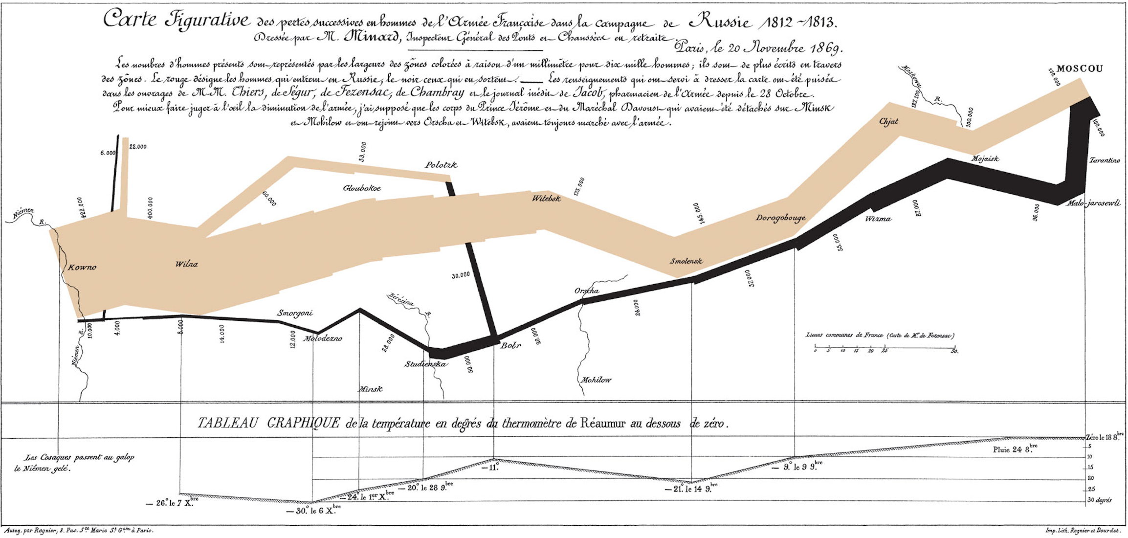
Figure 4.1: Minard’s Visualization of Napolean’s March
This was considered a revolution in statistical graphics because between the map on top and the line graph on the bottom, there are 6 dimensions of information (i.e. variables) being displayed on a 2-dimensional page. Let’s view this graphic through the lens of the Grammar of Graphics:
|
|
For example, the data variable longitude gets mapped to the x aesthetic of the points geometric objects on the map while the annotated line-graph displays date and temperature variable information via its mapping to the x and y aesthetic of the line geometric object.
4.1.3 Other Components of the Grammar
There are other components of the Grammar of Graphics we can control:
facet: how to break up a plot into subsetsstatistical transformations: this includes smoothing, binning values into a histogram, or just itself un-transformed as"identity".scalesboth- convert data units to physical units the computer can display
- draw a legend and/or axes, which provide an inverse mapping to make it possible to read the original data values from the graph.
coordinate system for x/y values: typicallycartesian, but can also bepolarormappositionadjustments
In this text, we will only focus on the first two: faceting (introduced in Section 4.6) and statistical transformations (in a limited sense, when consider Barplots in Section 4.8); the other components are left to a more advanced text. This is not a problem when producing a plot as each of these components have default settings.
There are other extra attributes that can be tweaked as well including the plot title, axes labels, and over-arching themes for the plot. In general, the Grammar of Graphics allows for customization but also a consistent framework that allows the user to easily tweak their creations as needed in order to convey a message about their data.
4.1.4 The ggplot2 Package
We next introduce Hadley Wickham’s ggplot2 package, which is an implementation of the Grammar of Graphics for R (Wickham and Chang 2016). You may have noticed that a lot of previous text in this chapter is written in computer font. This is because the various components of the Grammar of Graphics are specified using the ggplot function, which expects at a bare minimal as arguments
- the data frame where the variables exist (the
dataargument) and - the names of the variables to be plotted (the
mappingargument).
The names of the variables will be entered into the aes function as arguments where aes stands for “aesthetics”.
4.2 Five Named Graphs - The 5NG
For our purposes, we will be limiting consideration to five different types of graphs (note that in this text we use the terms “graphs”, “plots”, and “charts” interchangeably). We term these five named graphs the 5NG:
- scatter-plots
- line-graphs
- boxplots
- histograms
- barplots
With this repertoire of plots, you can visualize a wide array of data variables thrown at you. We will discuss some variations of these, but with the 5NG in your toolbox you can do big things! Something we will also stress here is that certain plots only work for categorical/logical variables and others only for quantitative variables. You’ll want to quiz yourself often as we go along on which plot makes sense a given a particular problem set-up.
4.3 5NG#1: Scatter-plots
The simplest of the 5NG are scatter-plots (also called bivariate plots); they allow you to investigate the relationship between two continuous variables. While you may already be familiar with such plots, let’s view it through the lens of the Grammar of Graphics. Specifically, we will graphically investigate the relationship between the following two continuous variables in the flights data frame:
dep_delay: departure delay on the horizontal “x” axis andarr_delay: arrival delay on the vertical “y” axis
for Alaska Airlines flights leaving NYC in 2013. This requires paring down the flights data frame to a smaller data frame all_alaska_flights consisting of only Alaska Airlines (carrier code “AS”) flights.
data(flights)
all_alaska_flights <- flights %>%
  filter(carrier == "AS")
This code snippet makes use of functions in the dplyr package for data manipulation to achieve our goal: it takes the flights data frame and filters it to only return the rows which meet the condition carrier == "AS" (recall equality is specified with == and not =). You will see many more examples using this function in Chapter 5.
Learning check
(LC4.1) Take a look at both the flights and all_alaska_flights data frames by running View(flights) and View(all_alaska_flights) in the console. In what respect do these data frames differ?
4.3.1 Scatter-plots via geom_point
We proceed to create the scatter-plot using the ggplot() function:
ggplot(data = all_alaska_flights, aes(x = dep_delay, y = arr_delay)) +
  geom_point()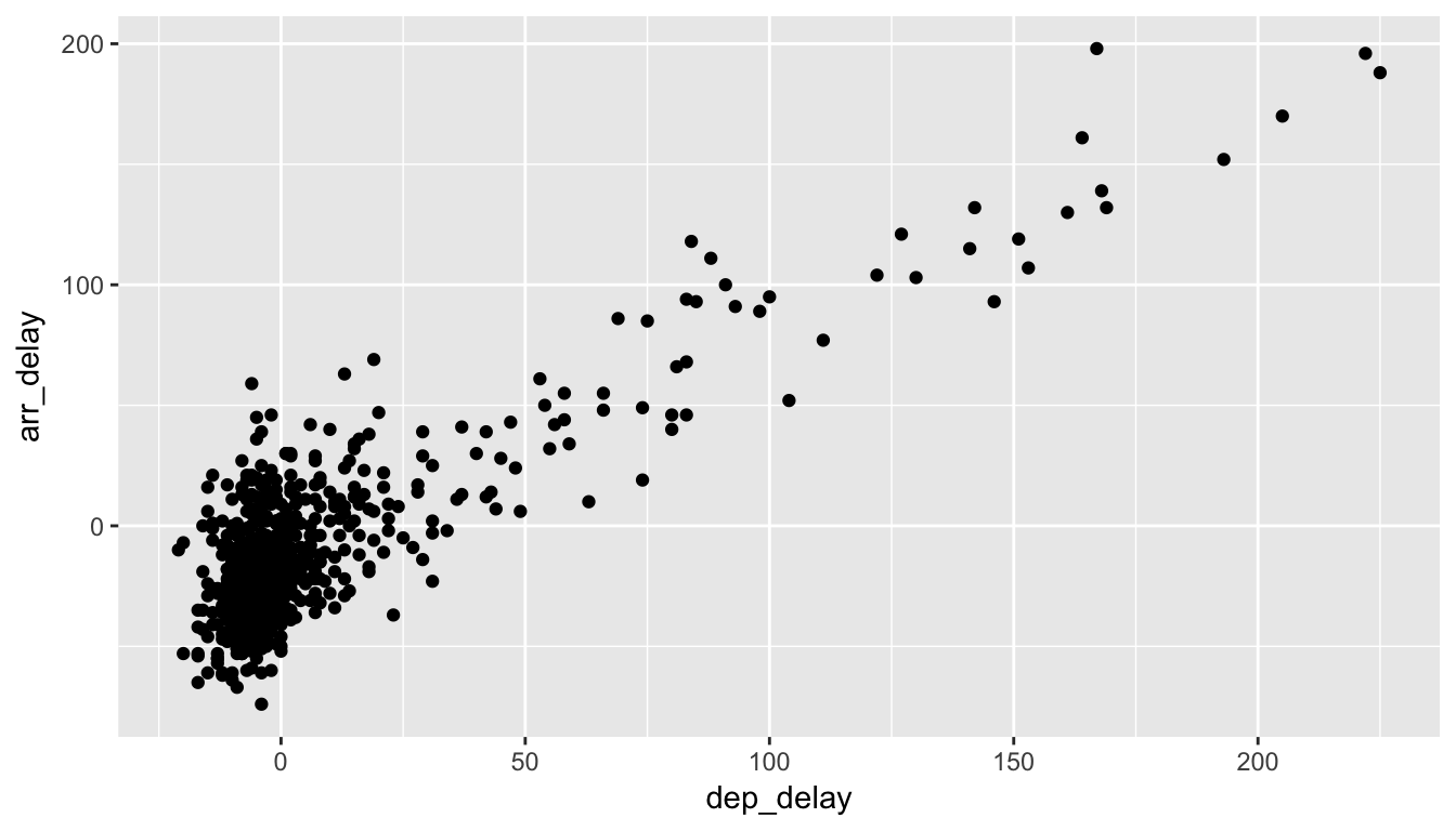
Figure 4.2: Arrival Delays vs Departure Delays for Alaska Airlines flights from NYC in 2013
You are encouraged to enter Return on your keyboard after entering the +. As we add more and more elements, it will be nice to keep them indented as you see below. Note that this will not work if you begin the line with the +.
Let’s break down this keeping in mind our discussion in Section 4.1:
- Within the
ggplot()function call, we specify two of the components of the grammar:- The
dataframe to beall_alaska_flightsby settingdata = all_alaska_flights - The
aesthetic mapping by settingaes(x = dep_delay, y = arr_delay). Specificallydep_delaymaps to thexpositionarr_delaymaps to theyposition
- The
- We add a layer to the
ggplot()function call using the+sign - The layer in question specifies the third component of the grammar: the
geometric object in question. In this case the geometric object arepoints, set by specifyinggeom_point()
In Figure 4.2 we see that a positive relationship exists between dep_delay and arr_delay: as departure delays increase, arrival delays tend to also increase. We also note that the majority of points fall near the point (0, 0). There is a large mass of points clustered there. (We will work more with this data set in Chapter 9, where we investigate correlation and linear regression.)
Learning check
(LC4.2) What are some practical reasons why dep_delay and arr_delay have a positive relationship?
(LC4.3) What variables (not necessarily in the flights data frame) would you expect to have a negative correlation (i.e. a negative relationship) with dep_delay? Why? Remember that we are focusing on continuous variables here.
(LC4.4) Why do you believe there is a cluster of points near (0, 0)? What does (0, 0) correspond to in terms of the Alaskan flights?
(LC4.5) What are some other features of the plot that stand out to you?
(LC4.6) Create a new scatter-plot using different variables in the all_alaska_flights data frame by modifying the example above.
4.3.2 Over-Plotting
The large mass of points near (0, 0) can cause some confusion. This is the result of a phenomenon called over-plotting. As one may guess, this corresponds to values being plotted on top of each other over and over again. It is often difficult to know just how many values are plotted in this way when looking at a basic scatter-plot as we have here. There are two ways to address this issue:
- By adjusting the transparency of the points via the
alphaargument - By jittering the points via
geom_jitter()
The first way of relieving over-plotting is by changing the alpha argument to geom_point() which controls the transparency of the points. By default, this value is set to 1. We can change this value to a smaller fraction (greater than 0) to change the transparency of the points in the plot:
ggplot(data = all_alaska_flights, aes(x = dep_delay, y = arr_delay)) +
  geom_point(alpha = 0.2)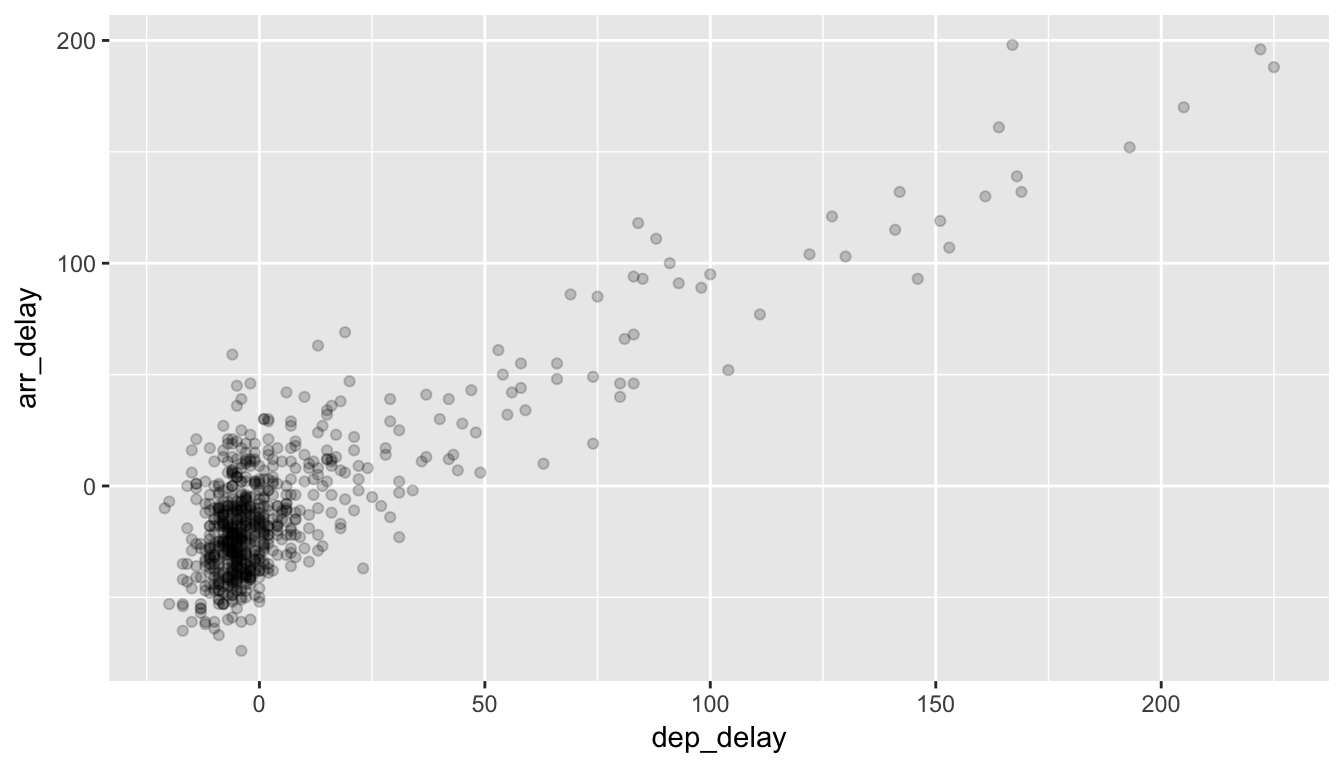
Figure 4.3: Delay scatterplot with alpha=0.2
Note how this function call is identical to the one in Section 4.3, but with geom_point() replaced with alpha = 0.2 added.
The second way of relieving over-plotting is to jitter the points a bit. In other words, we are going to add just a bit of random noise to the points to better see them and remove some of the over-plotting. You can think of “jittering” as shaking the points a bit on the plot. Instead of using geom_point, we use geom_jitter to perform this shaking and specify around how much jitter to add with the width and height arguments. This corresponds to how hard you’d like to shake the plot in units corresponding to those for both the horizontal and vertical variables (in this case minutes).
ggplot(data = all_alaska_flights, aes(x = dep_delay, y = arr_delay)) +
  geom_jitter(width = 30, height = 30)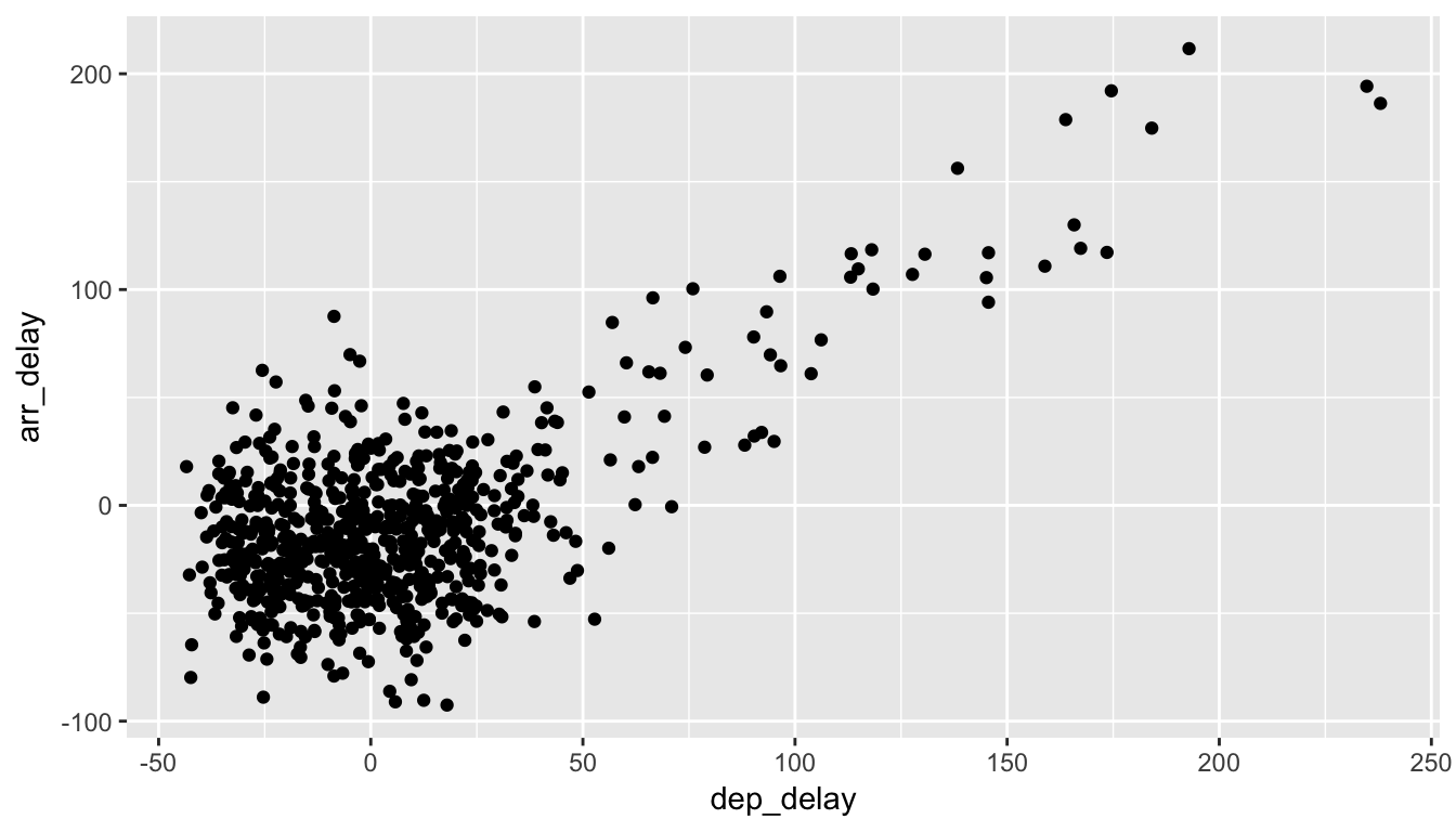
Figure 4.4: Jittered delay scatterplot
Note how this function call is identical to the one in Section 4.3.1, but with geom_point() replaced with geom_jitter(). The plot in 4.4 helps us a little bit in getting a sense for the over-plotting, but with a relatively large dataset like this one (714 flights), it can be argued that changing the transparency of the points by setting alpha proved more effective.
Learning check
(LC4.7) Why is setting the alpha argument value useful with scatter-plots? What further information does it give you that a regular scatter-plot cannot?
(LC4.8) After viewing the Figure 4.3 above, give a range of arrival times and departure times that occur most frequently? How has that region changed compared to when you observed the same plot without the alpha = 0.2 set in Figure 4.2?
4.3.3 Summary
Scatter-plots display the relationship between two continuous variables and may be the most used plot today as they can provide an immediate way to see the trend in one variable versus another. If you try to create a scatter-plot where either one of the two variables is not quantitative however, you will get strange results. Be careful!
With medium to large datasets, you may need to play with either geom_jitter or the alpha argument in order to get a good feel for relationships in your data. This tweaking is often a fun part of data visualization since you’ll have the chance to see different relationships come about as you make subtle changes to your plots.
4.4 5NG#2: Line-graphs
The next of the 5NG is a line-graph. They are most frequently used when the x-axis represents time and the y-axis represents some other numerical variable; such plots are known as time series. Time represents a variable that is connected together by each day following the previous day. In other words, time has a natural ordering. Line-graphs should be avoided when there is not a clear sequential ordering to the explanatory variable, i.e. the x-variable or the predictor variable.
Our focus turns to the temp variable in this weather dataset. By
- Looking over the
weatherdataset by typingView(weather)in the console. - Running
?weatherto bring up the help file.
We can see that the temp variable corresponds to hourly temperature (in Fahrenheit) recordings at weather stations near airports in New York City. Instead of considering all hours in 2013 for all three airports in NYC, let’s focus on the hourly temperature at Newark airport (origin code “EWR”) for the first 15 days in January 2013. The weather data frame in the nycflights13 package contains this data, but we first need to filter it to only include those rows that correspond to Newark in the first 15 days of January.
data(weather)
early_january_weather <- weather %>%
  filter(origin == "EWR" & month == 1 & day <= 15)
This is similar to the previous use of the filter command in Section 4.3, however we now use the & operator. The above selects only those rows in weather where origin == "EWR" and month = 1 and day <= 15.
Learning check
(LC4.9) Take a look at both the weather and early_january_weather data frames by running View(weather) and View(early_january_weather) in the console. In what respect do these data frames differ?
(LC4.10) The weather data is recorded hourly. Why does the time_hour variable correctly identify the hour of the measurement whereas the hour variable does not?
4.4.1 Line-graphs via geom_line
We plot a line-graph of hourly temperature using geom_line():
ggplot(data = early_january_weather, aes(x = time_hour, y = temp)) +
  geom_line()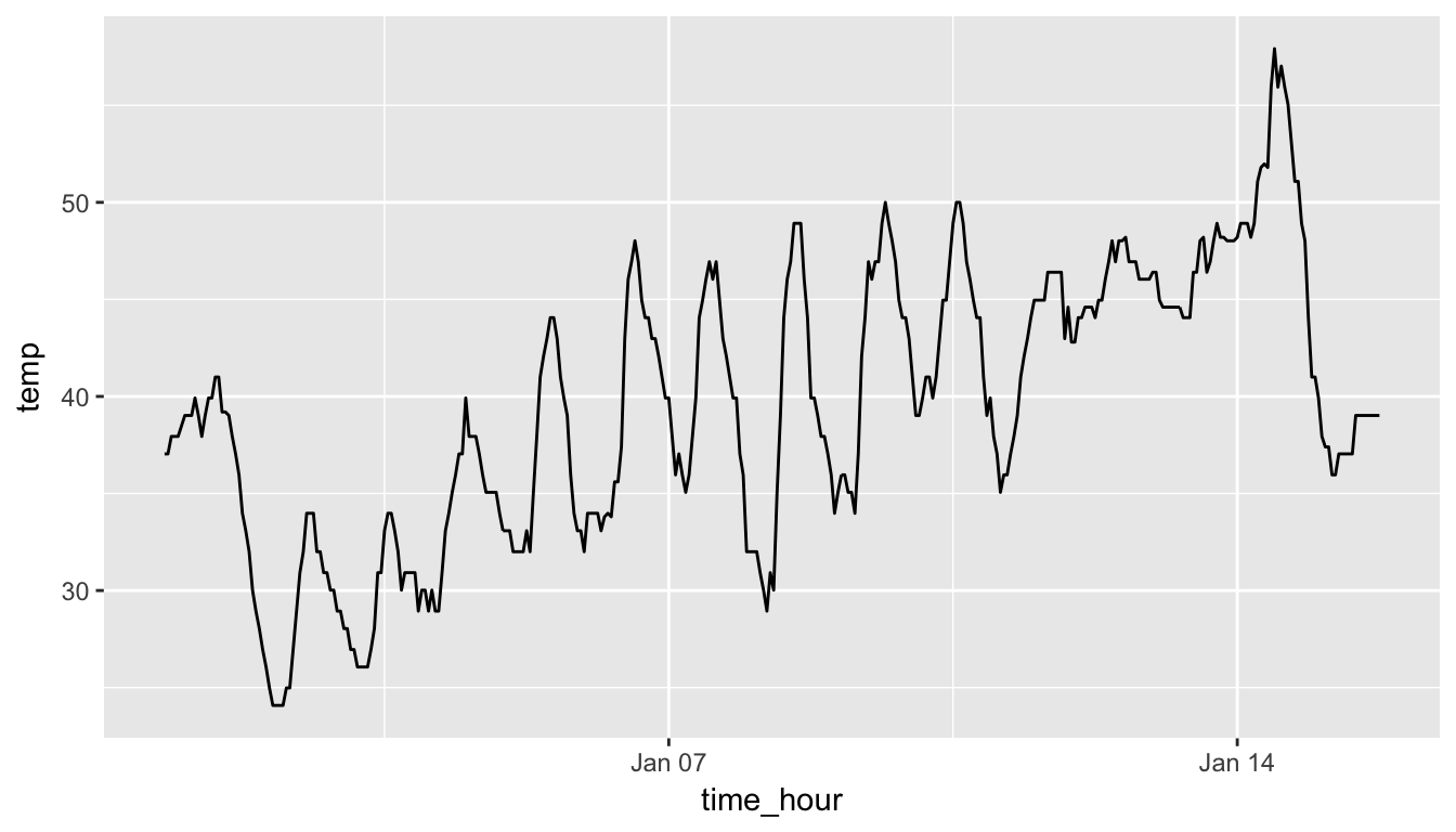
Figure 4.5: Hourly Temperature in Newark for Jan 1-15 2013
Much as with the ggplot() call in Section 4.3.1, we specify the components of the Grammar of Graphics:
- Within the
ggplot()function call, we specify two of the components of the grammar:- The
dataframe to beearly_january_weatherby settingdata = early_january_weather - The
aesthetic mapping by settingaes(x = time_hour, y = temp). Specificallytime_hour(i.e. the time variable) maps to thexpositiontempmaps to theyposition
- The
- We add a layer to the
ggplot()function call using the+sign - The layer in question specifies the third component of the grammar: the
geometric object in question. In this case the geometric object is aline, set by specifyinggeom_line()
Learning check
(LC4.11) Why should line-graphs be avoided when there is not a clear ordering of the horizontal axis?
(LC4.12) Why are line-graphs frequently used when time is the explanatory variable?
(LC4.13) Plot a time series of a variable other than temp for Newark Airport in the first 15 days of January 2013.
4.4.2 Summary
Line-graphs, just like scatter-plots, display the relationship between two continuous variables. However the variable on the x-axis (i.e. the explanatory variable) should have a natural ordering, like some notion of time. We can mislead our audience if that isn’t the case.
4.5 5NG#3: Histograms
Let’s consider the temp variable in the weather data frame once again, but now unlike with the line-graphs in Section 4.4, let’s say we don’t care about the relationship of temperature to time, but rather you care about the (statistical) distribution of temperatures. We could just produce points where each of the different values appear on something similar to a number line:
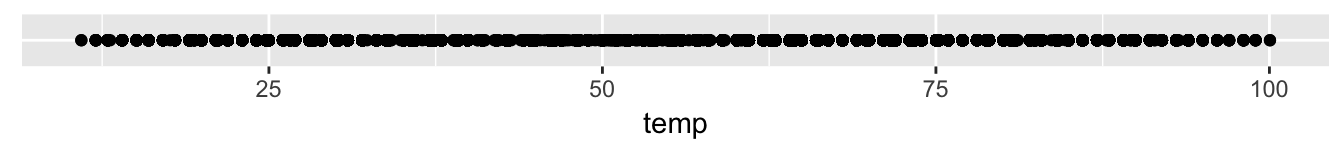
Figure 4.6: Strip Plot of Hourly Temperature Recordings from NYC in 2013
This gives us a general idea of how the values of temp differ. We see that temperatures vary from around 11 up to 100 degrees Fahrenheit. The area between 40 and 60 degrees appears to have more points plotted than outside that range.
4.5.1 Histograms via geom_histogram
What is commonly produced instead of this strip plot is a plot known as a histogram. The histogram shows how many elements of a single numerical variable fall in specified bins. In this case, these bins may correspond to between 0-10°F, 10-20°F, etc. We produce a histogram of the hour temperatures at all three NYC airports in 2013:
ggplot(data = weather, mapping = aes(x = temp)) +
  geom_histogram()
## `stat_bin()` using `bins = 30`. Pick better value with `binwidth`.## Warning: Removed 1 rows containing non-finite values (stat_bin).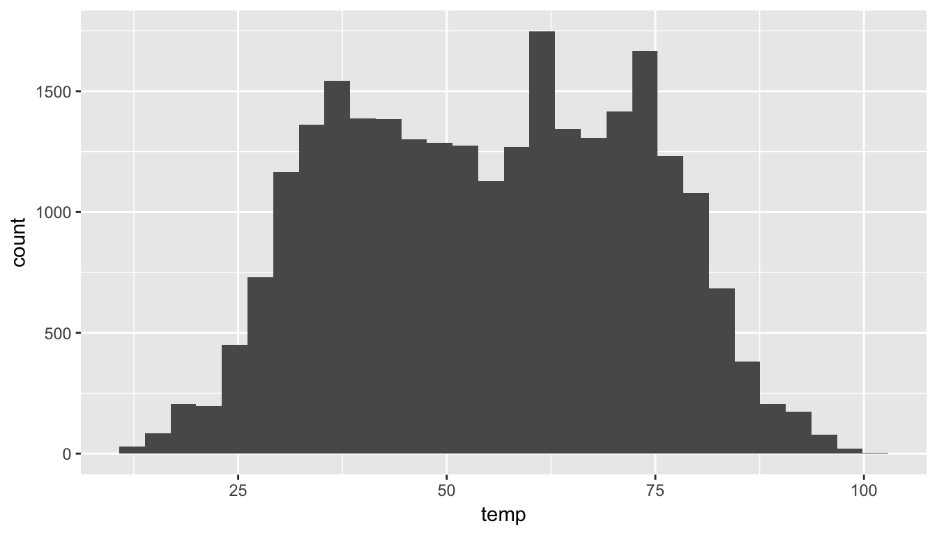
Figure 4.7: Histogram of Hourly Temperature Recordings from NYC in 2013
Note here:
- There is only one variable being mapped in
aes(): the single continuous variabletemp. You don’t need to compute the y-aesthetic: it gets computed automatically. - We set the
geometric object to begeom_histogram() - We got a warning message of
1 rows containing non-finite valuesbeing removed. This is due to one of the values of temperature being missing. R is alerting us that this happened.
4.5.2 Adjusting the Bins
We can adjust the number/size of the bins two ways:
- By adjusting the number of bins via the
binsargument - By adjusting the width of the bins via the
binwidthargument
First, we have the power to specify how many bins we would like to put the data into as an argument in the geom_histogram function. By default, this is chosen to be 30 somewhat arbitrarily; we have received a warning above our plot that this was done.
ggplot(data = weather, mapping = aes(x = temp)) +
  geom_histogram(bins = 60, color = "white")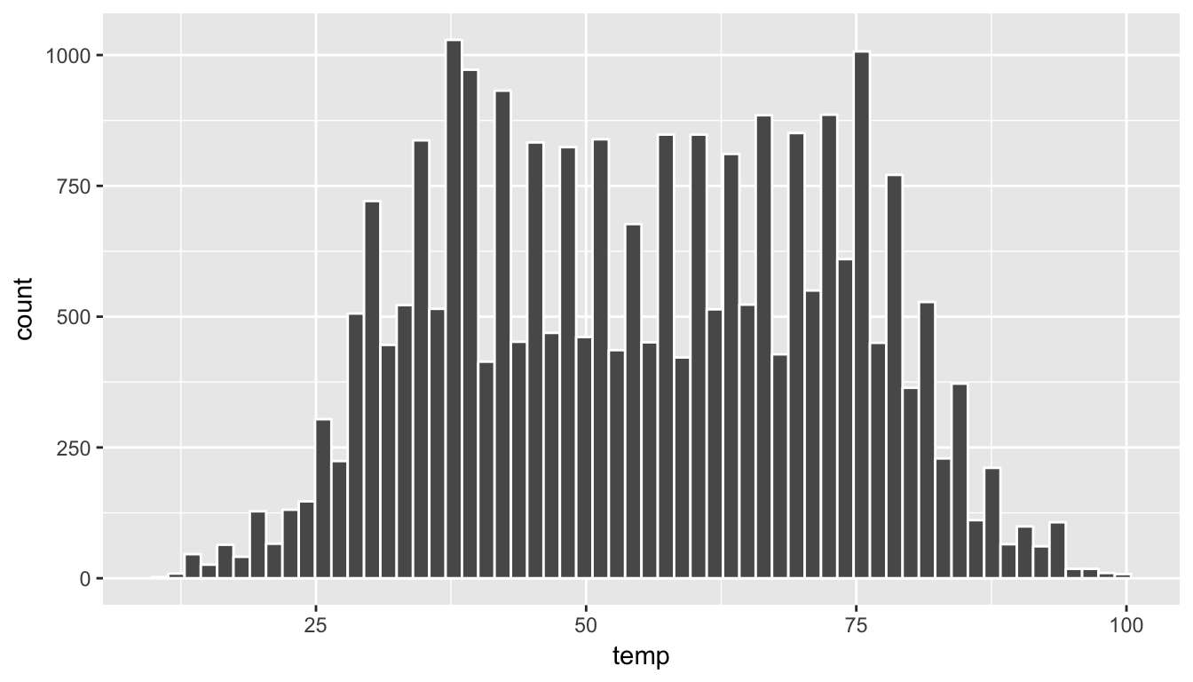
Figure 4.8: Histogram of Hourly Temperature Recordings from NYC in 2013 - 60 Bins
Note the addition of the color argument. If you’d like to be able to more easily differentiate each of the bins, you can specify the color of the outline as done above.
Second, instead of specifying the number of bins, we can also specify the width of the bins by using the binwidth argument in the geom_histogram function.
ggplot(data = weather, mapping = aes(x = temp)) +
  geom_histogram(binwidth = 10, color = "white")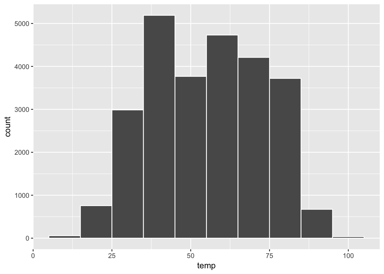
Figure 4.9: Histogram of Hourly Temperature Recordings from NYC in 2013 - Binwidth = 10
Learning check
(LC4.14) What does changing the number of bins from 30 to 60 tell us about the distribution of temperatures?
(LC4.15) Would you classify the distribution of temperatures as symmetric or skewed?
(LC4.16) What would you guess is the “center” value in this distribution? Why did you make that choice?
(LC4.17) Is this data spread out greatly from the center or is it close? Why?
4.5.3 Summary
Histograms, unlike scatter-plots and line-graphs, presents information on only a single continuous variable. In particular they are visualizations of the (statistical) distribution of values.
4.6 Facets
Before continuing the 5NG, we briefly introduce a new concept called faceting. Faceting is used when we’d like to create small multiples of the same plot over a different categorical variable. By default, all of the small multiples will have the same vertical axis.
For example, suppose we were interested in looking at how the temperature histograms we saw in Section 4.5 varied by month. This is what is meant by “the distribution of a variable over another variable”: temp is one variable and month is the other variable. In order to look at histograms of temp for each month, we add a layer facet_wrap(~month). You can also specify how many rows you’d like the small multiple plots to be in using nrow inside of facet_wrap.
ggplot(data = weather, aes(x = temp)) +
  geom_histogram(binwidth = 5, color = "white") +
  facet_wrap(~ month, nrow = 4)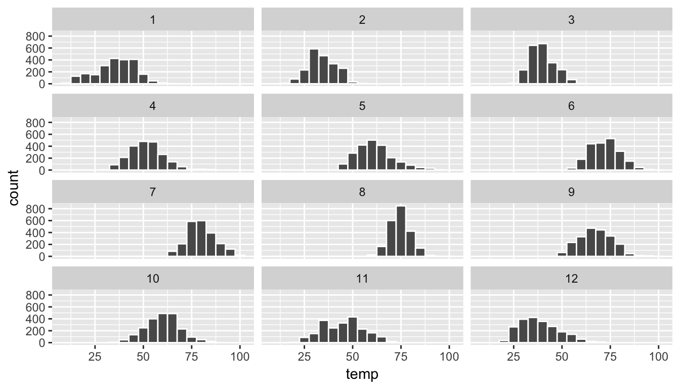
Figure 4.10: Faceted histogram
As we might expect, the temperature tends to increase as summer approaches and then decrease as winter approaches.
Learning check
(LC4.18) What other things do you notice about the faceted plot above? How does a faceted plot help us see how relationships between two variables?
(LC4.19) What do the numbers 1-12 correspond to in the plot above? What about 25, 50, 75, 100?
(LC4.20) For which types of datasets would these types of faceted plots not work well in comparing relationships between variables? Give an example describing the variability of the variables and other important characteristics.
(LC4.21) Does the temp variable in the weather data set have a lot of variability? Why do you say that?
4.7 5NG#4: Boxplots
While using faceted histograms can provide a way to compare distributions of a continuous variable split by groups of a categorical variable as in Chapter 4.6, an alternative plot called a boxplot (also called a side-by-side boxplot) achieves the same task and is frequently preferred. The boxplot uses the information provided in the five-number summary referred to in Appendix A. It gives a way to compare this summary information across the different levels of a categorical variable.
4.7.1 Boxplots via geom_boxplot
Let’s create a boxplot to compare the monthly temperatures as we did above with the faceted histograms.
ggplot(data = weather, aes(x = month, y = temp)) +
  geom_boxplot()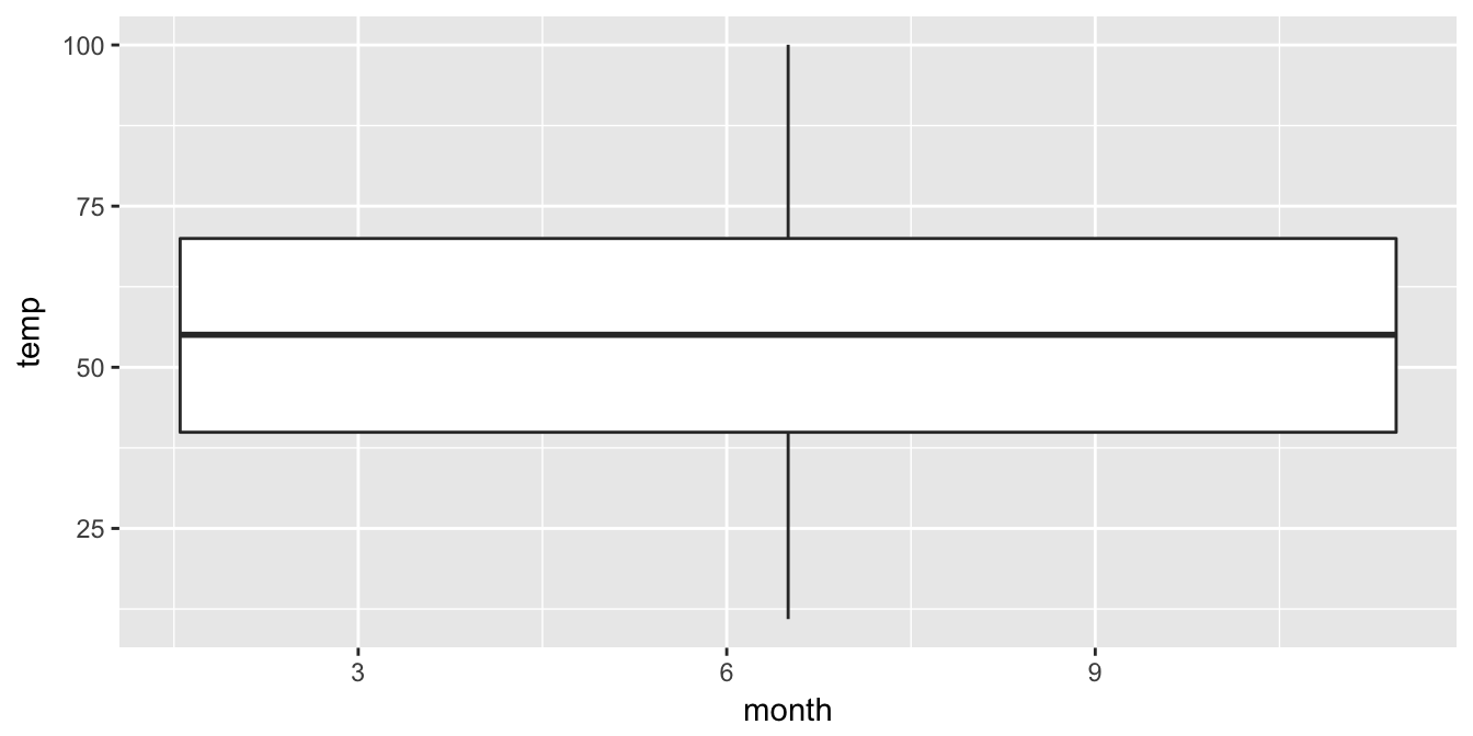
Figure 4.11: Invalid boxplot specification
Note the first warning that is given here. (The second one corresponds to missing values in the data frame and it is turned off on subsequent plots.) Observe that this plot does not look like what we were expecting. We were expecting to see the distribution of temperatures for each month (so 12 different boxplots). This gives us the overall boxplot without any other groupings. We can get around this by introducing a new function for our x variable:
ggplot(data = weather, mapping = aes(x = factor(month), y = temp)) +
  geom_boxplot()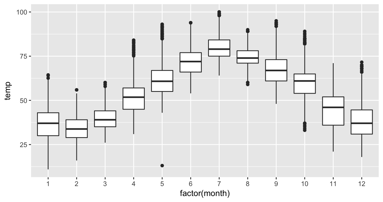
Figure 4.12: Month by temp boxplot
We have introduced a new function called factor() here. One of the things this function does is to convert a discrete value like month (1, 2, …, 12) into a categorical variable. The “box” part of this plot represents the 25th percentile, the median (50th percentile), and the 75th percentile. The dots correspond to outliers. (The specific formulation for these outliers is discussed in Appendix A.) The lines show how the data varies that is not in the center 50% defined by the first and third quantiles. Longer lines correspond to more variability and shorter lines correspond to less variability.
Learning check
(LC4.22) What does the dot at the bottom of the plot for May correspond to? Explain what might have occurred in May to produce this point.
(LC4.23) Which months have the highest variability in temperature? What reasons do you think this is?
(LC4.24) We looked at the distribution of a continuous variable over a categorical variable here with this boxplot. Why can’t we look at the distribution of one continuous variable over the distribution of another continuous variable? Say, temperature across pressure, for example?
(LC4.25) Boxplots provide a simple way to identify outliers. Why may outliers be easier to identify when looking at a boxplot instead of a faceted histogram?
4.7.2 Summary
Boxplots provide a way to compare and contrast the distribution of one quantitative variable across multiple levels of one categorical variable. One can easily look to see where the median falls across the different groups by looking at the center line in the box. You can also see how spread out the variable is across the different groups by looking at the width of the box and also how far out the lines stretch from the box. If the lines stretch far from the box but the box has a small width, the variability of the values closer to the center is much smaller than the variability of the outer ends of the variable. Lastly, outliers are even more easily identified when looking at a boxplot than when looking at a histogram.
4.8 5NG#5: Barplots
Both histograms and boxplots represent ways to visualize the variability of continuous variables. Another common task is to present the distribution of a categorical variable. This is a simpler task since we will be interested in how many elements from our data fall into the different categories of the categorical variable.
4.8.1 Barplots via geom_bar
Frequently, the best way to visualize these different counts (also known as frequencies) is via a barplot. Consider the distribution of airlines that flew out of New York City in 2013. Here we explore the number of flights from each airline/carrier. This can be plotted by invoking the geom_bar function in ggplot2:
ggplot(data = flights, mapping = aes(x = carrier)) +
  geom_bar()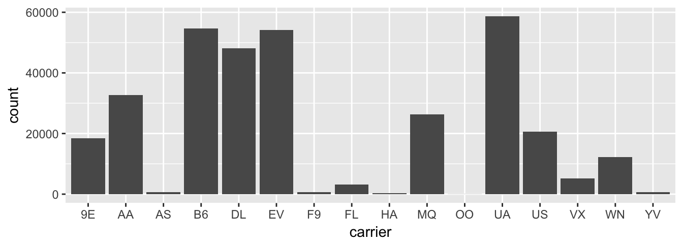
Figure 4.13: Number of flights departing NYC in 2013 by airline
To get an understanding of what the names of these airlines are corresponding to these carrier codes, we can look at the airlines data frame in the nycflights13 package. Note the use of the kable function here in the knitr package, which produces a nicely-formatted table of the values in the airlines data frame.
data(airlines)
kable(airlines)| carrier | name |
|---|---|
| 9E | Endeavor Air Inc. |
| AA | American Airlines Inc. |
| AS | Alaska Airlines Inc. |
| B6 | JetBlue Airways |
| DL | Delta Air Lines Inc. |
| EV | ExpressJet Airlines Inc. |
| F9 | Frontier Airlines Inc. |
| FL | AirTran Airways Corporation |
| HA | Hawaiian Airlines Inc. |
| MQ | Envoy Air |
| OO | SkyWest Airlines Inc. |
| UA | United Air Lines Inc. |
| US | US Airways Inc. |
| VX | Virgin America |
| WN | Southwest Airlines Co. |
| YV | Mesa Airlines Inc. |
Going back to our barplot, we see that United Air Lines, JetBlue Airways, and ExpressJet Airlines had the most flights depart New York City in 2013. To get the actual number of flights by each airline we can use the count function in the dplyr package on the carrier variable in flights, which we will introduce formally in Chapter 5.
flights_table <- flights %>% dplyr::count(carrier)
knitr::kable(flights_table)| carrier | n |
|---|---|
| 9E | 18460 |
| AA | 32729 |
| AS | 714 |
| B6 | 54635 |
| DL | 48110 |
| EV | 54173 |
| F9 | 685 |
| FL | 3260 |
| HA | 342 |
| MQ | 26397 |
| OO | 32 |
| UA | 58665 |
| US | 20536 |
| VX | 5162 |
| WN | 12275 |
| YV | 601 |
Technical note: Refer to the use of :: in both lines of code above. This is another way of ensuring the correct function is called. A count exists in a couple different packages and sometimes you’ll receive strange errors when a different instance of a function is used. This is a great way of telling R that “I want this one!”. You specify the name of the package directly before the :: and then the name of the function immediately after ::.
Learning check
(LC4.26) Why are histograms inappropriate for visualizing categorical variables?
(LC4.27) What is the difference between histograms and barplots?
(LC4.28) How many Envoy Air flights departed NYC in 2013?
(LC4.29) What was the seventh highest airline in terms of departed flights from NYC in 2013? How could we better present the table to get this answer quickly.
4.8.2 Must avoid pie charts!
Unfortunately, one of the most common plots seen today for categorical data is the pie chart. While they may see harmless enough, they actually present a problem in that humans are unable to judge angles well. As Naomi Robbins describes in her book “Creating More Effective Graphs” (Robbins 2013), we overestimate angles greater than 90 degrees and we underestimate angles less than 90 degrees. In other words, it is difficult for us to determine relative size of one piece of the pie compared to another.
Let’s examine our previous barplot example on the number of flights departing NYC by airline. This time we will use a pie chart. As you review this chart, try to identify
- how much larger the portion of the pie is for ExpressJet Airlines (
EV) compared to US Airways (US), - what the third largest carrier is in terms of departing flights, and
- how many carriers have fewer flights than United Airlines (
UA)?
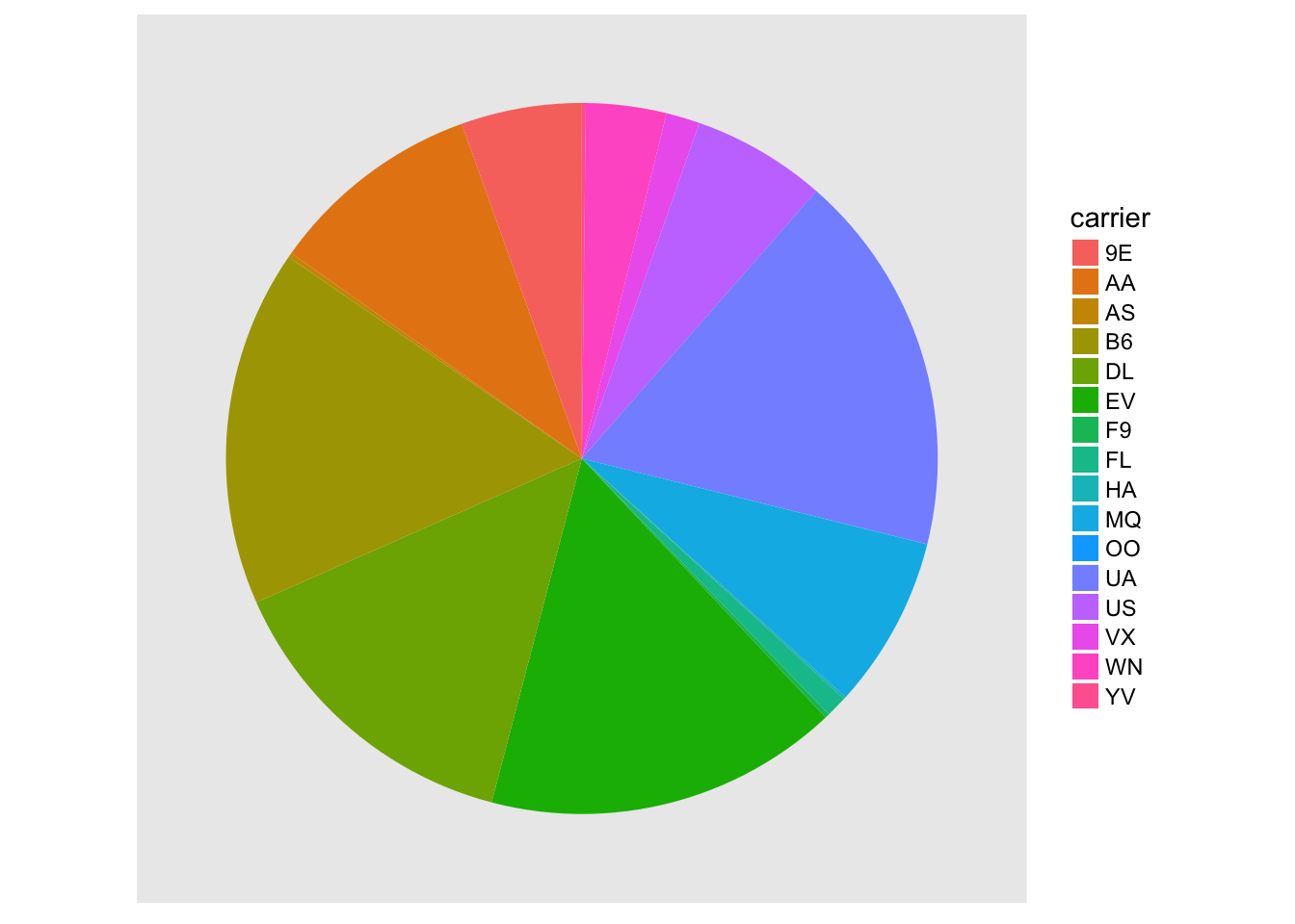
Figure 4.14: The dreaded pie chart
While it is quite easy to look back at the barplot to get the answer to these questions, it’s quite difficult to get the answers correct when looking at the pie graph. Barplots can always present the information in a way that is easier for the eye to determine relative position. There may be one exception from Nathan Yau at FlowingData.com but we will leave this for the reader to decide:
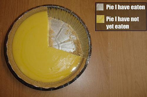
Figure 4.15: The only good pie chart
Learning check
(LC4.30) Why should pie charts be avoided and replaced by barplots?
(LC4.31) What is your opinion as to why pie charts continue to be used?
4.8.3 Using barplots to compare two variables
Barplots are the go-to way to visualize the frequency of different categories of a categorical variable. They make it easy to order the counts and to compare one group’s frequency to another. Another use of barplots (unfortunately, sometimes inappropriately and confusingly) is to compare two categorical variables together. Let’s examine the distribution of outgoing flights from NYC by carrier and airport.
We begin by getting the names of the airports in NYC that were included in the flights dataset. Remember from Chapter 3 that this can be done by using the inner_join function (more in Chapter 5).
flights_namedports <- flights %>%
  inner_join(airports, by = c("origin" = "faa"))
After running View(flights_namedports), we see that name now corresponds to the name of the airport as referenced by the origin variable. We will now plot carrier as the horizontal variable. When we specify geom_bar, it will specify count as being the vertical variable. A new addition here is fill = name. Look over what was produced from the plot to get an idea of what this argument gives.
Note that fill is an aesthetic just like x is an aesthetic. We need to make the name variable to this aesthetic. Any time you use a variable like this, you need to make sure it is wrapped inside the aes function. This is a common error! Make note of this now so you don’t fall into this problem later.
ggplot(data = flights_namedports, mapping = aes(x = carrier, fill = name)) +
  geom_bar()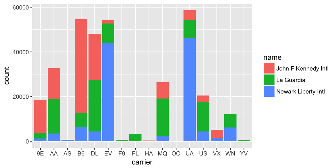
Figure 4.16: Stacked barplot comparing the number of flights by carrier and airport
This plot is what is known as a stacked barplot. While simple to make, it often leads to many problems.
Learning check
(LC4.32) What kinds of questions are not easily answered by looking at the above figure?
(LC4.33) What can you say, if anything, about the relationship between airline and airport in NYC in 2013 in regards to the number of departing flights?
Another variation on the stacked barplot is the side-by-side barplot.
ggplot(data = flights_namedports, mapping = aes(x = carrier, fill = name)) +
  geom_bar(position = "dodge")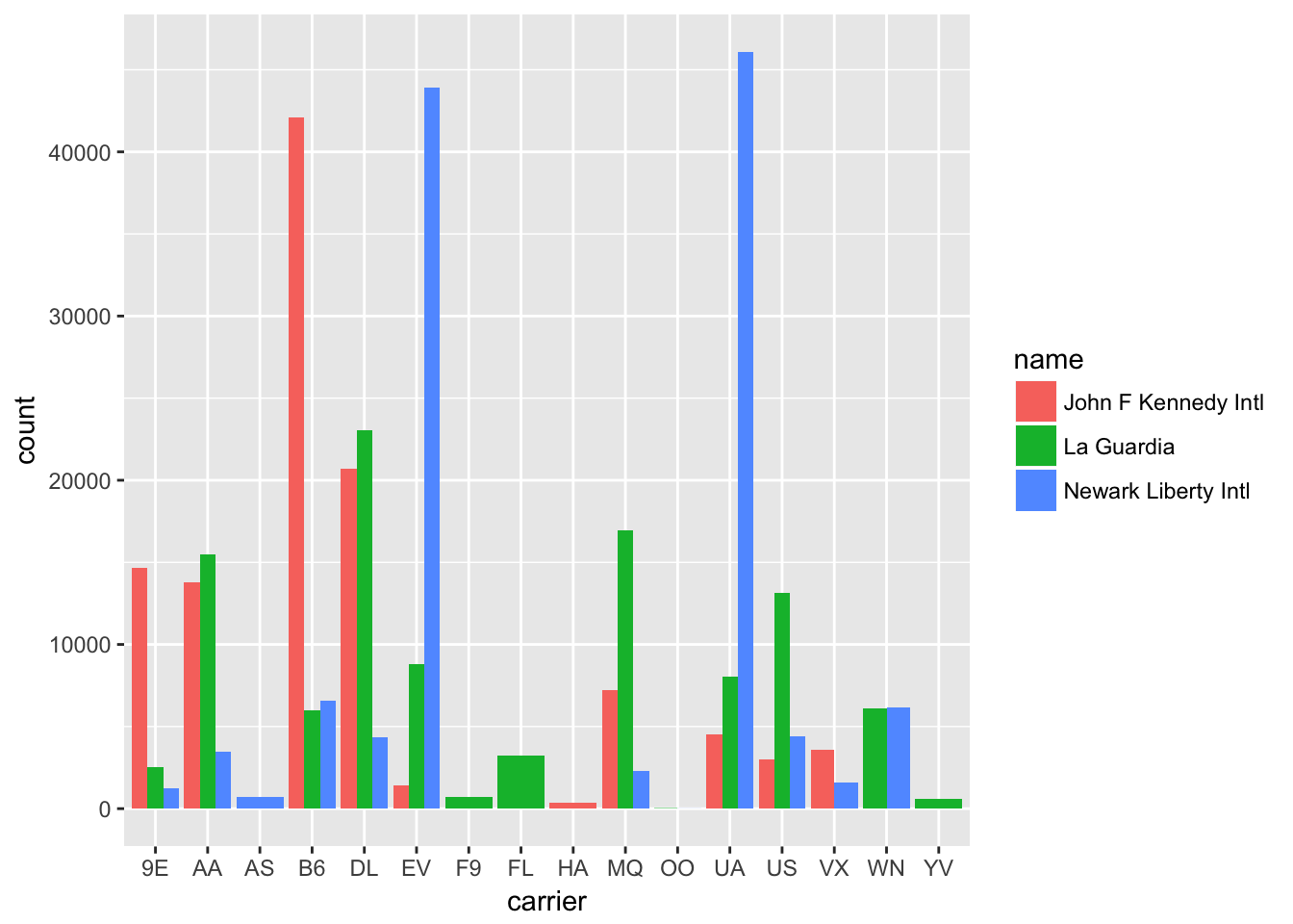
Figure 4.17: Side-by-side barplot comparing the number of flights by carrier and airport
Learning check
(LC4.34) Why might the side-by-side barplot be preferable to a stacked barplot in this case?
(LC4.35) What are the disadvantages of using a side-by-side barplot, in general?
Lastly, an often preferred type of barplot is the faceted barplot. We already saw this concept of faceting and small multiples in Section 4.6. This gives us a nicer way to compare the distributions across both carrier and airport/name.
ggplot(data = flights_namedports, mapping = aes(x = carrier, fill = name)) +
  geom_bar() +
  facet_grid(name ~ .)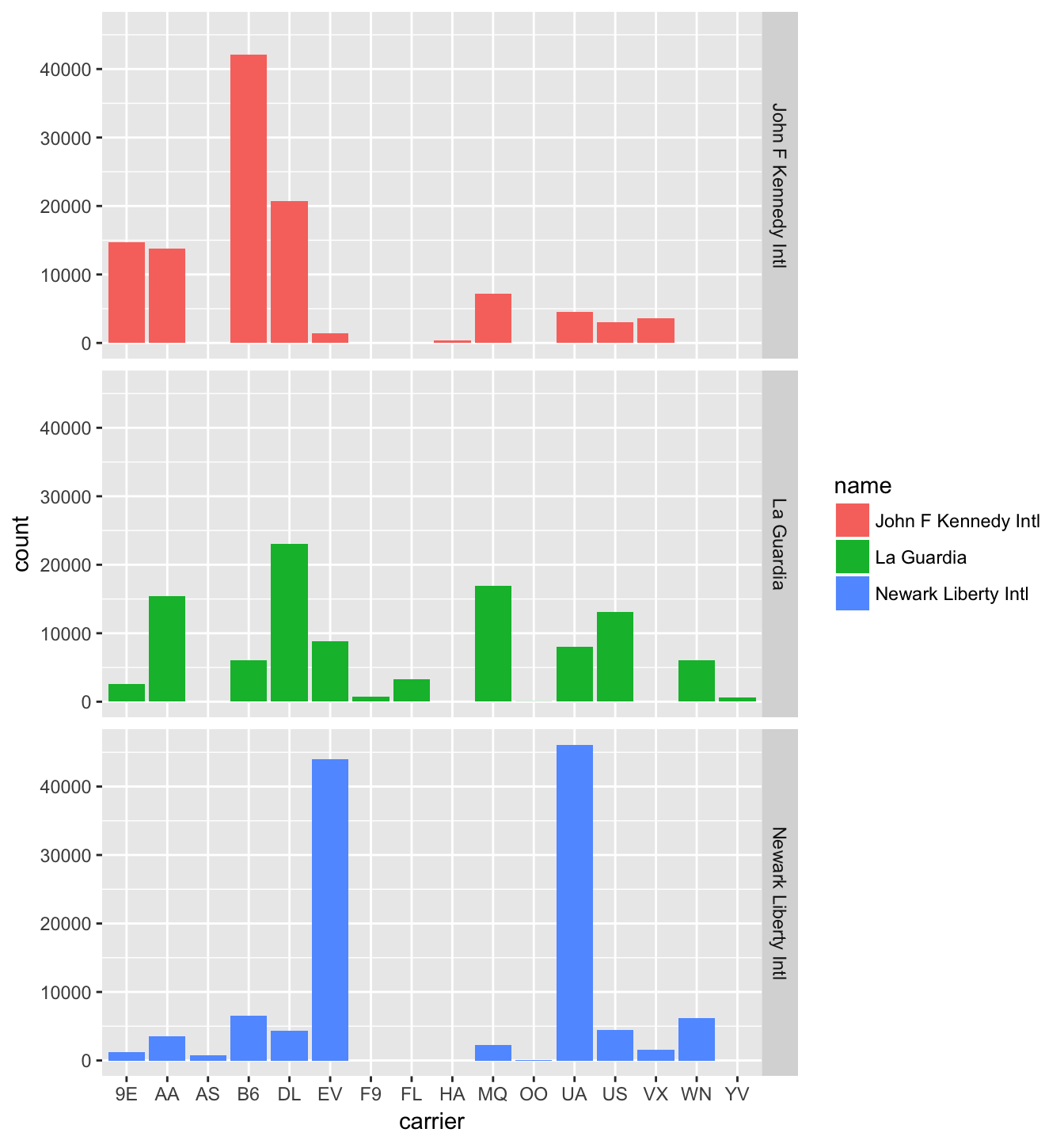
Figure 4.18: Faceted barplot comparing the number of flights by carrier and airport
Note how the facet_grid function arguments are written here. We are wanting the names of the airports vertically and the carrier listed horizontally. As you may have guessed, this argument and other formulas of this sort in R are in y ~ x order. We will see more examples of this in Chapter 9.
Learning check
(LC4.36) Why is the faceted barplot preferred to the side-by-side and stacked barplots in this case?
(LC4.37) What information about the different carriers at different airports is more easily seen in the faceted barplot?
4.8.4 Summary
Barplots are the preferred way of displaying categorical variables. They are easy-to-understand and to make comparisons across groups of a categorical variable. When dealing with more than one categorical variable, faceted barplots are frequently preferred over side-by-side or stacked barplots. Stacked barplots are sometimes nice to look at, but it is quite difficult to compare across the levels since the sizes of the bars are all of different sizes. Side-by-side barplots can provide an improvement on this, but the issue about comparing across groups still must be dealt with.
4.9 Conclusion
4.9.1 Resources
An excellent resource as you begin to create plots using the ggplot2 package is a cheatsheet that RStudio has put together entitled “Data Visualization with ggplot2” available
- by clicking here or
- by clicking the RStudio Menu Bar -> Help -> Cheatsheets -> “Data Visualization with
ggplot2”
This covers more than what we’ve discussed in this chapter but provides nice visual descriptions of what each function produces.
In addition, we’ve created a mind map to help you remember which types of plots are most appropriate in a given situation by identifying the types of variables involved in the problem. It is available here and below.
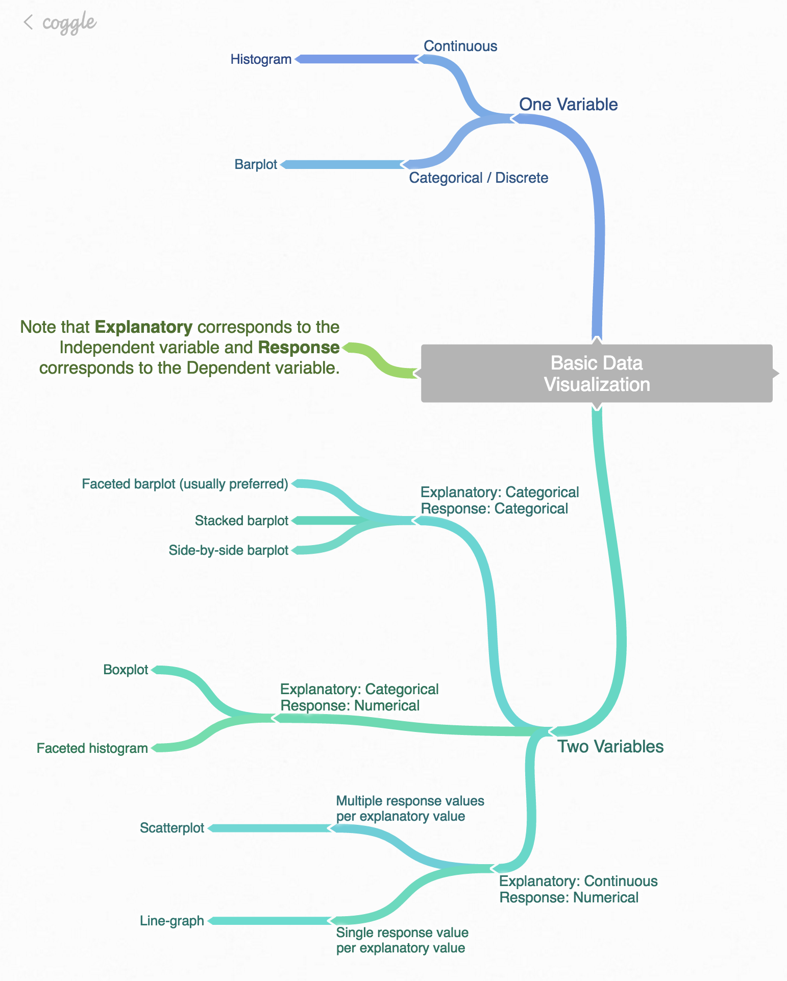
Figure 4.19: Mind map for Data Visualization
4.9.2 Script of R code
An R script file of all R code used in this chapter is available here.
Review questions
Review questions have been designed using the fivethirtyeight R package (Ismay and Chunn 2017) with links to the corresponding FiveThirtyEight.com articles in our free DataCamp course Effective Data Storytelling using the tidyverse. The material in this chapter is covered in the chapters of the DataCamp course available below:
A ggplot2 Review DataCamp course is in development currently.
4.9.3 What’s to come?
In Chapter 5, we’ll further explore data by grouping our data, creating summaries based on those groupings, filtering our data to match conditions, and other manipulations with our data including defining new columns/variables. These data manipulation procedures will go hand-in-hand with the data visualizations you’ve produced here.
References
Wilkinson, Leland. 2005. The Grammar of Graphics (Statistics and Computing). Secaucus, NJ, USA: Springer-Verlag New York, Inc.
Wickham, Hadley, and Winston Chang. 2016. Ggplot2: Create Elegant Data Visualisations Using the Grammar of Graphics. https://CRAN.R-project.org/package=ggplot2.
Robbins, Naomi. 2013. Creating More Effective Graphs. Chart House.
Ismay, Chester, and Jennifer Chunn. 2017. Fivethirtyeight: Data and Code Behind the Stories and Interactives at ’Fivethirtyeight’. https://github.com/rudeboybert/fivethirtyeight.