
8 Sampling
In this chapter we kick off the third segment of this book, statistical inference, by learning about sampling. The concepts behind sampling form the basis of confidence intervals and hypothesis testing, which we’ll cover in Chapters 9 and 10 respectively. We will see that the tools that you learned in the data science segment of this book (data visualization, “tidy” data format, and data wrangling) will also play an important role here in the development of your understanding. As mentioned before, the concepts throughout this text all build into a culmination allowing you to “think with data.”
Needed packages
Let’s load all the packages needed for this chapter (this assumes you’ve already installed them). If needed, read Section 2.3 for information on how to install and load R packages.
library(dplyr)
library(ggplot2)
library(moderndive)
8.1 Terminology
Before we can start studying sampling, we need to define some terminology.
- Population: The population is the (usually) large pool of observational units that we are interested in.
- Population parameter: A population parameter is a numerical quantify of interest about a population, such as a proportion or a mean.
- Census: An enumeration of every member of a population. Ex: the Decennial United States census.
- Sample: A sample is a smaller collection of observational units that is selected from the population. We would like to infer about the population based on this sample.
- Sampling: Sampling refers to the process of selecting observations from a population. There are both random and non-random ways this can be done.
- Representative sampling: A sample is said be a representative sample if the characteristics of observational units selected are a good approximation of the characteristics from the original population.
- Generalizability: Generalizability refers to the largest group in which it makes sense to make inferences about from the sample collected. This is directly related to how the sample was selected.
- Bias: Bias corresponds to a favoring of one group in a population over another group. Or put differently, when certain members of a population have a higher chance of being included in a sample than others.
- Statistic: A statistic is a calculation based on one or more variables measured in the sample.
- Point estimates/sample statistics: These are statistics, computed based on a sample, that estimate an unknown population parameter.
8.2 “In real life” sampling
Consider the following “sampling bowl” consisting of 2400 balls, which are either red, white, or green. We are interested in knowing the proportion of balls in the sampling bowl that are red, but do not wish to manually count the number of balls out of 2400 that are red. In other words, we’re not interested in conducting a census. So instead we attempt to estimate the proportion red by using the sampling “shovel” to extract a sample of size \(n = 50\) balls, and count the proportion of these that are red. However, before we extracted a sample using this shovel, we made sure to give the balls a good stir, ensuring we have random sampling.
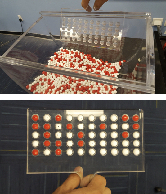
Figure 8.1: Sampling from a sampling bowl
We put students to the task of estimating the proportion of balls in the tub that are red, because frankly, we’re too lazy to do so ourselves! Groups of students “in real life” took random samples of size \(n = 50\). Thank you Niko, Sophie, Caitlin, Yaw, and Drew for doing double duty! In other words, we have 10 samples of size \(n = 50\):
bowl_samples| group | red | white | green | n |
|---|---|---|---|---|
| Kathleen and Max | 18 | 32 | 0 | 50 |
| Sean, Jack, and CJ | 18 | 32 | 0 | 50 |
| X and Judy | 22 | 28 | 0 | 50 |
| James and Jacob | 21 | 29 | 0 | 50 |
| Hannah and Siya | 16 | 34 | 0 | 50 |
| Niko, Sophie, and Caitlin | 14 | 36 | 0 | 50 |
| Niko, Sophie, and Caitlin | 19 | 31 | 0 | 50 |
| Aleja and Ray | 20 | 30 | 0 | 50 |
| Yaw and Drew | 16 | 34 | 0 | 50 |
| Yaw and Drew | 21 | 29 | 0 | 50 |
For each sample of size \(n\) = 50, what is the sample proportion that are red? In other words, what are the point estimates \(\widehat{p}\) based on a sample of size \(n = 50\) of \(p\), the true proportion of balls in the tub that is red? We can compute this using the mutate() function from the dplyr package we studied extensively in Chapter 5:
bowl_samples <- bowl_samples %>%
  mutate(prop_red = red / n) %>%
  select(group, prop_red)
bowl_samples| group | prop_red |
|---|---|
| Kathleen and Max | 0.36 |
| Sean, Jack, and CJ | 0.36 |
| X and Judy | 0.44 |
| James and Jacob | 0.42 |
| Hannah and Siya | 0.32 |
| Niko, Sophie, and Caitlin | 0.28 |
| Niko, Sophie, and Caitlin | 0.38 |
| Aleja and Ray | 0.40 |
| Yaw and Drew | 0.32 |
| Yaw and Drew | 0.42 |
We see that one group got a sample proportion \(\widehat{p}\) as low as 28% while another got a sample proportion \(\widehat{p}\) as high as 0.44. Why are these different? Why is there this variation? Because of sampling variability! Sampling is inherently random, so for a sample of \(n = 50\) balls, we’ll never get exactly the same number of red balls.
Let’s visualize this using our data visualization skills that you honed in Chapter 3! Let’s investigate the distribution of these 10 sample proportion red \(\widehat{p}\) each based on a random sample of size \(n = 50\) using a histogram, an appropriate visualization since prop_red is numerical:
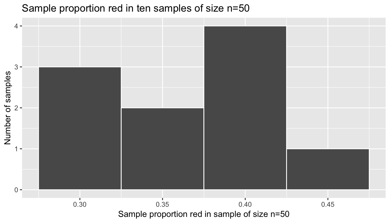
Figure 8.2: In real life: 10 sample proportions red based on 10 samples of size 50
Let’s ask ourselves some questions:
- Where is the histogram centered?
- What is the spread of this histogram?
Recall from Section 5.4 the mean and the standard deviation are two summary statistics that would answer this question:
bowl_samples %>%
summarize(mean = mean(prop_red), sd = sd(prop_red))| mean | sd |
|---|---|
| 0.37 | 0.052 |
What you have just unpacked are some very deep and very subtle concepts in statistical inference:
- The histogram in Figure 8.2 is called the sampling distribution of \(\widehat{p}\) based on samples of size \(n=50\). It describes how values of the sample proportion red will vary from sample-to-sample due to the aforementioned sampling variability.
- If the sampling is done in an unbiased and random fashion, in other words we made sure to stir the bowl before we sampled, then the sampling distribution will be guaranteed to be centered at the true unknown population proportion red, or in other words the true number of balls out of 2400 that are red. In this case, these 10 values of \(\widehat{p}\) are centered at 0.37.
- The spread of this histogram, as quantified by the standard deviation of 0.052, is called the standard error. It quantifies the variability of our estimates for \(\widehat{p}\).
8.3 Virtual sampling
In the moderndive package, we’ve included a data frame called bowl that actually is a virtual version of the above sampling bowl in Figure 8.1 with all 2400 balls! While we present a snap shot of the first 10 rows of bowl below, you should View() it in RStudio to convince yourselves that bowl is indeed a virtual version of the image above.
View(bowl)| ball_ID | color |
|---|---|
| 1 | white |
| 2 | white |
| 3 | white |
| 4 | red |
| 5 | white |
| 6 | white |
| 7 | red |
| 8 | white |
| 9 | red |
| 10 | white |
Note that the balls are not actually marked with numbers; the variable ball_ID is merely used as an identification variable for each row of bowl. Recall our previous discussion on identification variables in Subsection 4.2.2 in the “Data Tidying” Chapter 4.
Let’s replicate what the groups of students did above but virtually. We are going to now simulate using a computer what our students did by hand in Table 8.1 using the rep_sample_n() function. The rep_sample_n() function takes the following arguments:
tbl: a data frame representing the population you wish to infer about. We’ll set this tobowl, since this is the (virtual) population of interest.size: the sample size \(n\) in question. We’ll set this to 50, mimicking the number of slots in the sampling “shovel” in the image in Figure 8.1.replace: A logicalTRUE/FALSEvalue indicating whether or not to put each ball back into the bowl after we’ve sampled it. In our case, we’ll set this toFALSEsince we are sampling 50 balls at once, not 50 single balls individually.reps: the number of samples of size \(n =\)sizeto extract. We’ll set this to 10, mimicking the data we have in Table 8.1.
Let’s apply this function to mimic our situation above and View() the data. The output is rather large, so we won’t display it below.
all_samples <- rep_sample_n(bowl, size = 50, reps = 10)
View(all_samples)
Scrolling through the spreadsheet viewer, you’ll notice
- The values of
replicate(1through10) come in bunches of 50, representing the 10 groups of respective samples of size \(n\) = 50. - The
ball_IDidentification variable is all over the place, suggesting we really are (virtually) randomly sampling balls. colorrepresents the color of each of the virtually sampled balls.
What is the proportion red for each group as denoted by the replicate variable? Again, let’s leverage your data ninja skills from Chapter 5.
bowl_samples_virtual <- all_samples %>%
  mutate(is_red = color == "red") %>%
  group_by(replicate) %>%
  summarize(prop_red = mean(is_red))
bowl_samples_virtual| replicate | prop_red |
|---|---|
| 1 | 0.34 |
| 2 | 0.36 |
| 3 | 0.40 |
| 4 | 0.38 |
| 5 | 0.36 |
| 6 | 0.30 |
| 7 | 0.36 |
| 8 | 0.38 |
| 9 | 0.26 |
| 10 | 0.46 |
Compare Tables 8.2 and Table 8.4; they are similar in output format and also the resulting prop_red are similar in values. Let’s plot this using the same histogram code as in Figure 8.2, but switching out bowl_samples for bowl_samples_virtual:
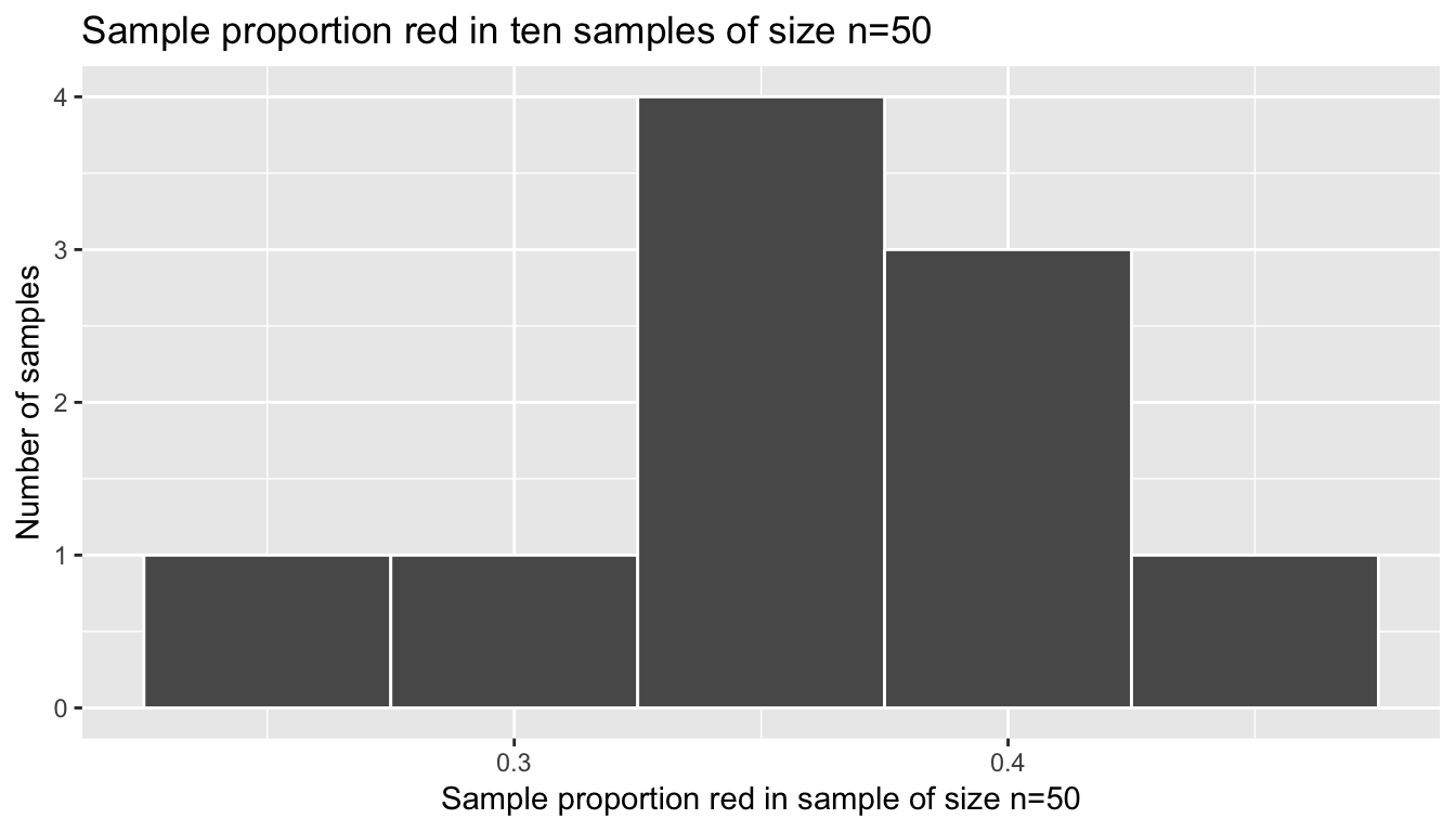
Figure 8.3: Virtual simulation: 10 sample proportions red based on 10 samples of size 50
We’ve replicated the sampling distribution, but using simulated random samples, instead of the “in real life” random samples that our students collected in Table 8.1. Let’s compute the center of this histogram and its standard deviation, which has a specific name: the standard error.
bowl_samples_virtual %>%
summarize(mean = mean(prop_red), sd = sd(prop_red))| mean | sd |
|---|---|
| 0.37 | 0.052 |
8.4 Repeated virtual sampling
Say we were feeling particularly unkind to Yaw and Drew and made them draw not 10 samples of size \(n = 50\), but TEN THOUSAND such samples. They would probably be at work for days! This is where computer simulations really come in handy: doing repetitive and boring tasks repeatedly. To achieve this virtually, we just use the same code as above but set reps = 10000:
# Draw one million samples of size n = 50
all_samples <- rep_sample_n(bowl, size = 50, reps = 10000)

# For each sample, as marked by the variable `replicate`, compute the proportion red
bowl_samples_virtual <- all_samples %>%
  mutate(is_red = (color == "red")) %>%
  group_by(replicate) %>%
  summarize(prop_red = mean(is_red))

# Plot the histogram
ggplot(bowl_samples_virtual, aes(x = prop_red)) +
  geom_histogram(binwidth = 0.02, color = "white") +
  labs(x = "Sample proportion red in sample of size n=50", y="Number of samples",
title = "Sample proportion red in ten samples of size n=50") 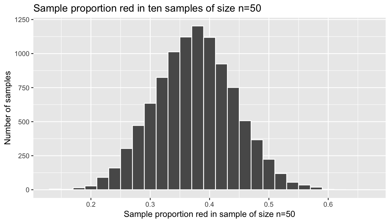
Figure 8.4: Virtual simulation: Ten thousand sample proportions red based on ten thousand samples of size 50
This distribution looks an awful lot like the bell-shaped normal distribution. That’s because it is the normal distribution! Let’s compute the center of this sampling distribution and the standard error again:
bowl_samples_virtual %>%
summarize(mean = mean(prop_red), sd = sd(prop_red))| mean | sd |
|---|---|
| 0.37 | 0.052 |
Learning check
(LC8.1) Repeat the above repeated virtual sampling exercise for 10,000 samples of size \(n\) = 100. What do you notice is different about the histogram, i.e. the sampling distribution?
(LC8.2) Repeat the above repeated virtual sampling exercise for 10,000 samples of size \(n\) = 25. What do you notice is different about the histogram, i.e. the sampling distribution, when compared to the instances when the samples were of size \(n\) = 50 and \(n\) = 100?
(LC8.3) Repeat the above repeated virtual sampling exercise for 10,000 samples of size \(n\) = 50, but where the population is the pennies dataset in the moderndive package representing 800 pennies and where the population parameter of interest is the mean year of minting of the 800 pennies. See the help file ?pennies for more information about this dataset.
8.5 Central Limit Theorem
What you have just shown in the previous section is a very famous theorem, or mathematically proven truth, called the Central Limit Theorem. It loosely states that when samples means and sample proportions are based on larger and larger samples, the sampling distribution corresponding to these point estimates get
- More and more normal
- More and more narrow
Shuyi Chiou, Casey Dunn, and Pathikrit Bhattacharyya created the following 3m38s video explaining this crucial theorem to statistics using as examples, what else?
- The average weight of wild bunny rabbits!
- The average wing span of dragons!
8.6 Conclusion
8.6.1 What’s to come?
This chapter serves as an introduction to the theoretical underpinning of the statistical inference techniques that will be discussed in greater detail in Chapter 9 for confidence intervals and Chapter 10 for hypothesis testing.
8.6.2 Script of R code
An R script file of all R code used in this chapter is available here.